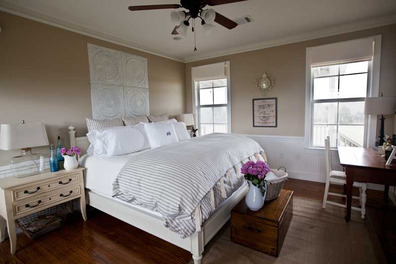
Every room needs a focal point. It’s that place your eye goes in a room to rest. This was my problem with the ceiling tiles used above my bed. I like the size of the tiles. They are appropriate for the large size of the king bed, but they had no focal point. Your eye just wanders around the tile looking for a pace to focus or rest, but there really wasn’t one. That meant the tiles looked ‘off’ to me.
I decided to add a mirror to the center of the tiles.
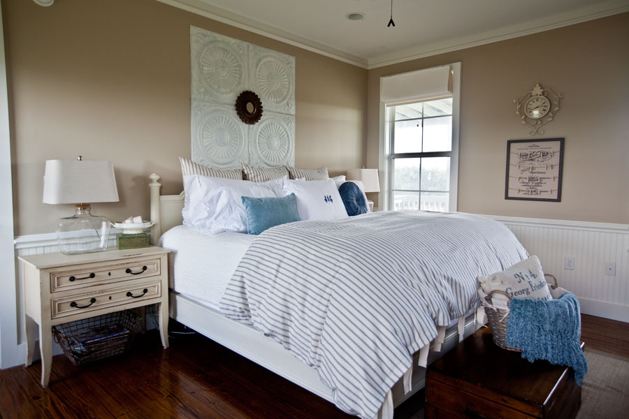
As soon as I added it, I realized it wasn’t right. I asked for ideas on FB, and got a ton!! I had planned to paint the mirror, but someone suggested trying a larger one, and so I did.
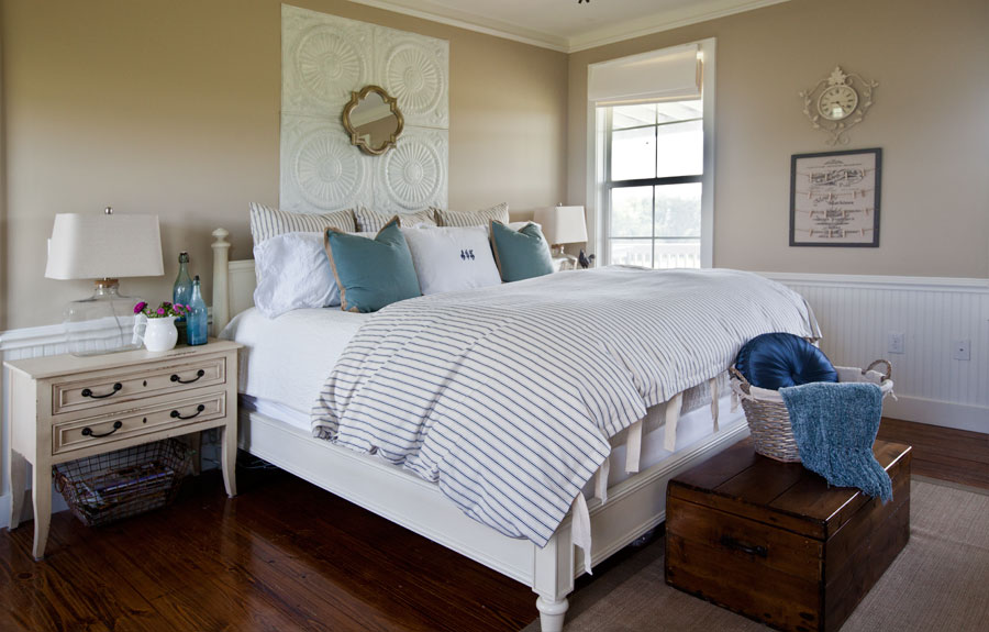
I also made some changes to the pillows, so that there were two pillows on the bed that match. I like the silver on the mirror, and the fact that it is larger than the old one. This gives what I would call a good focal point.
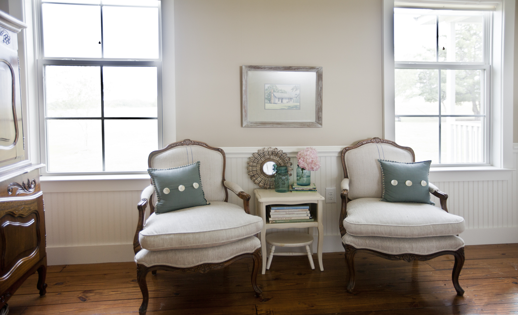
So what did I do with the little mirror? I actually really liked it so I moved it here. Below is the before.
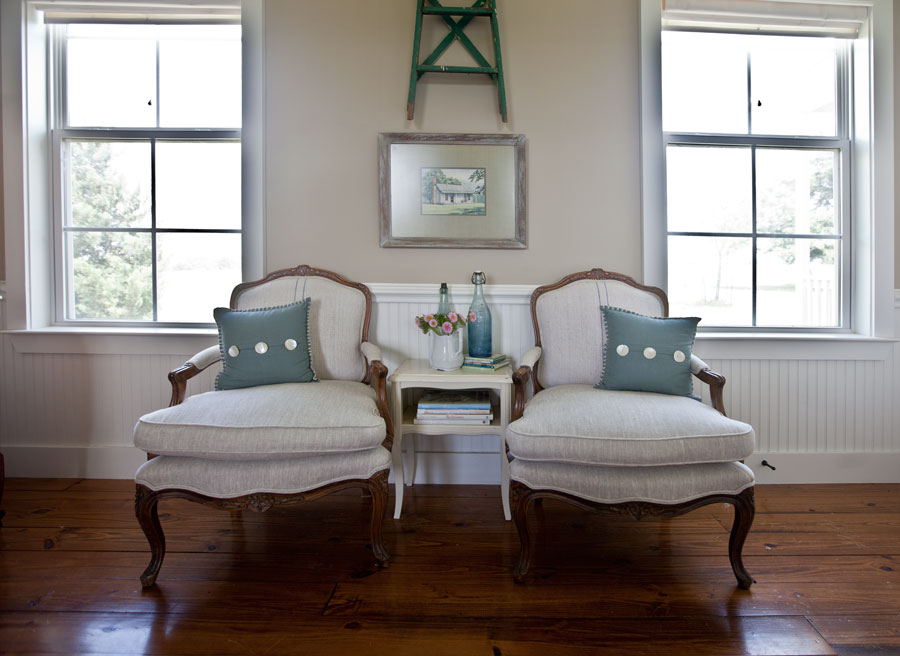
And here is the after. I also painted the little mirror, and removed the ladder from the wall. The ladder worked when I had some more rustic chairs here, but doesn’t go well with the French chairs.
And so here are my ‘take aways’.
1. Check to see what your focal point is in each room. Where is your eye drawn? Is that where you want visitors to look? If not change out your focal point for something else.
2. If at first you don’t succeed…try, try again. That’s right, I change things around all of the time. I rarely get it the way I want with the first try. If you aren’t happy with the way a room looks, keep at it until you are happy with it.
3. Ask for help. I get great advice from friends all of the time. If you have a decorating question, send it to me, and I’ll put it on my facebook page for readers to answer for you.
Hi, I’m new to your blog and loved reading about your decorating trials and errors, it’s definitely the way I go about arranging and rearranging things in my house as well. I’m always amazed at how well, when changed up, things work in new places.
Your bedroom is beautiful but I kind of liked the first mirror better on the tiles. It went with the wall paint but that’s the beauty of it all. We all see things differently! Love that you are using the blue mason jars. I’m a rustic kinda gal 🙂
That is the way it goes Debbie. I have found that rarely does everyone agree on what looks good. I guess that is why everyone’s house looks so different. Yes I can see that you would prefer the first mirror if you really like rustic. Well I think that is a lesson for all of us. It’s great to get feedback from others, but at the end of the day, you have make sure you are happy with your home.
Anita, I loved reading this post. Great job! I am amazed how much better the tiles look with the larger mirror attached and I totally agree that every room needs a focal point. You have given me a great tip and I’m putting it into practice. Thank you for being so transparent each time and allowing us to feel “it’s ok if we don’t get it right the first time.”
I love your striped duvet cover? Did you get it on line? I live in B.C. Canada and am just wondering. Your room is fabulous ! Thanks, P
Patricia it is from Ballard Designs.
now you got me thinking about focal points. I’m wondering if any room in my house even has one!
It’s all so beautiful Anita, for me and my design back ground I would have taken one chair away under the window and added a bit larger and taller reading table and lamp adding a balance with the two windows as to not over crowd the space, it is one time with the pattern of two’s do better alone. The two windows now melt away when one chair is in it place and a wonderful side table perhaps round so it can float a bit away from the wall balancing the windows.
( yet I am sure in real life you do perhaps just that)
The bed is lush and makes a powerful statement and the side tables are bold, you have a bold foot bench all so very lovely, when you have 3 bold statement pieces that you visually see when entering the room on one wall you then take one away…..
I would take away the white ceiling panel away and balance the attention to the bed. Add the light mirror in its place, yes out of scale in this case would work. For example Brooke G. over at velvet and linen ” author and stylist of Patina Style” did it well in a room of simplicity. I feel that your room would invite an aww ha! moment when one enters you room to see the master of the room and that’s your bed. Space is a funny things and because we have it doesn’t always mean we need to use it.
Negative space adds to the balance of noticing.
My very small investment home that my daughter and I moved into left us with a whole lot of design challenges we brought along furnishings that would fit best, and sold off all that wouldn’t, to then fill space with more size-able pieces of salvage to anchor the living space, a little more lived in French Cottage feel, keeping it neutral giving the spaces breathing room and flow to a degree.
No two designer will think alike, this is what makes designs in the industry so unique.
Your style is unique to you, and if it feels good to you then that’s all that matters whether you add or take away.
Dore Callaway
Interior Design
Designer Estate Model Homes res/com
Asid
Ps. I also find it so refreshing to create from salvage, then always the mass market, for that very reason I love that you anchor each room with something salvaged.
It amazes me that Dore felt the need to completly redo your lovely room. However, on one point I will agree…the tin panels behind the bed are a bit distracting but less so with the charming mirror at center. I think the change I would make is the wall color…..it has no depth. I would take it up a notch or two,on the color sheet,in the same tone, or I would do a nice blue grey with some depth. Sherwin Williams Samovar Silver is a color I have used in my guest room and always get huge compliments…even have the blue and white duvet cover! And antiques!! Great job and it’s so fun to play!!
I love the white tiles, but not the small mirror in the center. Not good scale. You don’t really see the outstanding design in the tiles. I think they would look better if you glazed them in a color similar to the night stands. Wipe off and leave glaze in all the crevices. That would be outstanding. The lamps on the night stands are in line with the pillows on the bed. It gives a straight line affect. The lamps are really too short for bedside lamps. If you are in bed reading, the light would be below you and would not benefit you at all. The table in between the two chairs is way too small for the scale of the chairs. I think you should use only 1 chair with a larger table, preferably round. I would move the lamp off the dresser and put on this table. The lamp on the dresser is way too tall. Looking at the lamp and the candlesticks is not pleasing to the eye. They are almost the same height. When you vary the height of a tabletop display, it is softer and is a more pleasant visual. The room is beautiful and you really did a good job, but just need to make a few adjustments. Please don’t be offended, I just wanted to give you some professional advice that may be useful. Again, I reinstate how beautiful the room is.
Connie Callahan
Creative Interiors by Connie
IDS, Associate