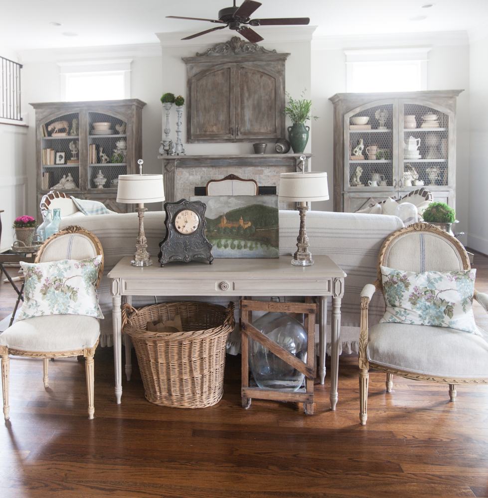
Often you don’t need new furniture, they just need some new scenery. Today’s change is simply the result of moving things from one room to another. If you have rooms with similar colors and decor, the move from one room to another can be quite seamless. That’s why I love to use similar colors and a mostly neutral palette for my entire house. Here’s what my living room looked like last summer.

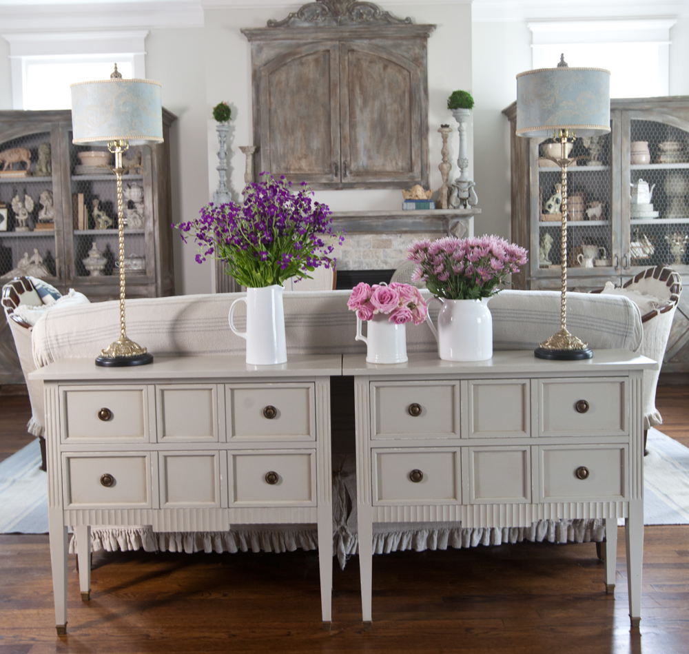
Then I added these fabulous chests from Soft Surroundings. I liked the two chests here, but my family missed the chairs. I acquiesced. The way it looks is important to me, but I really like to make sure the house makes everyone happy.

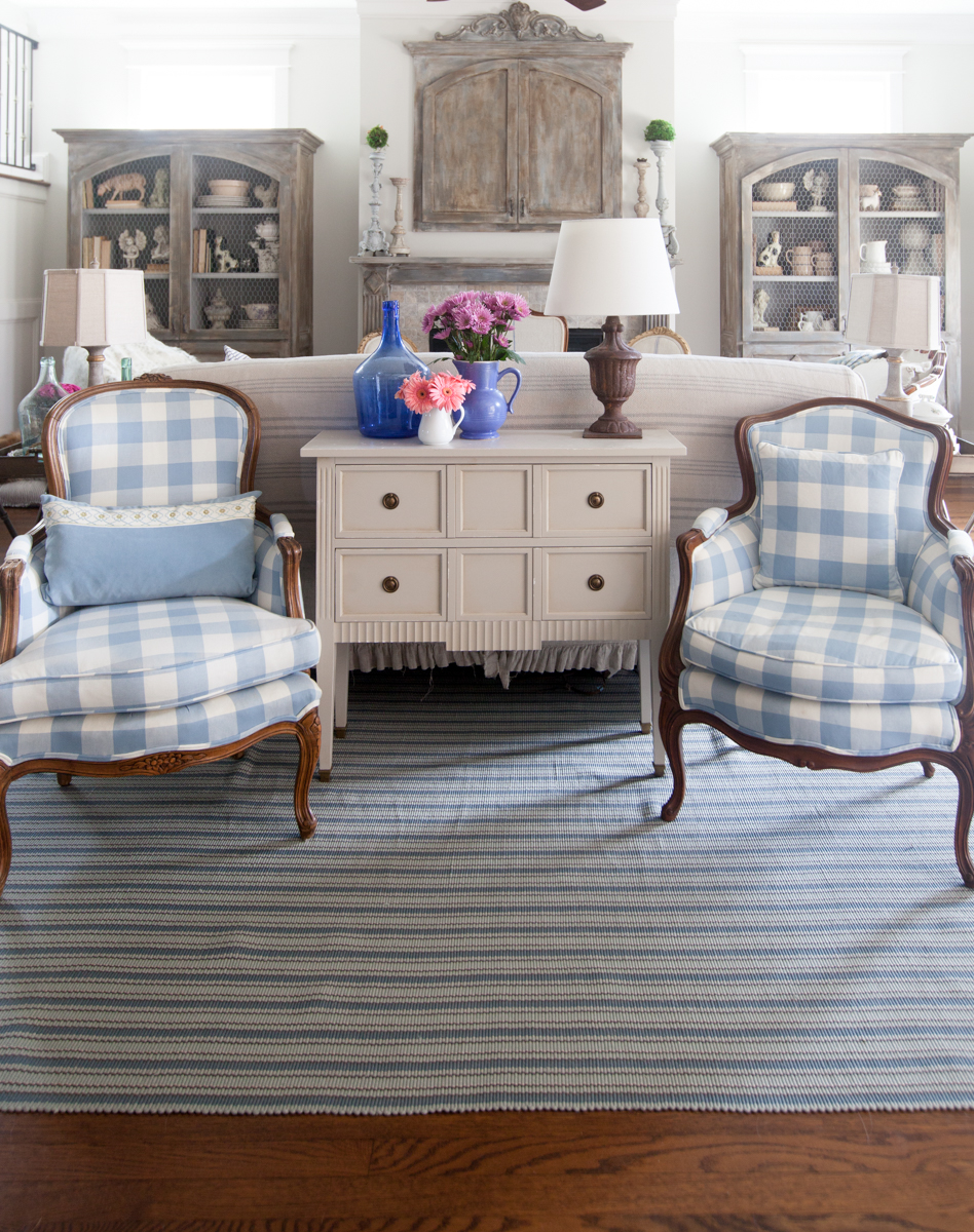
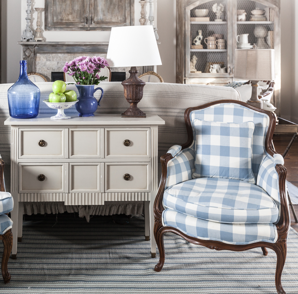
I wanted a bit more color, so I added these chairs that were in the study previously. The rug too is new to the room, but not new. See? Now my family is happy again. And since people still ask me about the windows in this room, let me say that the cabinets are not blocking the windows. The cabinets are built in, and the windows are above the cabinets, but not behind them. There is a house about 10 ft away from our house so there’s no view this direction. We added windows so the light could come in, but I didn’t want to be staring at the side of a house so close to ours.

I hope you try some new things in your house. And even if you are on a budget, you can do this, move some furniture from one room to another. Or if your room feels overstuffed, maybe move something out all together.

I learned this from my Mother, my Father would quip that you never sit down in their home before turning on all the lights! The chair that was there yesterday may not be there today. She would even paint an entire room, switch furniture around and not blink an eye. One day I came home from school and my bedroom had been turned into a TV room. You just never knew!
You may have gotten this question a lot but I like what you have over your fireplace. Is your tv in It? Is it custom built? I want something similar for the tv in my bedroom. Have looked at several styles but like this the best so far.
Claire, it’s our TV cabinet. It’s built in, and our carpenter made it before we moved in. I told him what I wanted it to look like, and he did a fabulous job. All of the wiring was put in the wall when the house was built.
Back when my kids were young I would come home from work to find that they and my husband had rearranged the furniture. At the time we had a somewhat massive living room so you never knew what you would find. I wasn’t always happy with their choices but it made for an interesting end to the day. Now some 30 plus years later my husband still thinks he’s a decorator and drives me nuts at times with his placement of not only furniture but rugs and the like. Yesterday I found that he’d moved the rug out from under the end of the bed so more rug would show. I never thought we would spend retirement arguing over home decor!
Ha! That’s funny. Yes, I guess I need to keep that in mind.
Hi Anita,
Thank you so much for your reply and understanding of my comments! You are absolutely right about the difference from photos to actually being there…., living it! I’m sorry, I didn’t realize the view was of another house so close…. I get it now! I wouldn’t want to look at that either ?! Thanks again for sharing your wonderful home with us!
Good morning,
Thank you for sharing more pictures of your beautiful living room as I always love to see what you do next! As stunning as the chests are that you had behind the couch, the two together seemed a bit overpowering. The 2 chairs in place of one of the chests is much more appealing to the eye and I can understand why your family missed the chairs. It’s always nice to have some extra seating. On a different note, I have always wanted to make a comment though about the beautiful built in cabinets as some others have in the past, but have bitten my tongue because I didn’t want to sound critical as I am surely no expert. I know you have explained that the windows are above the cabinets and not interfering with the view, but from an outsiders perspective (not someone actually in the space) I so desperately want to move them every time I see them. It does appear that they are blocking the windows like a barrier of some sort. I love the symmetry of the room, so I can understand how the cabinets fulfill that aspect, but they just seem way too tall and out of place with the windows. I hope this doesn’t sound mean, as that is definately NOT my intention! You have a truly beautiful home with an amazing eye for decorating! Thank you for always sharing your talent with us!
Hi Sam, I don’t think you are critical at all! I get what you are saying, and seeing the room on the website is different from experiencing it in person. I completely understand where you are coming from. It feels like the cabinets are blocking the view. They are, but that was on purpose. The reason I didn’t want to see out the windows here is because the view is of the side of the neighbor’s house. It’s about 10 feet away, and if I saw the house that close, I would feel like I live in an army barracks. The view is not worth seeing (think of the view in NYC where you just see the side of a building a few feet away). What you don’t see in that photo is that there are two large windows just out of view on the right. If you want a view, you just look that direction into our postage sized backyard. It’s small, but yes you can see outside and see lots of light. Thank you for your feedback. I think if you came here, you would see what I am talking about.
I agree with the two chests and the tall lamps behind the sofa, but as you said, you must also make your family happy. I’m wondering why the two chairs were so important. Did they face something lovely to see, or was the change just too much for them ?
The chairs are by the back door and it’s a staging place for things to grab on the way to work. I thought they had a good idea to put the chairs back.
I have to agree that sometimes we need a flat surface or a chair for our out the door stuff. When I start minimizing, I find that I often have a tendency to remove convenience in favor of “style.” Whatever works …..
I love what your family loves. The color blue looks beautiul in this room. Relaxing
The changes are not only stunning but the area looks convenient for putting on shoes and such. Good job, Anita!
I love the two blue and white chairs with the chest, but it’s nice to see the comparison. It gives me ideas for my own space. Thanks so much for the photos, they really show that small changes can make a big difference in the look.
It’s my pleasure Andrea. I’m excited that the photos were helpful for you.
Well I think the latest arrangement looks very nice and I like the blue. Cath