My mom always said that if you had one color in a room, you should repeat it a few times. And so today we are talking about how to repeat color in a room. I know that sometimes I go overboard with a particular color in a room. Then later when I change colors, I have to change out everything! So how much is enough?
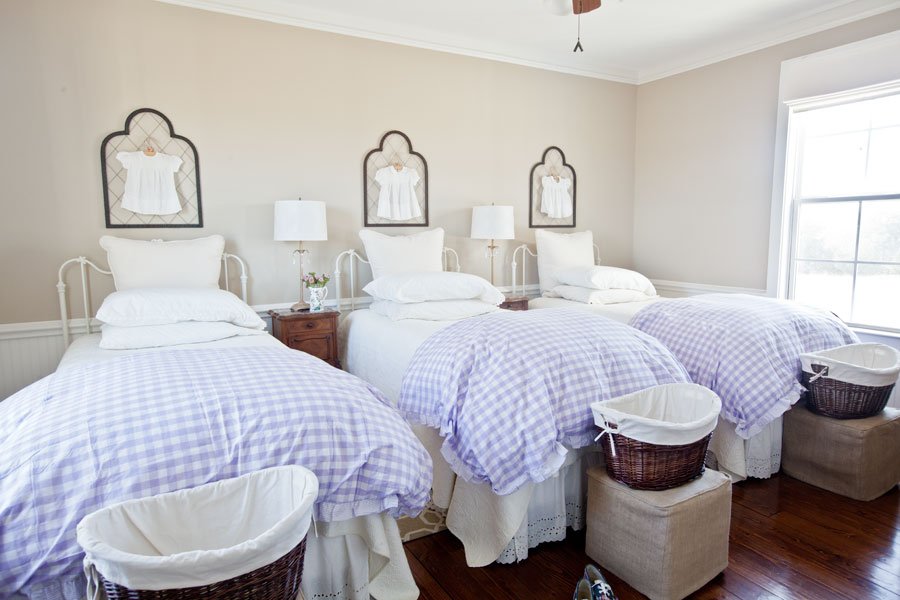
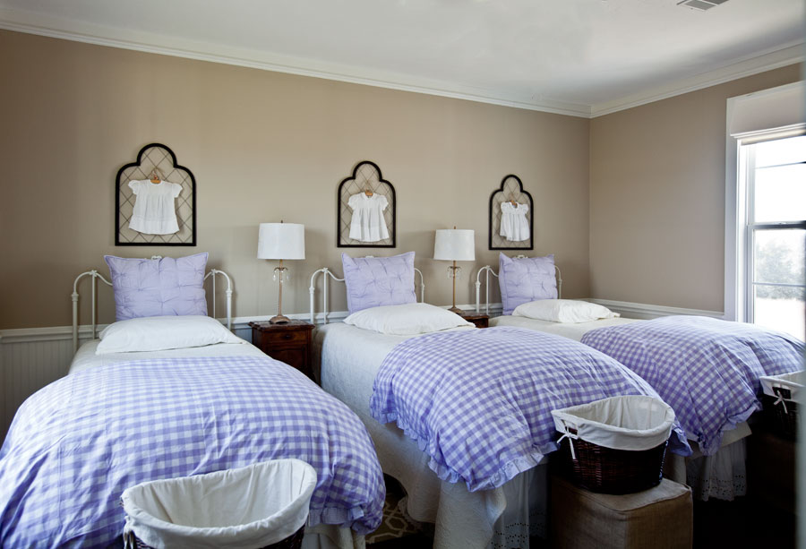
When you last saw this room, I had changed out the red duvets for these lavender ones above.
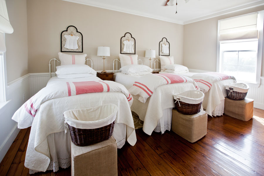
Here’s what it looked like a few months ago.
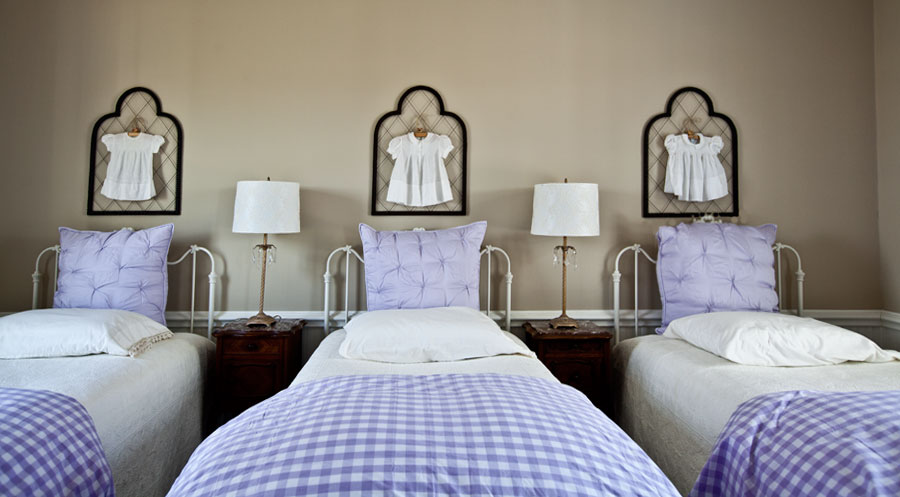
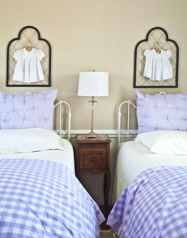
I fell in love with the lavender look in here. But the only lavender in here was in the duvets. Was that enough? I felt the room needed at least one more shot of lavender and I felt that going with lavender euro shams was the way to go.
The duvets covers were purchased on sale at Pottery Barn, and they no longer had the coordinating euro shams.
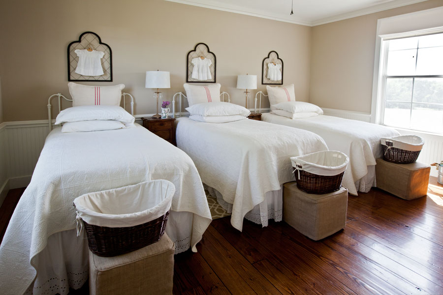
But that’s okay, because I actually like the fact that the pillows are not exactly like the duvet covers. I am very, very happy with the look! It only took me 6 years to get it here! A year ago the room looked like this. Remember the Downton Abbey Hospital ward look?
It was a bit stark. Now it feels more cozy and inviting. I like white, but sometimes you just need some color. So to go back to our how to repeat color in a room theme today, I felt that I needed at least two repeats in this room. Yes there were 3 duvets, all lavender, but I counted that as one. I like if a color is meant to be a dominant color in the room, you probably need to repeat it at least once. The lavender shams worked for me. I did not add lavender on the other side of the room either. This is it. Now when I add curtains in here, I will consider lavender, but I will probably go with something neutral so it will work if I ever get tired of the lavender. Oh my that makes me sad to think I might get tired of the lavender; I hope I don’t.
The point is if you want to introduce a color to a room, you want it to look balanced. The pillows added that balance to the beds. It is difficult to make a hard and fast rule about how much color you need to repeat in a room. I think the thing I want to point out is to be aware of it, and ask yourself if it looks balanced. Try a few different looks, then decide which one is best. EXPERIMENT!
We recently had a lot of guests over to the farm for an overnight camping party. Some guests slept in the house, while most slept on the porch or in tents. They said that the house was cozy and inviting. And that is why I do what I do, to make our home a sanctuary for my family and for friends. I think those of us that love to decorate and to nest do it for the love of home, of friends and family. It’s not for show or a competitive sport, it’s about making our homes welcoming. Now that I’ve said what I think, how about you? Do you have any thoughts on repeating a color or pattern in a room?
You are so right with the color! It gives so much character to a room… I need to think about my daughter`s room in a new way! I`m in love with what you have created in that room ♥ Alexandra
I love your website and find it really interesting, but am not happy with all the adverts attached to your photos. It seems that the only way to look at the photos with out the adverts are to close each one as you look at the photos. Please can you do something about it.
I am very proud of the fact that I provide quality content for free to readers. If I removed the ads, I would need to charge readers to access the site to cover all of the many expenses. Think of a magazine you read. Most are full of ads, and you still had to pay for it. Cable TV you pay for, and still there are commercials. My blog has always been free. I am not a hobby blogger, this blog is my business.
I love your blog & would love to meet you if you are ever in Western Canada. 🙂 I appreciate there is no charge for your blog & completely understand the need for income in order to offer your blog free.
I was always told to repeat the color around the room, so your eyes moves around the room. For example, a red cushion on the sofa, then maybe a red throw on a chair in a corner. Maybe a vase of roses on a coffee table, just so the accessorizing color takes your eye around the room. Not overload, but just enough. Love your lavender by the way.
Jane
Repeating the color was great but the additional texture really made it work.
Your room looks great, just finished a color class at school. Balance is important , also it was said to use one color and then use a complementary colors at least 2 or use one color and different shades and tint of that one color , always making one color more dominate, by using one main color you keep a good flow or balance.. I’m not an expert just was passing on some fun general info.
Have a good day.
Pam
I too hope you don’t get tired of the lavender because it is lovely. Just the right amount of the color and much more interesting that the pattern of the shams and comforters are not identical. However, if you do tire of it I have no doubt you will do something equally wonderful.
I love the lavender! For soem reason too much white isn’t good for me. I love color. I spread it around the room. This room has always been a very favorite. I also agree that we do what we do to make our home welcoming and inviting. That is always and has always been my goal.
I like both, but I was fully expecting you to say repeat it 3 times by meaning 3 separate places since that’s what I’ve always read. I love the white neutral, I’m going to have to remember that. It’s so crisp and clean, but I can’t do it with my boys or black cat.
I love the room! Agreeing with the comment above, I also understood that there should be three instances of a color in a room (if you want the color to be noticed as part of the room). The idea for three separate locations was for the eye to see it in three different places.
I love what you have done to this pretty room. I agree with other comments that 3 seems to be a good # to repeat a color in a room. I love the idea of a neutral window treatment in this room and I would incorporate the lavender in the valance or tie-back of the panels, etc..
Hope you had a lovely Mother’s Day weekend.
Thank you to all of you for hosting. I’m having so much trouble finding the comment enter to Debbie, I just don’t get it.
Have a great week you all.
FABBY
Love the room!
Can you tell me about the frame around the dresses?
Where did you get them?
I was wondering if a tiny bit of green would look nice in the room?
Jill, I am working on finding out where you can still buy them. Stay tuned.
This is sooo beautiful.. completely redefines interior design for bedrooms and cottage house plans. ^_^ thanks for sharing this…
Where can I get the “frames” for the dresses. I have been smocking for 36 years and would love to display them.
Thanks, Jo
Jo, I’ve already emailed you, but for anyone else wondering, here it is. http://shop.cedarhillfarmhouse.com/products/metal-arched-display
The room looks so inviting. What a sweet spot for a nap.
Have you thought about adding a real lavender plant in a basket (or two)?
This is really just the sweetest room………..
Thank you Ter’e, great idea!!
Yes, love this room in whatever way you choose to color it!
I purchased Romantic Homes in which you’re featured & on the Cover, well done?