I love the look of white, cream, and oatmeal fabric in a room, but it can look a bit flat where there isn’t any color. I have decided that my neutral rooms would look a lot better with a touch of color. Adding just a touch of color still allows the room to keep a neutral feel, but gives it a little pop. This is my theory at least. Here are 4 rooms with a before and after photo showing the neutral room with and without a touch of color. Here we go.
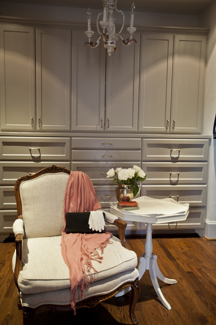
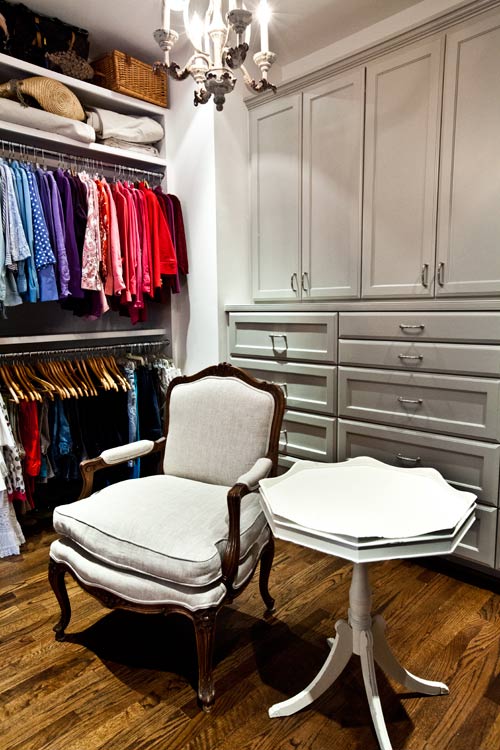
The first one is my dressing room.
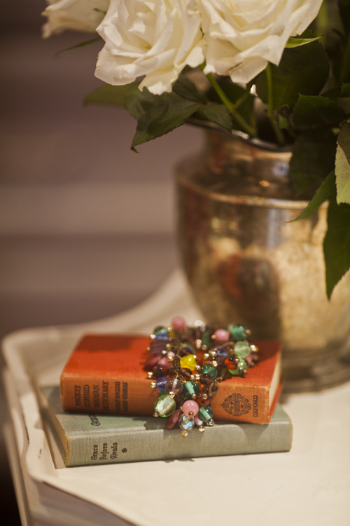
Well this one may not count, because you still have the color of my clothes in the background in this room, but here is the before.
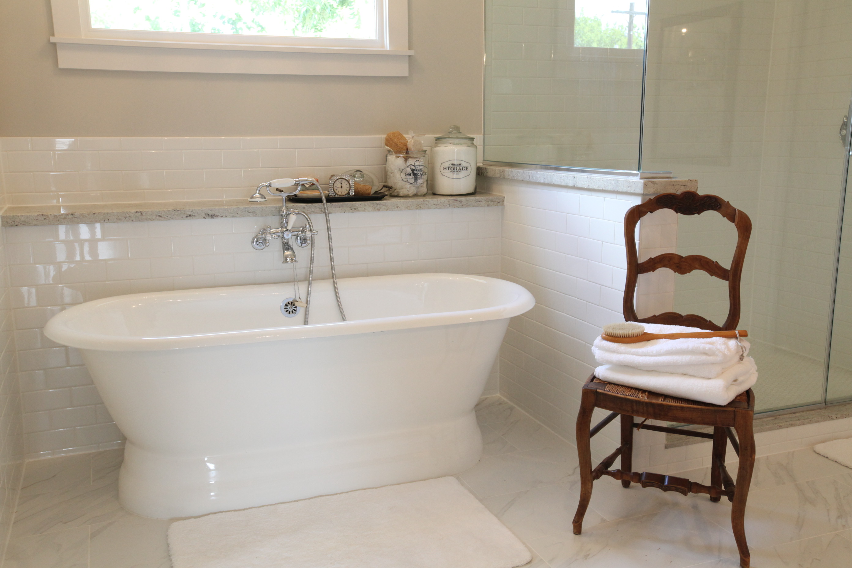
Next is my bathroom with a more comfy chair, a throw, some flowers and my cup of lavender.
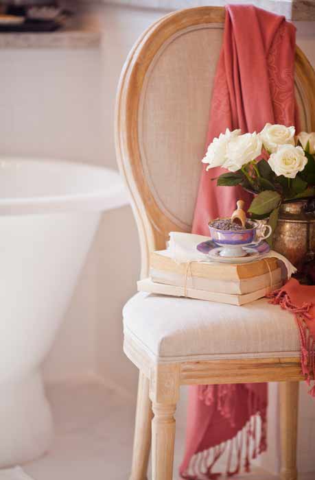
I really like the more comfy chair in the bathroom, and the color really adds some interest in here.
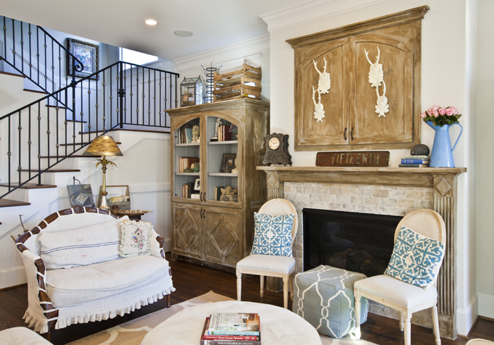
Next is the living room. I really like the color on the room. I added the blues when I did the Cozy home tour.
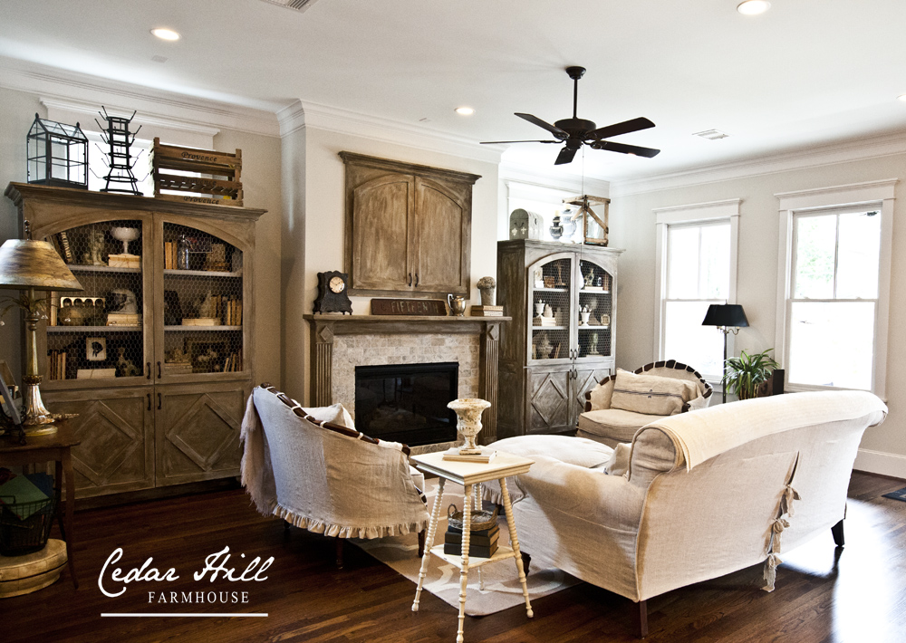
Here it is without the color.
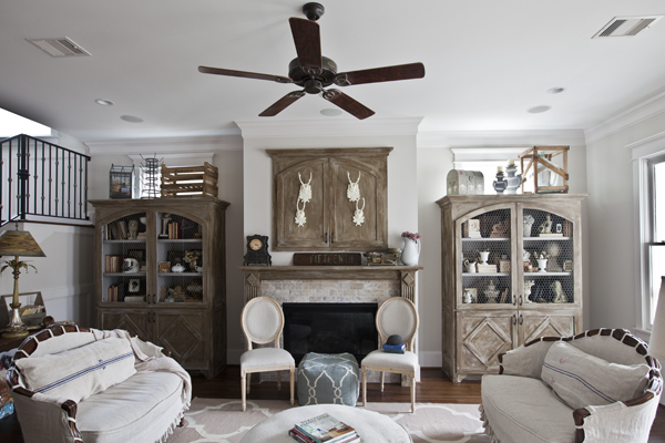
Okay some of you didn’t like the blue pillows here. I agree! I actually ordered the pillows, and then found I didn’t like the color, but I had a blog post to do, so on the chairs they went. Uggh. So here is another photo without the pillows.
I actually have some beautiful new pillows that I will be showing you soon!!
Lastly here is the kitchen with a little bit of color.
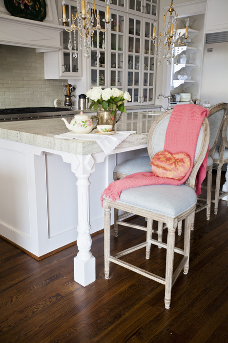
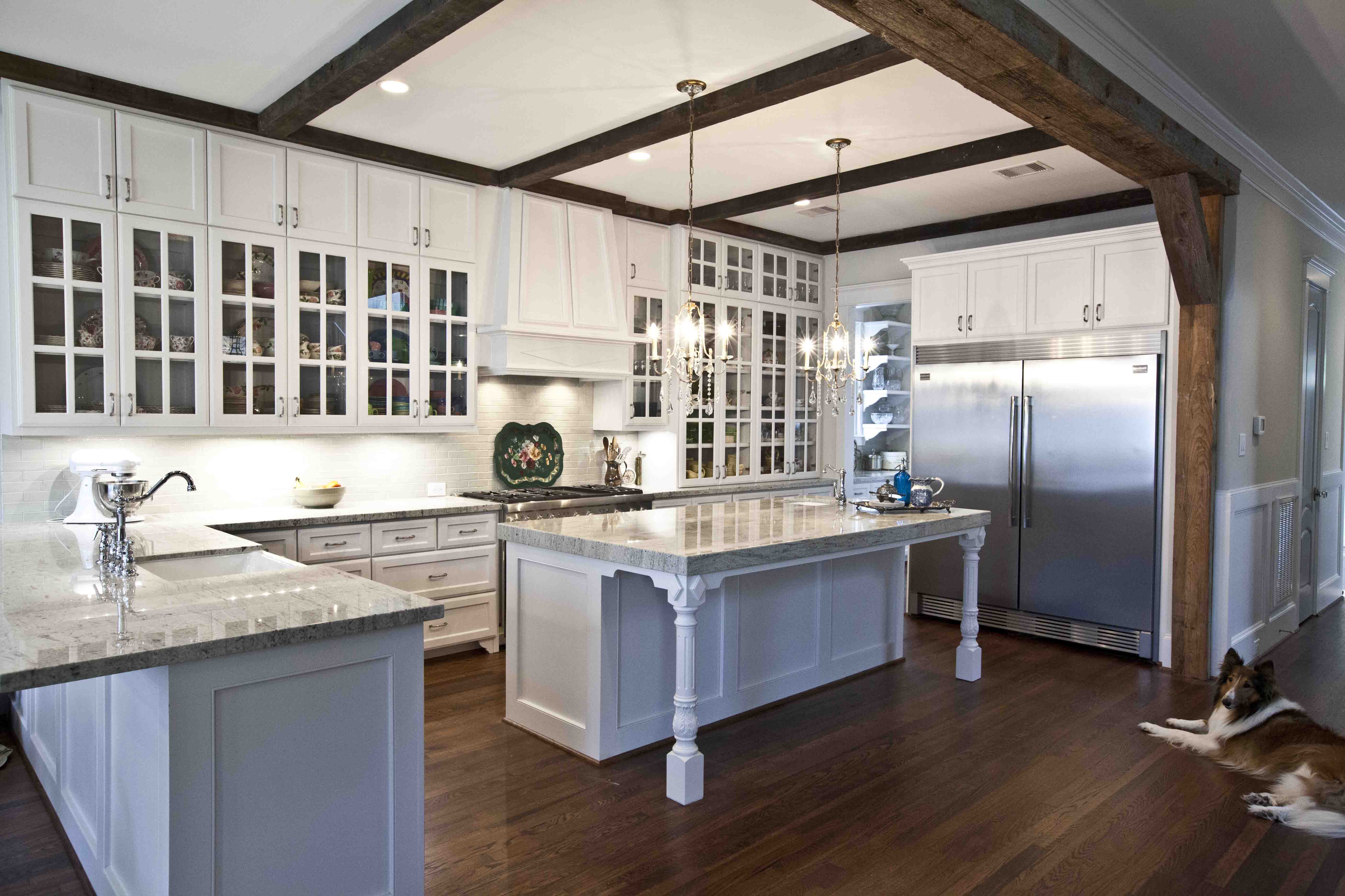
Here is the kitchen before I added the kitchen counter stools and the color.
Well what do you think? I’m convinced that a touch of color makes a room come alive. Stay tuned while I make some adjustments. I just got some fabulous colorful items I’ll be introducing in upcoming posts. I’ll be working to balance it so that the house stays neutral but has some interest at the same time.
Don’t forget to join me for the Cedar Hill Farmhouse curated collection going on now at Joss and Main. Just click on the image! (contains affiliate link)
Hi Anita,
There has never been a “neutral” room that I’ve enjoyed as much as yours – actually your entire “neutral” house is so relaxing to me.
Your additions of a pop of color in your Dressing Room and Bathroom look great…I like the soft colors you chose. The pop of color in your Living Room isn’t working for me…it’s the various shades of blue and the additional chairs in front of the fireplace – they interfere with the beauty you’ve created in that space. The color on the ottoman in front of the fireplace is the BEST blue there, with it’s greyed-blue shade…softer, more in keeping with the tone of the space. Now if all of the blue was that shade, and scattered around the room, I’d love it. JMHO
Hugs,
Jan
This is exactly how I decorate. I love neutrals and then bring in little pops of color all over the room. It is so easy to change out as the seasons change also. Great post!
Would you mind terribly if I moved in? I could be very quiet. 🙂 And is that a TV behind those doors above the fireplace? It’s all so gorgeous, so calming. These are perfect colors for summertime. Makes me want to paint something.
Hi Anita,
I love the pops of color but I have to agree with Jan…the blues in the living room don’t seem to flow with the rest of the room…maybe if you moved the pillows to the sofa it would balance..as it is, looks like the blue is heavy on one side of the room..not that you asked for my opinion…lol..:-)
By the way, the bar stools look fabulous..are you happy with them? I want new stools and those are the prettiest I’ve seen in a while…
Have a great day!
Sharon
Ya’ll crack me up!! I agree! I changed out those pillows weeks ago. New photos to follow!!
I just love the look of neutral with pops of great color here and there….and most of all, I never tire of seeing your gorgeous rooms and that closet to die for!..
Luvly pops of colour Anita. I too luv a neutral palette with pops of seasonal colour.
Happy today!
I love your rooms, but the pops of color is a nice change. Personally I like color, it makes me happy and winter has been terrible so I may be pining for Spring.
Anita these are beautiful rooms and great accessories. What a gorgeous s dressing room.
Cynthia
I love a neutral room and your’s are calm and warm. The throws on your chair and stool certainly add to the feel of the room. Very spring like. But, your living room is gorgeous just the way it is.
All of the rooms are wonderful with the pops of color you added. I love the chairs in the kitchen with those beautiful blue seats, perfect! Can’t wait to see what you replaced the pillows in the LR with–not that I do not like the ones you had before!
I most definitely agree with you, colour brings life to a neutral palette. My home is based on a neutral palette but I have pops of colour and as I speak I am about to put my new ‘blue and white’ cushions in my living room which were completed yesterday. I am also doing up my office which is going to have very pale blue walls and accents of possibly yellow in the room.
Your before and after images are great illustrations of how colour can lift an area. By the way I love your bar stools, I have never seen anything like those in New Zealand.
Thank you for sharing and the work that has gone into taking all those lovely images.
Lee 🙂
I love the pops of colors you have added. I have to admit I wasn’t crazy about the bright blue pillows either and I think your space looks better without them. Your home is simply gorgeous – either way.
Patty at Home and Lifestyle Design
The whole house is just beautiful. The great thing about color is that you can change it when it is “small”. Love your blog. Happy to have just found it!
Paula
Locksley Lane
A big, big yes on the touch of color. It absolutely brings life into the room.
Love, love, love the pops of color in your gorgeous home!
Hey Anita! Your rooms look lovely as always! I so enjoy reading your blog. Thank you for allowing us into your beautiful home!
Your home is just gorgeous! One of my favorite things about an all white/neutral decor scheme is being able to add a pop of color and then change it out for something else!
Anita,
Gorgeous PoPs of color, dear friend!!!
I agree…new pillows!
Think the size of those hides the elegant style of your chairs.
I’ll be watching for the “new” pillows, soon!!!
Fondly,
Pat
Your beautiful neutral home has been my favorite for a while. With that inspiration I have begun some changes in my home, but was thinking all along that a pop of color in the guest room was the pop it would need. I painted the furniture with white chalk paint, but saw a RED Jenny Lind (or is it Lynn) bed on Houzz and decided it was exactly what I needed. I’m loving the whole look! Thanks for your “free” consultation!
While I love a pop of color for interest, I do love the neutral colors of your home. It is soothing & not distracting and oh so comfortable while also homey ! 🙂
Hi Anita. I am just joining you for the first time through e-mail. Your home is beautiful and even though I use lots of color, the all white room is beginning to grow on me. I have to say I love the pops of color, but must admit my favorite is the kitchen with that big fluffy “rug” on the floor. Your blog is wonderful..Happy Wednesday..Judy
No matter what you do it always looks spectacular! But when you add just a pop or two of color your decor comes alive. I adore the salmon color! Beautiful as always, Anita!
April 1st I’m moving to another state from a house to a small “white” apartment. I will taking my antiques out of storage and I’m so looking forward to try the many ideas shown on this site!
Joyce, I am loving all the selections you made for Joss and Main! Literally I love everything!
Patty at Home and Lifestyle Design
I LOVE the color of your living room! Do you know what it is?
It is SW Agreeable Gray.
I love the wooden beams! I like that they’re smaller so you still feel like you have high ceilings.