So I’m finally showing the rest of the guest quarters today.
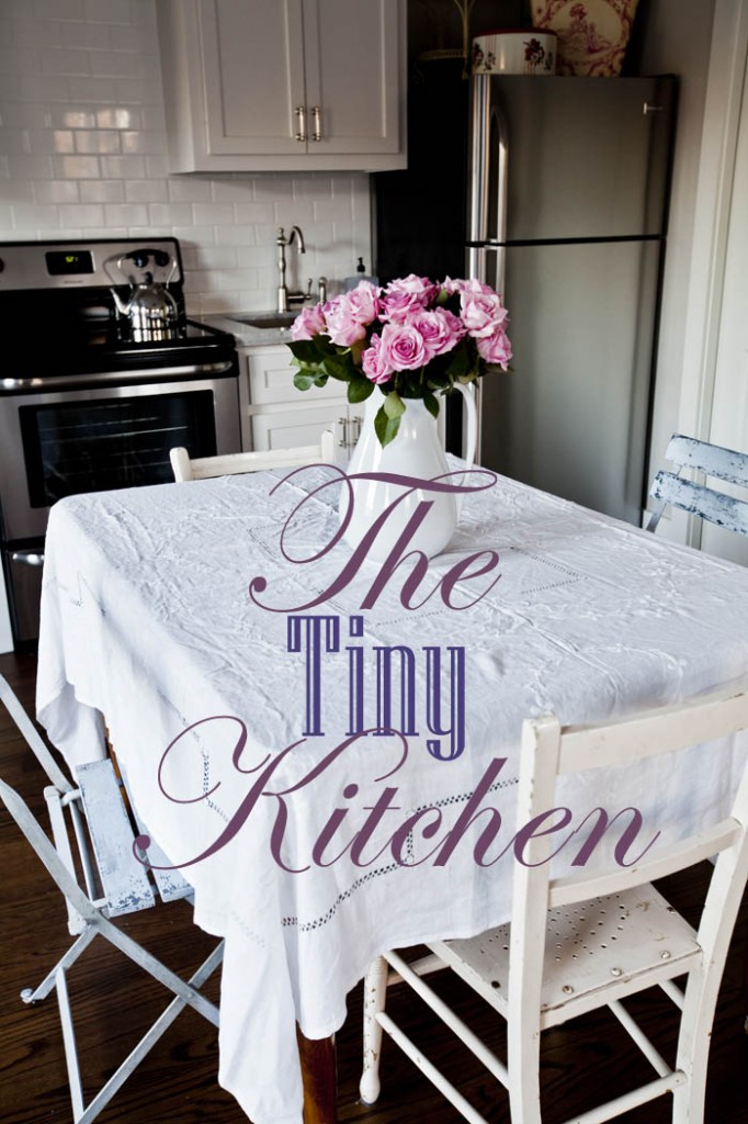
You saw the kitchenette here,
the craft corner here, and here.
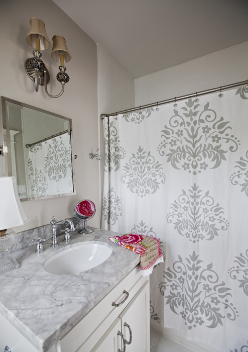
and the bathroom here,
and now we are going to move onto the rest of the quarters.
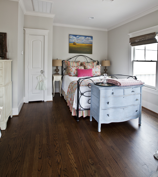
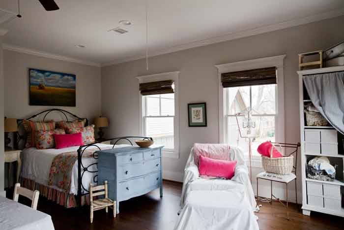
Tucked in a corner, I’ve got a queen size bed. This is really more of a work room for me, but if we need to use it for guests, the bed will come in handy. The chest at the foot of the bed is for guest clothes and for holding a suitcase. I know from my FB page, that readers felt I should move the chest to a wall and not block the foot of the bed. I agree that when looking at the photos it does look better to not have the chest in front of the bed, but in person it seems just fine. This is just another example of how sometimes something that works in person may look odd when captured in a photo.
And I just found somethings at Round Top, so this photo is already out of date!
I moved the painting from the farm to here. I love this painting and I think it looks so much better in with this bedding.
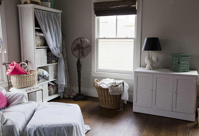
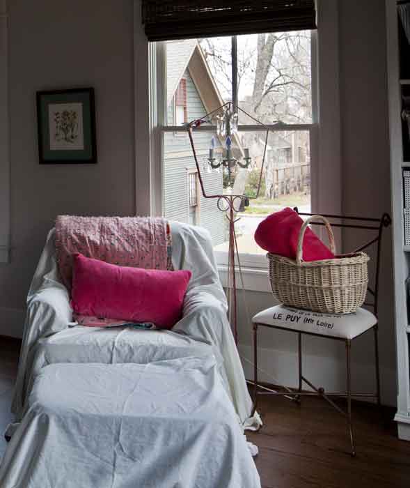
The leather chair is covered in a vintage linen sheet. I am still deciding what to with the chair and ottoman. It belonged to my mother-in-law, and I am trying to find a way to keep it to make Mr. CH happy. I got rid of so many of her other things, I am trying to make an effort here. It’s a comfortable chair. Some readers have suggested I paint the leather, but just the idea of slipcovering it is causing enough of a stir at our house.
Notice the blinds in here? They are were provided by my fabulous friends and partners at Blinds.com. For information about which blinds I chose and why, click here.
Well, it’s a start. I still have a lot I plan to do in here. If you have any ideas on what you would like to see me do, feel free to leave your ideas here. I always enjoy hearing what you have to say.
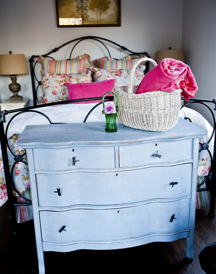
I like the look and the functionality of the chest at the end of the bed because the bed is high enough to hide the back of the chest. The picture over the bed gives a very serene feel to the space, as well. It is all very well done!
Hi!!! Well…I LOVE the little dresser at the end! When you look at the room as a whole, it is perfect!! I ABSOLUTELY LOVE your style, you make me crazy when I see your posts or ramble thru your blog here!!! Ugh…I am insanely jealous!!!1 YOUR look is the look I would LOVE!! I moved into my hubbies house and it is an old 1842 one room school house converted into a house back in like 1930’s..Not much has been done since the 60’s whoever had this tiny house before. I did do the bathroom, but doing it again!! And then the kitchen and livingroom and bedroom! Seems so huge a task, but in reality…this house is tiny! I keep changing my mind on colors so it hasnt gotten done!! Wish I had a ton of money to hire YOU to come do it! LOL thanks for another great post!!!
A one room school house sounds wonderful-always wanted to convert a church into a living space my self. Try taking it one small space at a time and just concentrate on that; your style will allow the entire project to be cohesive- it’s what I tell my writing students when they are assigned a long essay or research project.
I’d love to see photos of the school house reno, too! I LOVE small space renovations! My first house was a 1943 cottage…miss it so much!
Love your guest cottage. Dresser looks fine at the end of the bed and guests will like that too. If the leather chair is a brown or carmel color it may look fine in the room and should not need a slip cover just a pillow .
Love the guest quarters! Got tickled by the wrinkled tablecloth…I try to convince myself that a few wrinkles are just fine…and then I snatch it off the table and iron it. So I’m usually resetting the table frantically just before the guests arrive. No more!
I think the chest at the end of the bed is perfect!! The room looks absolutely adorable! I would think you could leave the chair as is. It would blend in. Just add a pillow. Can’t wait to see what else you have planned for this space.
What a beautiful room Anita !!…I love the fact that there is a kitchenette in there…loved seeing the progression of this room…great job as always and when may I make my reservation?!!!
Any time Shirley!!
Guest quarters with a craft area? Sign me up! Hope you will be taking reservations the next time I have a project to work on…that would be heaven. A place to craft with kitchen and all, and no interruptions.
The little blue chest does work at the end of the bed. In the first photo it does not appear so. But when you pull back and show a fuller view you can see that it really does work and in fact looks great!
The whole space is just lovely. I love the cozy, pretty feel to it all. You did a wonderful job. Are you taking reservations yet??? LOL.
Such a pretty room! Love the blue chest!
-Shelley
I love the dresser at the foot of the bed (that’s where I have mine)…..and the entire “guest quarters” has a comfy, homey, cottage feel. I would be happy there…..and you would probably have to call the Sheriff to have me removed! lol As for the leather chair….I would embrace it as “vintage” and let the leather be another element of texture and color. Put that pretty pink quilt that is on the back of the chair, folded across the ottoman….add a little wooden tray (paint it the bright pink of your pillow on the chair) on top, which can act as a place to put your cup of tea or coffee….then you could take that nice large basket off of the chair (so the great upholstered seat shows), and put it to the side of the leather chair….you can use it for magazines/books. Aren’t you sorry you asked for input? lol Truly…..the room is lovely as it is….I’m just trying to convince you to make it look like you “love” your hubby’s Mom-chair, so that he will be happy, until he decides that it needs to go! I really enjoy your blog and your decorating ideas. xo
I think you should invite me to stay the night and then I will give you my thoughts! 🙂
Anita, I like the chest at the end of the bed. Your guest quarters look very inviting.
The room looks lovely and I actually like the idea of the drawers at the end of the bed, in fact if I have room when I do up my bedroom I might also copy this idea. I am hesitant to make suggestions to people about their decor but as you are asking, what about lighter coloured shades on the beside lamps, maybe white. It is just a thought, I do realise they do co-ordinate with a similar colour in the bedding.
It is hard to determine the exact colour on your walls, is it a pale grey or does it have some blue in it. It looks very similar to the colour I finally chose for my home office. Mine is called ‘Hint of Grey’. I love it and am sitting at my desk (I have re-finished) and writing from here at this minute. I will hopefully be posting images later next week.
Lee 🙂
Lee, it is Sherwin Willaims Agreeable gray.
I just love what you’ve done Anita. I’ve followed along and every post thrills me to see what you’ve done between posts. It’s sooo cozy and bright and airy. Great job girl 🙂
Sheila
A small and/or combo area is always hard to work with. But you seem to have it conquered here. Clever use of the space. I’m with Marianne . . . if it’s in good shape, maybe the leather chair and stool would look nice. It could help carry your eye from the wood floor to the wooden blinds and work with the browns in the lamps and the painting. The pink accessories would still work with most browns. What do you think?
Nice post. Thanks for sharing your lovely place.
I love the guest quarters with their own little kitchen. I could see holing up in there over a long weekend and scrapbook my heart away. I would also uncover the chair. Barbara had some really good ideas of how to tweak the chair area. The only other thing might be an area rug under the bed area, for warmer foot area when getting out of bed. Love the farm picture too. Keep up the great work.
Thanks for your thought provoking comments. In your guest quarters I would place curtains on the windows a nice soft linen draping over the floor. The “leather chair” would look perfect with a slipcover of a neutral color , white or off white, so it could integrate with the quarters.. You are blessed to have such a room in which to play and a place for your guests.
I agree that the leather chair should remain. There is a leather stain, not sure what color, but if brown you can also try bleach solution to lighten it to take the stain/polish, then wax. Using the pink pillow and tray as someone suggested. There is nothing like a comfy chair for reading before bed. Most old leather chairs were comfy. I have the same bedspread(blue one) in my lake house. I used white eyelet and light pink. Luckily I found a perfect pink chair at a thrift store $12. Love your blog! Dying of envy at pocket doors to your office and bathroom fixture….love them. Enjoy reading every post!
I have really enjoyed reading your blog and Facebook pages, Anita. You have such a flair for some many things, it seems!! I was wondering where you got the standing antique looking fan in your craft corner? I would like to have one of those but have yet to find one.
Thanks!!
What an oasis of tranquility – your guests are fortunate fellows, indeed. Thank you for sharing so much with us. You have a wonderful eye for making things lovely.
I love the room, but would still move the chest to the area between the two long windows. the frame is beautiful…but like you said you have to be in there to see it..lol cute room
I LOVE the dresser at the foot of the bed and it does translate well in the photos. Not many can think outside the box.
Hello from Kentucky!! I just wanted to say I love all of your rooms, everything looks so nice. I especially like your kitchen….love the “homey” look to the kitchen as well as the other rooms. Looks so warm and comfy too!!
God Bless!
I love the chest right where it is! Just my two cents but it looks a little cramped at the head of the bed. I think the nite stands are nice but how about a hanging lamp above each instead of table lamps? Love your style!
Great idea Jeanne!