So much of design is personal taste. I have posted photos on Facebook where I felt it was obvious which one was my BEFORE and which was my AFTER, and still it seems many people vote for my BEFORE as their favorite.
So what gives? Well I guess we are all different and we all like different looks. Some like a LOT of color, some like a bit, and some like NONE.
And so I thought I would share some bedroom updates and ask your opinion.
Some like contemporary designs and some prefer more traditional looks. I won’t belabor the point.
This is one of those rooms that has sparked the most controversy. I loved the hay painting but everyone told me it didn’t work in here.
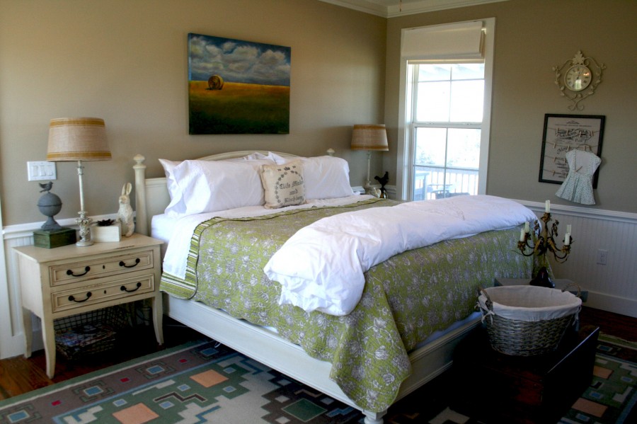
I have to agree I prefer less color on the wall behind the bed. Some people hated the mirror behind my bed, but I really like it, so it stays.
Which brings me to my current dilemma.
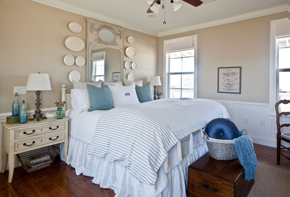
Should I use the blue pillows below or go with no blue pillows?
I also wanted to point out another change; I removed the two round plates on either side of the mirror, and replaced them with the oblong platters.
I am curious though as to which you prefer, the bed with blue pillows or without?
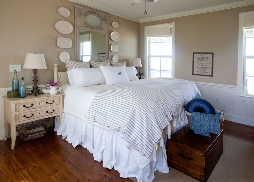
Hmm, it’s a tough one. I am trying to use a bit more color in my rooms, but there is something I like about the bed without the blue pillows. Maybe a different shade of blue? What do you think?
No blue pillows!
I have almost the same bedroom décor as you show. I used blue pillows etc. just like yours. I put the blue pillows in the back of the pillows on the bed. It softened the blue just enough. I like the platters better than the two plates.
I like the white pillows-there is something a little more calming about them in a bedroom.
Without blue pillows since they are too small for my taste. Love the plates all in a row since it is symmetrical. Still love the painting just need a little larger piece or maybe several art pieces. The reason the mirror works is because it fills the area over bed.
I enjoy your work.
I love your bed and all the linens on the bed….a beautiful room. IMHO I’m not a fan of the plates….not in a bedroom. It reminds me of a kitchen/dining room. I’d probably use some natural decoration like a spray of greenery or white flowers with a hint of another color (pastel).
Agree … why kitchen plates above a bed? With all the decorating options, how about something else like a very muted pastel on canvas on each side of the mirror?
I agree about the plates. I just don’t see the sense in hanging on the wall. It might be that they remind me of my mother in law but then I live in earthquake country and wouldn’t take the chance
I like the plates. Much better without the two little round ones. Perhaps just 3 on either side of the mirror would be more visually appealing…3 is more interesting than 4. If not plates then maybe long, slender French flower baskets filled with only a bit of color. I like the new lamps a lot better as well. I think I’d be tempted to try the very lightest, sofest shade of brown pillow on the bed. It would still be neutral but you’d compliment and tie-in the gorgeous floor and trunk at the food of the bed. I love this post and being able to compare and contrast the two looks. It’s a great exercise in sharpening our decorating skills. You can hardly go wrong with this room. It’s gorgeous both ways. You have great taste.
I like the blue pillows on the bed. I love blue! It is my favorite color and I absolutely love how you did that bedroom! I think the blue pillows add just the right amount of “color pop” to the room! Love it!
I like the room better with the blue pillows
I absolutely LOVE the second picture! The room whispers happiness, warmth and welcoming! It’s peaceful and beautiful! I hope you leave it just like that! And have sweet dreams every night!
Definitely with the BLUE pillows!! Lovely!
Absolutely no blue pillows. By the way I have been an interior designer for the past 30 years!
I like the blue pillows… but then again…. I am one who loves color
I like the 3rd bedroom, but I like the softer blue pillows on the bed and think the blue pillow in the basket at the end is just too bright!
This is such a lovely , peaceful looking space, and the last photo without the blue pillows and with less plates makes it even more restful and calming. If you did want a blue, I think a very soft pale blue might look nice.
They definitely both have appeal. When I see the room with the blue pillows, I feel like the room is more casual but also more inviting and friendly. When I see the room without the blue pillows, I feel like the room is more formal but perhaps more “correct”. The bed without the pillows does not seem as “soft” to me, it is a more tailored, simple feeling.
The other thing I was thinking was that it might not be the shade of the pillows’ color as it might be the size. Perhaps if they were a bit smaller than the middle, monogrammed pillow, they would create a more pleasing balance on the bed? I could very much see the same color pillows, but smaller rectangular shapes, fitting in beautifully and still giving that pop of color. Or perhaps putting the blue pillows behind the long white bolster pillow, so their color just peeks out (that might look weird but who knows)?
I do like the little pitcher with long purple stems better in the non-pillowed photo 🙂
They are both VERY lovely! But I think if I had to pick, I like the pillows. It gives the room a liveliness!
I like the absence of blue pillows completely!
I like the blue pillows and I like the 2 small plates on each side better too…I think they maybe give a little more dimension then all of the plates being roughly identical in size 🙂 both rooms are beautiful though!
I like it with the blue pillows much more, but prefer the platters in the 2nd picture over the 2 round plates. To each, his own…as they say!
I like the blue pillow picture better!
No blue….Much better without! =)
I think I’d stick with the blue pillows. Not too much color… just the right amount.
No blue pillows…
No blue pillows on bed and perhaps a lighter blue one in the basket instead of the shiny, dark one! Either way…I am ready to take a nap 🙂 !
No blue pillows. Stop with the blue at this point since you have blue, at least in the photo. But my stop point will be different from your stop point, or maybe not! Have fun!
No blue pillows and I happen to like the plates above the bed.
I like the second arrangement better.
I like the blue pillows but the blue at the foot of the bed is throwing things off.
In the end it comes down to what you like. I have blue in every room! Blue and white are my favorites.
I like the blue pillows and love the oblong platters in place of the round plates. The room looks good even without the blue pillows too. I just love blue. It is a lovely room. sb
No blue pillows
Okay! No blue pillows and I prefer the oblong platters to the two round plates! How’s that for short and sweet!!!!
No to the blue pillows and, if you decide to continue with the serving pieces above the bed, I prefer the oblong platters. I’m just sayin”……..
I like the blue pillows on the bed, BUT I would remove the basket with pillows and throw at the end of the bed, I think it distracts from the serenity of the room. I love the bed both ways, but I am a blue gal so a bit partial. I am also a less is more gal, so I would also take a few things off the night stand, either the blue bottles stay or the white pieces, but not both. It is nice to have a bit of open space on the night stand for function and visually. Your bed looks like a bed I would love to cuddle up in and ta!ke a good nap!!
Kathy Sue, I agree! I’ve moved that pillow out already. My posts are always a bit behind what is going on here.
Beauty is in the eye of the beholder. If you like it, KEEP IT.
I love the floor without the rug. I like the blue pillows and spread. The pillows are to perfectly placed. Whee do you put them at night? I really like simplicity and clutter free. I am not a fan of the plates in the bedroom but if you like it keep it. I like the sparkle and light of the mirror. Could you frame the mirror to match the bed? Maybe a long framed rectangle mirror would look nice. I do like the flowers and pitcher too.
Both rooms are pretty. Again go with what you like and works for you.
It is always fun to see what you have come up with.
Nancy
The blue pillows make it look like a nicely decorated bedroom. The white pillows present a more high-end resort/spa appearance. I would definitely vote for white, but you really cannot go wrong with either!
Interesting … I hate blue BUT I love the blue pillows – just a hint of contrast!!
In my opinion, removing the blue pillows makes the bedding and the entire bedroom itself look more upscale. I love it. I also agree about removing the hay painting. Though I like the painting, it just seemed out of sync with the rest of the furnishings.
I like the white. Also like your changing plates/platters on each side of mirror half way down from having one only and not having two on each side. This is my favorite bedroom of all.
I like the blue pillows, maybe only a different shape (larger). Very pretty room, calm and serene. What color did you use on the walls?
It is SW Windsor Greige.
I adore blue, it’s by far my favorite color, and my first impulse was to say, “with the blue pillows!” I took another look, and I think maybe it’s the shade of blue…the soft cornflower blue is more lowcountry than French country to me, so I prefer the white.
No blue pillows. I think it look calmer with the white. I’d also replace the blue pillow in the basket at the end of the bed with a much softer blue or white pillow, as I think it distracts from the calmness of the room. Whilst I like the plates, I don’t think they suit a bedroom scenario and think they would be better suited on a kitchen or dining room wall.
I love the bedroom and the plates and mirror look nice! I like the neutral, but a touch of blue would be nice for spring and summer. I think I would not have them showing as much. Maybe a smaller pillow in front of them or is that a long roll pillow on the ” neutral” bed? Could try it in front of the blue. I am in the process of doing this color scheme in our master. Having trouble with blues, also. My walls are blue and I am going with a beachy, cottage feel because of our trip to Watercolor, Florida this past summer! Good luck! Go with what makes you happy!
Hi I love blue but would rather have blue and white pillows love the mirror think there are too many plates
Love the new room you don’t need the blue pillows but they do look fine. The problem with the plates I think is they are too close to the mirror and too many there. I would move 2 to above the bed side tables and the place the rest half way between those and the mirror
Overall I love the room and your home
No blue pillows. I don’t care for the mirror AND plates. Use one or the other.
I like it with the white pillow best. I would take one of the blue pillows and place it in the basket at foot of bed and remove the throw or use a white throw. It seems to me that there is too much going on over the bed with the plates and the mirror. I would keep the mirror and replace the plates with something a little less busy.
Well, I say you decorate the way you love it…..but, if it was my room I would take the plates down, remove the basket. If you want plates in that room put on side wall. Fold throw and put on chest at foot of bed. Don’t need basket. For pillows I would find French tapestry pillow or pillows to put on bed. If I was going to use plates I would find blue and white ironstone. If I wanted something beside mirror I would find French filigree piece on each side. I also would use taller chunky altar lamps with an icon or santo on bedside table. If you do this to bedside table you then could also put cherubs beside mirror instead of filigree. I love to decorate, it is my passion. Decorate the way it makes you happy when you enter the room.
Instead of the rectangular white pillow, maybe the rectangle blue would look good. I actually love that painting in the first image. You could have pulled some of the colours from it into the room.
I have just finished a photo shoot of an amazing French Provincal home, I hope you get over to my blog to see my first post as I have so many photos it will be in 5 posts. The owner is an interior designer with a passion for French style. I would love your feedback on my first post if you get to read it. It is probably a little improper to link the post up here but I know you will love this home.
http://leecarolineart.blogspot.co.nz/2015/04/an-exclusive-tour-of-auckland-interior.html
Can’t wait to see it Lee!!
Interesting the comments are as expected about half and half, so you will have to choose. I like both but lean toward no blue, it seems calmer to the eye. Something, but not plates, they seem kitchen. Maybe just the mirror would seem more calm as well. i love your blue bottlesl
Keep 2 blue pillows on bed…no dishes…no dark blue pillow in basket at foot of bed.
Blue pillows bring out the pinstripe on comforter! Lovely room!
I love the more simple bed with no blue pillows but do like the blue accessories. It is a beautiful bedroom. I hope you will stop by my blog sometime to learn more about this Missouri Farm Girl.
Anita, I like them both. I am going to throw something out there that I don’t think has been mentioned. I like the blue pillow idea, just not in the square shape. Too many pillows with similar shape. Perhaps a pale blue bolster. I really like the shape of the bolster in the second one, but white on white again is not as visually interesting.
I like the plates in the last one better, but I would put the round plates on the top, again, so that the repetition of the oval pattern in the mirror and the plates is not all on the top. The plate arrangement seems top heavy visually as is.
Also have to agree with the dark round pillow, it is the most contrasting item in the room, and so your eye goes immediately to it.
And the far wall with the square picture, it splits the wall equally into two halves, so again to add visual interest I would add a small curved item above the framed piece. A smaller plate or a piece of ironwork or small ornate scrolled frame? I just noticed that in the first picture you had a clock above the framed piece and I like it better.
As far as the bedside arrangement, I like the bottom one. The aqua just throws me off.
Lastly someone mentioned a rug to the side of the bed, and I agree with that. I always like the idea of placing my bare feet on something soft and warm when getting them out of bed.
What a beautiful room to play decorator in!
Beautiful room! I must say, this is a hard choice! I love the serene look with just the white and then again, the blue sure as that wow factor! You can’t go wrong with either!
Happy Day!
Nancy
No blue pillows!!
The small touch of blue in the pillows helps to brighten the room. Without that small burst of color, it is just a bit boring. To me anyway. I love the transformation and the touch of blue says welcome in my humble opinion. You will decide for yourself which way you prefer, so good luck.
In the picture the blue pillows are the wrong color for the spread. The wheat painting is beautiful, but not calming for a bedroom. I’m neutral about the mirror in your bedroom. However, it would not be my personal placement choice. The plates are good, but a little over done and make the wall a greater/heavier focus than the bed. I like your bed and would prefer my eyes went there first.
Such a pretty room. You have a designer’s eye and should always trust you own taste.
Celebrated designer of French style interiors, Charles Faudree, did not limit his use of plates to the kitchen and dining room. In his book, French Country Signature, he used them in every room of the house. Above the bedside tables were pictures topped off by five plates of various sizes and across the room—-a bookcase with more plates. He would have been impressed with the frenchy mirror over you bed surrounded with simple white ironstone.
As for your pillows, you own both looks so you can switch them out and enjoy them as you please.
The room appears beautiful and peaceful in both pictures. You mentioned you are playing with more color in your design. The blue pillows balance the color across the room. Beauty is in the eye of the beholder and my eyes love your designs! Thank you for the sheer enjoyment you provide to me and countless others.
I
It depends. Our master bedroom is very close to yours with the blue pillows. Our bathroom reflects the same theme, which was intentional. We live on the beach! So, tans (sand) and blue (water) make it perfect for our home. If not on/near the beach, the first photo with green was superb! You need to carry the green into your bath too. That room was the most bold & eclectic. Good luck!
Either all white pillows or a few very pale blue pillows . Love the change of small plates to platters. The room is so welcoming!
I am a “blue” person and a pillow person,however, I think with the bolster pillow you don’t need the two blue pillows. I would take the pillow out of the basket and drape the throw on the bed.
I like just the white pillows, but, I think the blue pillows would work better if there was some blue in the plates…one on each side of the mirror perhaps. Beautiful bedroom either way!
I prefer no blue pillows. Perhaps a pillow with blue and white toile.
I also do not like your plates at all, I feel plates should be hung in the kitchen, dining room, living room but not a bedroom. I do like the mirror! The rest of the room looks great.
Replace the antique satin navy pillow in the basket with the two blue pillows on the bed. The plates in the second picture are my favorites.
The final version is my favorite with the exception of the bright blue pillow in the basket. I would remove that and I think I read something above where you have. I commented once before on the mirror and plates – I absolutely love the mirror but not above the bed – maybe on the side wall where it can shine by itself? I think the plates distract from it. Your bedding is beautiful but too much going on around it with the mirror, plates, basket, bright blue pillow etc. And, as I said in my earlier comment – regardless of what any of us think, it’s your home and you should decorate it the way YOU like it.
Thank you for such a great blog.
I am a lover of blue – from deepest indiigo to the palest icy. Must say, though, that I prefer the bed without the blue pillows. There is something about your white/beige bed that is so fresh and inviting..
I love blue in bedrooms. Agree with others that it provides such a calm, relaxing vibe. IMHO, I am not crazy about the dishes above the bed either. It’s just a personal thing – I’ve seen it done at B & B’s in bedrooms before, but it just doesn’t feel appropriate in a bedroom.
I would take the blue pillows off the bed and try out a different color pillows with the changing seasons. Maybe a sunny yellow or a red around memorial day or linen color for something more neutral. I would also lose the blue pillow in the basket – it just doesn’t seem to fit the décor of the room.
A darker blue pillow – a color to match the stripe in the ticking would be good. Otherwise, stick with the white.
I like a little bit of both? I like the mirror but not the plates, it’s just a little to much for me. And I like it better without the rug. But other then that I like both.
I love the white pillows but the plates belong in the dining room.
Where did you purchase the blue striped comforter on top of the bed?
It is from Ballard Designs.