Have you ever worked on a room, I mean made some super big changes, but still felt it needed something? I’ve added 3 things to this room to give it a big impact. But first, let’s go back to the beginning.
My room went from this
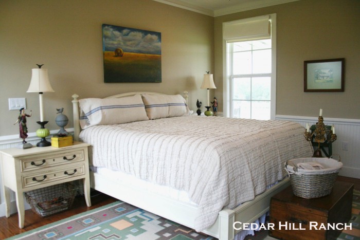
to this,
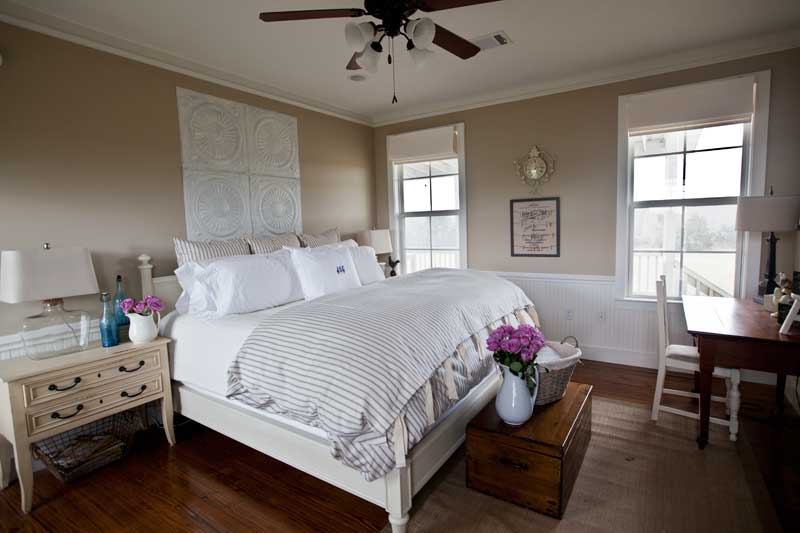
to this.
I mean really, those are some big changes with a new bed, bedding, lamps, and the ceiling tiles. I thought it looked pretty good… considering. But it still wasn’t quite right. I felt the ceiling tiles were missing a focal point.
Sooooo,
1. I added this little mirror to the center. I still think this little wood mirror, could use a little bit of gilding, and I’ll do that in my spare time, ha, ha, between 3 and 5 am when I’m not doing anything else, besides sleeping. But seriously I think it could use a bit of bling.
2. The other thing I added were these two pillows. Well, I’m counting them as one thing, since they are both pillows. The bed looks better with a bit of color. It might look better if both blue pillows were the same shade of blue, but I couldn’t find any yet. I’m still looking…
3. The last thing I added was the blue throw in the basket. Just a bit more color for the mix. I like the room to look neutral, but a touch of color really makes the room sing.
So here they are side by side? Your verdict?
The funny thing is that sometimes people say they like my ‘BEFORE’ better than my ‘AFTER’.
Mr CH recently told me he never liked the green coverlet that we used to have. Really? He never said anything. And now he has said he doesn’t like the sofa at the farm. That’s strange… I’m kinda tired of it any way… I wonder if I can fit a new sofa in the back of my SUV and haul it out to the farm… to be continued.
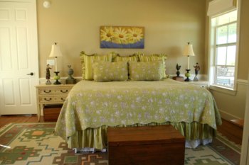
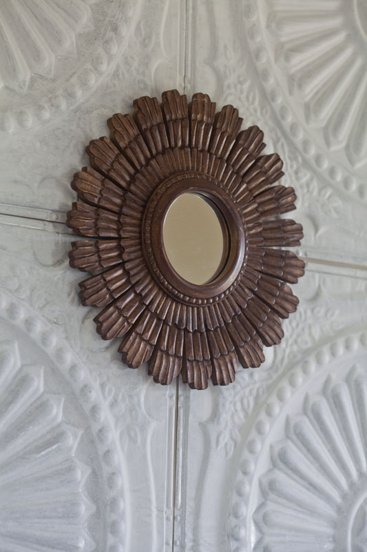
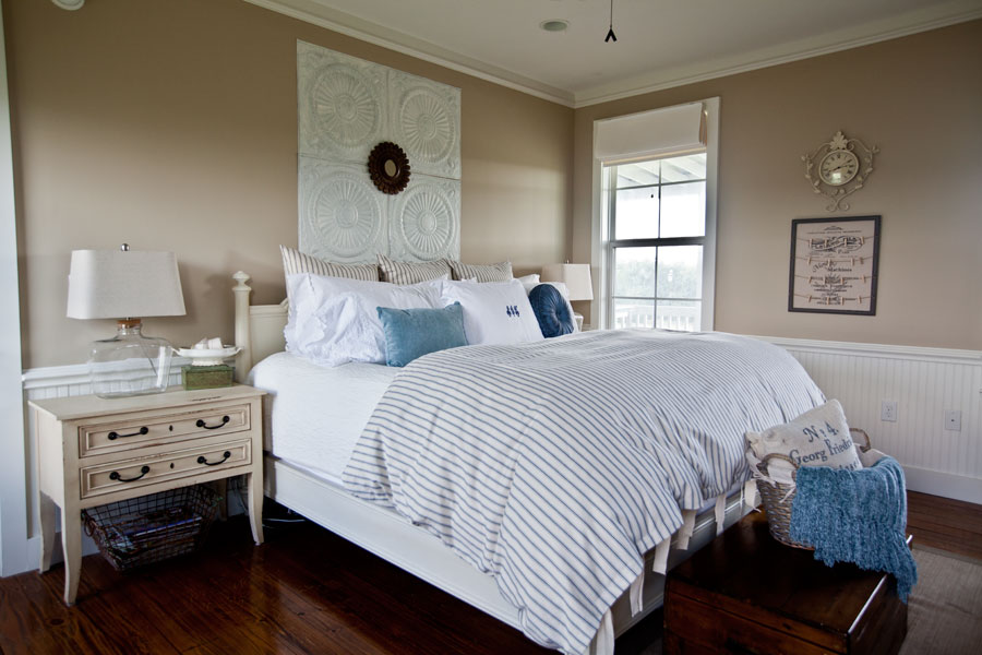
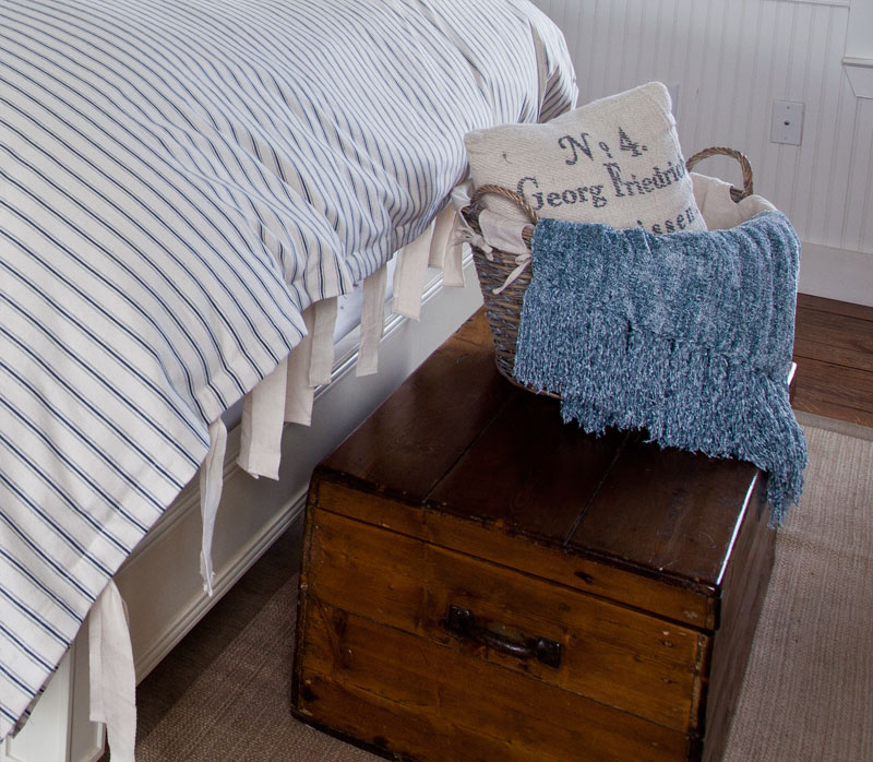


I actually like both the green coverlet and the last one with the mirror. It’s just a matter of preference-the first one looks ;country cottage at the farm’ and a bit more feminine, while the last one looks ‘country cottage at the sea’ and a bit more gender neutral. The mirror does add a focal point to the tiles and a pop of color is always nice in a sea of neutrals! BTW- I purchased the tin tiles to add a headboard, but I , too, will have to complete that project at perhaps 2-4AM while I am not doing anything else but sleeping!
It looks great Anita, love the ticking duvet cover.
Amazing how a few changes can make such a difference, and I’ve never seen the time when change wasn’t good!
Why no curtains? I think some crisp, white country curtains in the windows would add charm.
Libbie, yes agreed curtains would be great in here. Something to add to my list. 🙂
I love the after but also love the flowers in the in-between. I think flowers would make a dramatic impact.
The new look is perfect for summer. So cool. The green is great for the rest of the year. It looks warmer. The blue pillow on the left seems to match the throw very well. I like the room. I just purchased a cover in a blue, white and beige stripe for the guest room. Love your lamps. Where did you find them? What color are the walls? The room looks so relaxing. GREAT JOB!!!!!!!!!!!!!
Lamps are from TJ Maxx.
Both before and after are great, but the after is just cozy and beautiful.
-Alison-
I think they are all lovely. My taste must run more cottage-y because I like the green coverlet as well! But your three little changes made a big difference in the latest version of the room.
I love the after! May I ask where you bought your duvet? I would like to use that color combo in one of my bedrooms. Love the idea of the mirror on the tiles…….I agree it needs something. If the addition of some bling isn’t enough, perhaps using a larger mirror might help.
It is from Ballard Designs.
Love it Anita! The mirror added to the ceiling tiles is perfect! I especially like the ticking stripe duvet and the blue throw you added to the basket! The throw is such a lovely shade of blue and a soft touch!
Lynn
I love the after but the flowers and plain tile squares are the most pleasing to my eye. 🙂 It’s a gorgeous room!
Nancy
This is myy opinion only so no offense is intended. The issue with the tiles on the wall is that they are kind of lost in space. They would come together the way you might be hoping (as a focal point with impact but not overwhelming) if you framed them in a (warm brown with random gilding) simple frame (simple as in not ornate!). Framing with simple lines allows the tiles to shine or “pop” and not appear to float in a sea of wall space.
The tiny mirror is cute, but looks like a tufting button. It would look better in a gallery of photos or other mirrors. Or hung just above an end table, etc.
Also, if the tiles are four separate tiles, you might consider lining three of them horizontally above the bed rather than the four piece cube that sits above it. These are Just my decor observations. Thanks for your blog. I enjoy it. And remember….this is only my opinion and is not meant to dishearten you. Carry on!
Great ideas Kathryn!! I enjoy hearing everyone’s ideas.
hi anita. i have to admit i like the before better. i agree the tiles need something but that mirror is too small and too dark. maybe a large one, similar style in an aged tarnished brass or silver etc. i think the blue pillows in the same style and color shade would look great. i love the blue throw. love your stuff woman!!!!!
.
I love all of these ideas!!
We may be distantly related . . . even when it looks great to most everyone, I still want to tweak things! I’m agreeing with 1. having flowers; 2. blinging up the mirror and 3. drapes of some sort, but not too frilly or lacey. Maybe with a touch of blue to set off that great ticking!
Pretty room all round!
I have to say that I also think the ceiling tiles just aren’t quite right for the space. Too big with nothing to ground them. Your designs are great ! Maybe think of replacing them altogether with something else. Love your blog !
Anita,
The blue accents adds to the room’s personality. Why not put the blue bottles on the desk and maybe
blue valances? I love gold bling in a room.
Ann
Actually love them all; however, I do love the current room the best…love that ticking duvet cover…the mirror added the needed color and texture to the tin headboard…and just love the pops of blue in the room.
I think the finished room is the greatest and it looks finished! You should be quite proud of yourself.
Also, yes to your answer on a sofa. I got one in the back of a Taurus wagon- tight but it fit.
Looks nice, pat yourself on the back from me!
Amazing difference, Anita! What a great lesson on adding detail for big impact! I always learn so much from you!!!
I also mean no offense. However, I too think the ceiling tiles are too large and just floating out in space. I would think using three & spacing them out would be better. There is just too much wall space left open with nothing on it. I’m just not sure they are right for this space. I also like the idea of some curtains or the previously suggested blue valences. Sorry I don’t have more positive things to offer but I have no doubt you will get it right, you always do!
First time I’ve ever seen your blog – and so glad I did! I LOVE the ceiling tiles!!! The mirror is a great addition. I have some vintage ceiling tiles in my garage from a building that was being redone in my town. Still looking for a use for them. Don’t need a headboard, so searching for inspiration…
I love the finished room…it’s so pretty and cozy! The tiles are great with and without the mirror! And I think the different color blue pillows add more interest than matchy matchy!
Love the before, but I’m not a blue person. I think if you just toned the mirror frame down to match the side tables it would be perfect.
Love the after look….never thought about using ceiling tiles as a headboard…I know that’s not how you are using the tiles but it looks like they would work for my bedroom. I will certainly be trying that look before long…..thanks so much for sharing your beautiful bedroom.
I love the changes! You did such a wonderful job, the room look beautiful. I love blue and white together. I really love the ceiling tiles and the mirror. Sorry to gush so much……..I just LOVE……LOVE……LOVE……the room!
I love the color of lavender in the flowers before the blue pillows and throw were incorporated. I’d forget the blue and get lavender pillows and a faux fur throw in neutral tones. The lavender seems to be more soothing than the pop of blue. Just my preference! Definitely a great transformation!