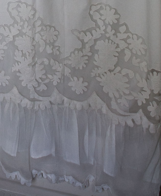
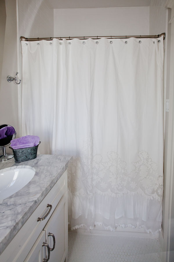
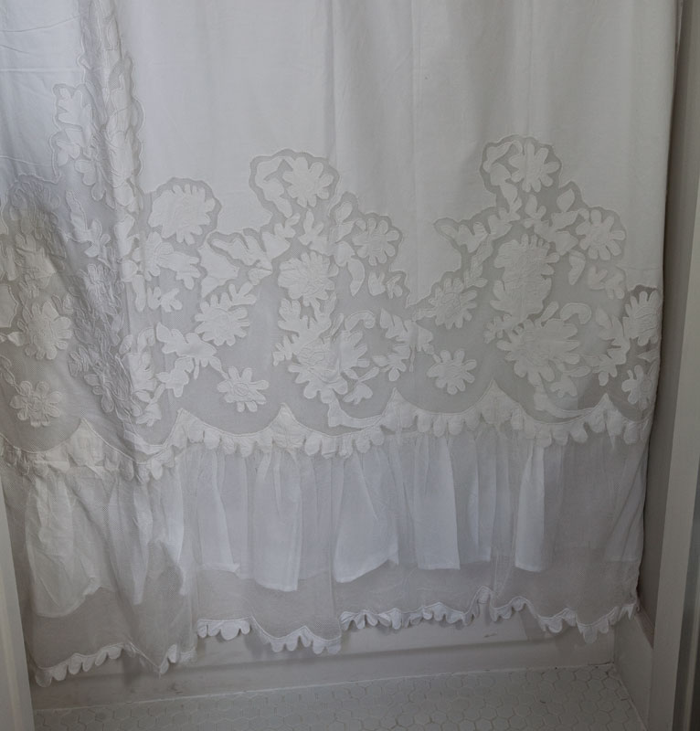
Once again, I had a very difficult time deciding which way to go here. I changed out the shower curtain a long time ago, but didn’t feel that I got pictures that really did the new curtain justice. But here we go. This is in the guest quarters. The new curtains are full of frills, and flounces. It’s not something that screams at you, just something with a quiet elegance.
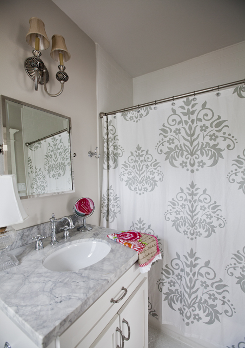
Now is the previous one below. So which one do you prefer? I like the splash of color below, even though it is gray. Okay not much color, but more colorful than the white one above.
I moved the gray patterned shower curtain to another bathroom, so I still have it. I tried to get some close ups so you could see the detail on the shower curtain.
To see more of this room, you can go HERE.
Thoughts?
BTW, Peggy I know it looks terrible here and would look much better in your house! Ha!!


I prefer the one with the gray on it. It just adds something to the very neutral space and brings out the marble.
I like the one with the gray pattern. The frilly shower curtain is very pretty,
but, for a neutral-gender bathroom, I like the gray one. The gray one also
picks up the marble tone. What would a seamless glass door look like?
Donna
i love the subtle details in the white shower curtain. I vote for that one.
I love the new white frilly curtain! It’s a lovely choice and lets the pop of lilac hand towel stand out. Just beautiful… 🙂
I like them both.
Like the white one. The grey one seems to compete with the vanity top. You’ll make the best choice,because you have such a great sense of style!
I LOVE the white lacy one and just looking at both would choose that. But when they are in your bathroom the grey just stands out! Sorry pretty lacy baby 🙁
It’s really hard to pick because they are both so pretty.I like both of them.
I prefer the white one. I only wish there was some more detail at the top of the curtain.
I love the white one it is beautiful. Too you can add any pop of color you want.
The white one does’t compete with the marble. The one with the black makes the room look too busy and encloses the room.
I like the white curtain but agree that something needs to be added to the top. Could you find some grey fabric and add a valance to the top of the shower curtain? Maybe a pale gray and white striped fabric or other subtle geometric pattern to complement the floral design?
They’d are both nice, but a clear one with a pattern would make the small room appear larger.
Haha – you beat me to it! I love love love the white. So, where did you get it? It is beautiful and goes so well with the living/bedroom area of the guest quarters.
That white one is LOVELY!!! My fave!
It’s hard to decide between them! They both look great but for me the white one wins by a nose….
I like the one with the gray also. It does compliment the marble.
Good choice!
I think that the white one is better in the guest quarters. I like the gray one too.Where did it go?
I have white marble in my bathroom, I ended up using a curtain with more color in it, sorry, my choice would be a curtain that brings in more colors to use with towels and accessories. But if I have to vote for one of the two, I love the Damask one. Whatever you choose it will be beautiful.
Both are lovely, however, my designer mother always said if any design element doesn’t instantly “sing” to you when added to the room – then it isn’t right. Maybe these are both beautiful-but not perfect?
LOVE the white one! I would have to have more then one because I would want to use it somewhere else also like drapes or? Beautiful. But then my kids say I’m boring because I always want white . . everything.
I love the white. The texture is beautiful and adds interest. I agree that the gray one is pretty, but it seems to enclose the space and make it seem smaller. The white one enlargers the room and compliments the marble. Just my opinion based on the photos…
Best,
Michelle from simplysantabarbara.blogspot.com
I love the white curtain. It’s amazing and unique. But with the gray in the marble, the curtain with gray damask pattern is more complimentary to space.
Both are lovely. I personally love damask patterns and I love grey, so my choice is obvious. The damask with the marble is stunning combined with the beautiful, neutral wall color, it is sophisticated yet casual and cozy.
If the white one had more detail up higher it would be best, but with it all at the bottom it makes the bathroom feel cluttered. Because the one with gray is evenly patterned no stress is put on the business it also speads the color evenly over the bathroom.
I’m more of a color and pattern gal, than the frills and lace, but in your bath, either looks beautiful. I just enjoy reading all the comments. I always learn something from others, that I may not have thought of.
I prefer the white–aside from it being beautiful, it softens the area without looking too fussy.
LOVE the white one the most. So much I’d love to know where to find it.
I’d choose the white one. Then on the wire rack, perhaps a small fern or some greenery… you can add color in accessories. Also maybe a clear glass container (or two) that would hold cotton balls, q-tips, little soaps, or what ever…. I like something green in every space – but that’s just me! 😉
I love the white one with just enough detail to add interest.
The gray one is nice but I feel it is a little too busy for the size of the room and being directly next to the marble.
I think the showing of the top rings is a mess up, maybe a cornice board. Sure would be prettier with both. Just a thought ad an Interior Designer
Like both of them. Need color at the top. Red/pinkish rose (to match hand towel) for shower hooks. If you can’t find that color (you can always paint your own.
I love the white one! Can you email me where you got it?
I prefer the grey one.
I prefer the white
I think the grey one makes your counter top pop. The pattern on the white one competes with the marble design.
I love the grey damask. It gives the room a relaxing element. The white reminds me of something my grandma would use for a window curtain. Too frilly. It says “hands off” to me.
My husband and I both vote for the grey patterned shower curtain the best. Shockingly, he actually gave an opinion! We like the contrast of the patterned curtain with the countertop.
From the view in the pictures I choose the one with the grey details. I like how it pulls the colors from your vanity top.
The white one gets my vote. The only thing I would do differently is use two of them instead of one. The gray one seems a little harsh to me . . .
Anita, I prefer the first shower curtain. I think it’s lovely, soft, romantic and unique. Where can I buy it for myself? The other shower curtain is, indeed, nice enough and gender neutral, but most men take no notice anyway so I would err on the side of pretty and romantic for your women guests.
I like them both! You mentioned that you like more color, so I’m wondering if you could use either one of the shower curtains and dress the area like a window. You could use a panel of fabric, floor to ceiling, pulling it to the side as you would for a window. Or a valance at the ceiling height, with a curtain in front of the shower curtain pulled to one side. You could be very creative with the tie back, flowers, a bow, jewelry, whatever you think to add.
I love the white one! Where did you buy it?
I don’t remember now. Layla Grace I think. Sorry I can’t remember.
You did get it at Layla Grace (I remember). And, it would still look awesome at my house!
The damask is nice but does not have the uniqueness that the white one does. I agree with comments:
* The damask competes w/marble–overwhelms the small space.
* DO add some pale color detail above that would coordinate with accessories you add.
* The damask is pretty, but I see so much that’s similar that is feels “ho-hum” to me (my opinion).
* Lastly, the white one seems to go with everything else in your home–same unique French flavor!
But, no matter what you choose, it will look beautiful, I’m sure of it!
Well said!
I found the lovely white shower curtain one at Layla Grace. It’s called “Pom Pom at Home Caprice Shower Curtain.” Go to: http://www.laylagrayce.com/Products/Pom-Pom-at-Home-Caprice-Shower-Curtain__PPHB3003W01.asps. It IS an investment!
Anita, what about some 1″ French antique-style satin ribbon in a pale lilac just tied casually through each shower curtain hole?
I love the white one. It is more unique and elegant.
They are both pretty shower curtains, but the gray one is a my favorite.
I like the gray one. It adds to the space.
Love the grey pattern!!
I like the white one.
It’s a close call. From the comments above, I wonder if you could do a podcast or post about how to decide whether a decorating element competes with or compliments something else in the room! ?
The lacey white one doesn’t look like too much with the gray marble and looks more like “you”.
I love the white one, it adds a hint of quiet elegance.
I love the white curtain, but with a tiny addition. Perhaps adding a splash of soft color in the form of narrow ribbon would give you the look you’re after.(?) Tie the ribbons from the curtain rings in each grommet.
The gray pattern is too big for me. If it was smaller and tighter I think it would be ok.
I like the white one. Subtle and lets the marble be the star.
I love the white one but I think I have to vote for gray one. 🙂 It adds a little more color and looks great with the marble. I think I would hold on to the lovely white one for another time.
BTW, I watched Texas Flip and Move 🙂 Great Look!
Donna
The white curtain is exquisite, but the detailing gets lost in the color of the walls. I much prefer the gray curtain which ties the color scheme together.
Definitely the white one! No contest. The gray is pretty but the space is too small, it’s like it is in your face when you walk in. Love love love the white!!
Hmmm…. the gray patterned one is too busy. The white one is too plain and dull at the top and the pattern at the bottom is partially hidden by the vanity – so it doesn’t work for me either!☹️
I really want to love the white one in the space as I love the detail on the bottom. However, my initial reaction to the gray pattern was WOW–look at that countertop!
LOVE LOVE the frilly white one!!
Where can I purchase one? Thanks.
Jennie, I think I got it at Layla Grace.
My favorite is the white one. I love the lace at the bottom. I guess I’m a bit prejudice, though, as the shower curtain in our master is a two tone white and really looks fabulous with the white marble counter.
The gray one is pretty, but seems a bit busy.
I prefer the one with the gray because the white all blends into the walls from eye level up as I look into the room. The one with the gray pattern brings interest to the room over all to me. I certainly can think of some other places other than as a shower curtain that I’d use the white one though. Both lovely choices.
I prefer the gray one. It’s more compatible with the gray countertop. Only, I’d change out the shades on the wall light to white or gray. I love white, but doesn’t seem to ‘look’ right in this space…too frilly.
The white one.
I love the white one! The gray one is too loud and busy for the small area.
I like the one without the grey details it looks much better with the colors of the counter top
I like the white one it seem to go well with your country french home
I prefer the grey one, as it adds more life to the room. Perhaps the white one would look better in a room with non-white walls.
Love the gray
Both would look great but in order to decide, the white is definitely feminine and the grey would serve both sexes. Just depends on what you want to project
I think the shower curtain with the ruffles is very pretty. That’s my favorite.
Anita, the white one gives serenity to the room. However, I would add a second one to give fullness and avoid that “stretched out” look.