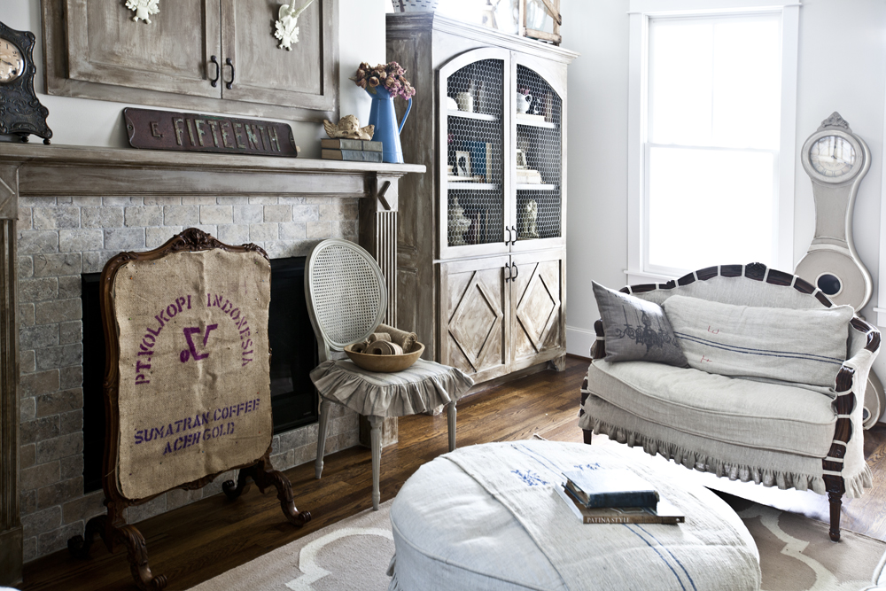
Sometimes decorating is not about what you buy, but where it goes. Today I’m talking about arranging furniture.
Take the clock for instance. I bought it for this spot in the living room, but with the two windows, I was barely noticed, especially in this big room with lots of other things going on.
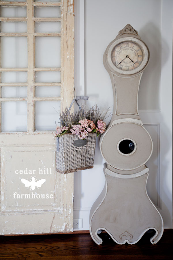
I decided that maybe I needed to put it somewhere else. I tried the foyer.
Not bad. But I thought I would try the dining room as well.
BINGO!
I love it in here. I think it really shows up and is very noticeable in this smaller room.
The scale is right, and it doesn’t take up as much space as the cupboard that was in here before. It’s going to stay in here, at least for awhile.
So how do you know where to put things?
Tip 1. Try several places.
Well I think you need to move things are around and see where you like the piece the best. It might look better somewhere you never intended it to go.
Tip 2. Think scale.
This size does well in the dining room because it is scaled better for a smaller room. It got lost in the living room with so much else going on. Here in the dining room it is much more noticeable and sized correctly for the room.
Tip 3. Consider color.
Does the color of the item work in the room? I really think the lighter color of the clock works better in the dining room, than the old dark cupboard.
Tip 4: Photograph it.
As you move the furniture into different places, take a photo, then look at the different photos. Usually one emerges as the winner.
Tip 5: Buy sliders.
I’m not talking about little hamburgers, but yum that sounds pretty good right now. Sliders are felt rounds that go under chair legs and allow you to move furniture around so that the floor isn’t scratched and it can easily be moved by one person. You’ll need a set of these. They have one type for moving furniture on carpet and a different type for moving things on a wood floor. Make sure you get the right type. I know this isn’t going to shock you, but I have several sets of sliders.
Now go have fun arranging your furniture.
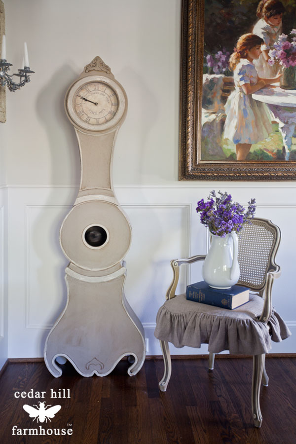
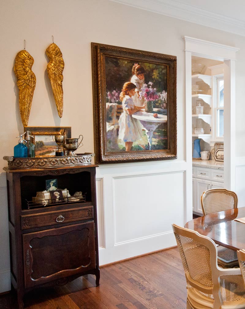
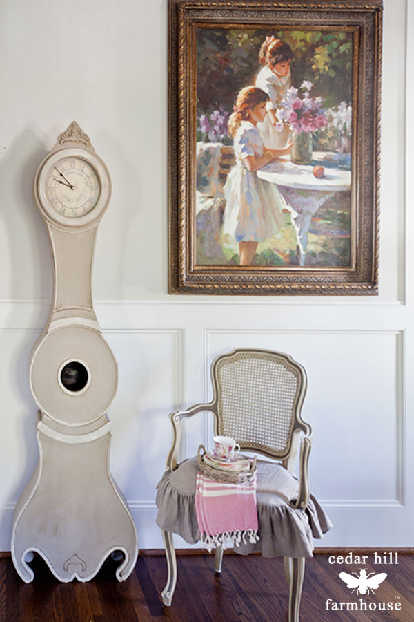
Anita you clock looks wonderful in her new home. And she coordinates perfectly with the color and size of the chair next to her. I also LOVE that painting in your dining room. Thank you so much for the tips and have a great day!!!
XO Barbara
Love the clock in its new space…you have a great talent for placing things in just the right places that showcases the items in all its glory!
I love all your pieces but my eye always goes to the picture, I think it dwarfs your lovely chair and clock. I do like the clock in the hallway
Great post, Anita. What a good idea to compare photos for placement. We discovered sliders after our third move. Wow! Now I use them to move the furniture around even by myself.
They say that the bottom of milk cartons work well as sliders if you can’t afford several sets of sliders!!!
A photo tells all, even when you can see the area “in person.” I move furniture (thanks to sliders, of course) all the time. After the holidays things will be “rotating” in my home in and out of rooms just for a change. You have some marvelous ideas and a great blog! Thanks for sharing!
{{HUG}}
Joy
Clove the clock. I need the name and where to,purchase it also,the price. Thank you
You can find it here. This is an affiliate link http://bit.ly/jossandmaincedarhill
Great article! Thanks for sharing! I love the clock and it looks great in its new placement but I agree with Ellie, I loved in in the entryway!! What a lively vignet it made next to the door but of course it’s hard to tell without seeing the entire space. I really enjoy your blog! I’m glad I subscribed!!
Thanks Donna, and it’s since been moved to the farm, so I agree that it wasn’t quit right next to the chair.
The clock is charming and unique but placing it by the painting is too much competition for the eye. That painting is really beautiful and it’s color totally draws your eye to it. In terms of scale, the painting, the clock, and chair work but in my opinion there is something about the “weight” of the pieces together that feel off balance. The painting and it’s ornate frame just feel much heavier than the light airy feel of the clock and chair. I think the clock deserves to be its own focal point. And the clock does look lovely with the chair. It’s hard to tell from just pictures but if I was playing the move the furniture game because I wanted to do a room refresh (something I love to do) I’d like to try hanging the painting over the chest just a bit higher on the wall than you have it now – perhaps where the top of the painting frame is level with the top of the molding around the door. The angel wings, smaller painting and other accessories on top of the chest might have to go but I do like that ornate tray – it plays nicely with the painting frame. Well have fun!
I think you are correct Linda. I’ve since moved the painting to a better spot. That didn’t work very well. Great catch.
Anita, I have a question about the chair cover. Do you have the chair cover for sale? It appears wider and has opening for the arms. The clock does fit in this location and with the painting. I love the basket with the pink flowers. Thank you Jean
We do a ruffled one without openings for the arms. Are you interested in one for an armchair or side chair?
I am interested in two covers for arm chairs. I would like them in natural linen. Thank you Jean