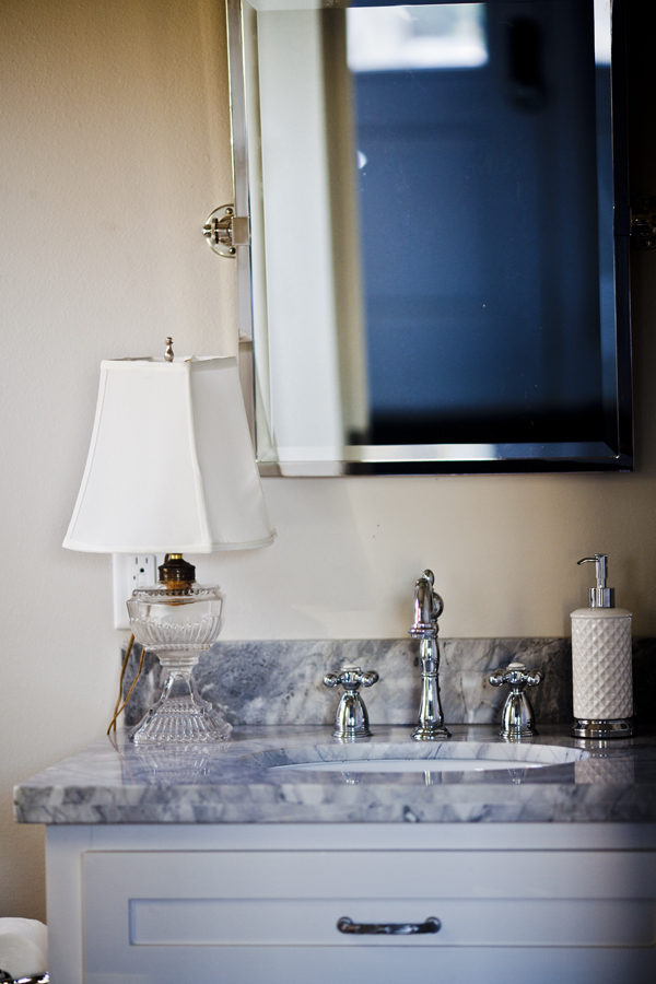
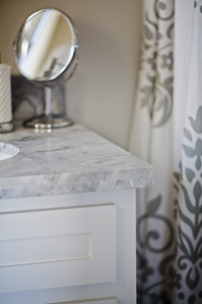
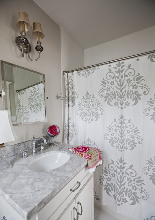
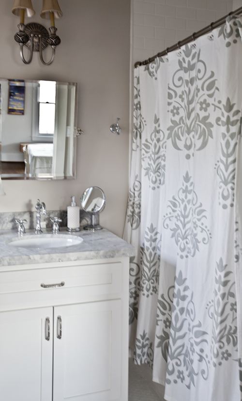
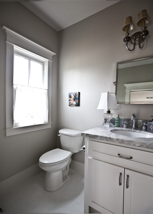
Our new guest quarters are small as you might imagine, which means the bath is also small. I went simple and elegant in here, while trying to keep the budget tight. The floor is a hex ceramic tile, and we used a subway tile on the wall in the bath. We went with Moen fixtures in the shower because of their reliability. Echoing the material used in the kitchenette, we used quaritzite in the bath for the countertop. As with the kitchenette, the cabinets were site built.
The mirror is from Pottery Barn (not a sponsored post) and I think it is really beautiful.
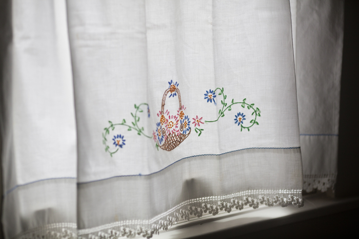
As I mentioned in the post here, the window curtain was made from a vintage pillow case. You can see that post here.
The shower curtain was something I found at Target (not a sponsored post). I usually make my own stuff, but I found this shower curtain to be quite charming and I was short on time.
The room is quite tiny, but functional for one person.
In the main house, I went with a very old world look, but decided to go with more of a contemporary look here. Why not mix it up a bit, right?
I love different looks, although I do feel it works best if you stick with a particular look and style for consistency of your home. Here since it is in a different building, I thought it would be fun to deviate a bit from the look of the main house. Still the flooring, trim work, and much of the tile is the same as what is in the main house.
I hope you come back to see the rest of the guest quarters. You can see the kitchen here and the craft corner here.
I also wanted to announce the winner of the Decor Steals gift certificate,
Heather Guerard!! If you are Heather, please get back to me, right away. Your inbox is full, so my email bounced. I need to hear back from you in 48 hours, or I will need to select a new winner. If you know Heather, please help her out, and give her a call!! Heather you can email me at anita(at)cedarhillfarmhouse(dot)com. Of course replace the (at) with @ and the (dot) with .

Very elegant and will make the guests feel as part of the main house! Love the pattern on the shower curtain!
Love the bathroom. What color did you paint the wall a taupe or grey? Thanks.
Sher Williams agreeable gray
So elegant! You will have some very lucky guests!
Pretty bathroom, Anita. Love the flooring you chose.
I really like this bathroom it is clean and pretty. I think bathrooms should be light and cheerful and sometimes that makes it hard to decide what to do.
I love your bathroom . Simple and elegant at the same time.
I love the paint color may I ask what is the color.
It is Sherwin Williams Agreeable Gray.
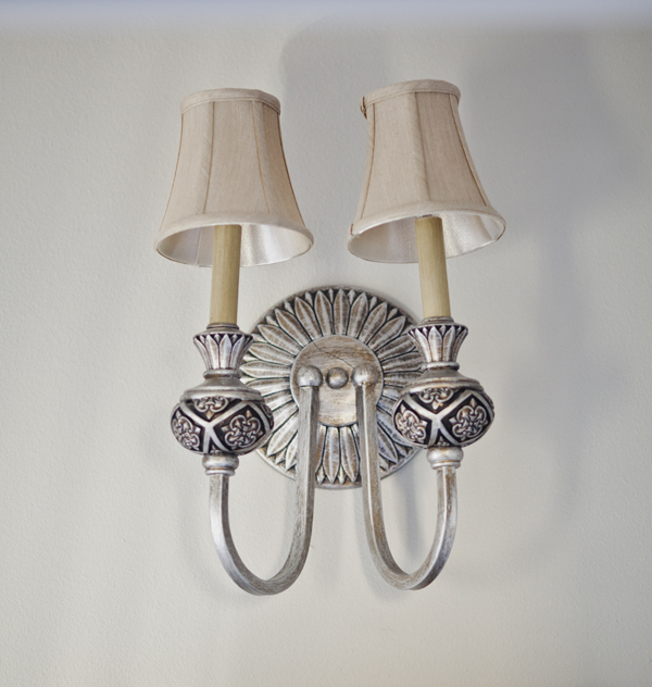
Anita, I love what you’ve done with the bathroom. Very cheery and elegant. My favorites are the sink area. I love the counter top and the faucet. Of course I love the shower curtain too! It all works together to create a cohesive look. Where did you get the lamp?
The lamp is inherited.
Anita, this is lovely! Your guest will feel so pampered! I love the curtain- how clever!
Your small bathroom is packed with style. I love it. Adore the floor title.
Very pretty and elegant. The shower curtain is stunning.
It’s all in the detail, isn’t it? Especially in small spaces! Perfectly done (as always)… Thanks for sharing. Have a wonderful Wednesday.
Perfect in its details, Anita. Congratulations to Heather.
Hi Anita. Another great job. Really pretty. If I were to build another home it would have to have a window in every bathroom. I have four bathrooms and only the Master has one large window over the tub and a window in the shower and toilet area. I think we need more WOMAN architects! Anyone agree?
Anita I love that light and shower curtain. What a great guest bath you made and PB vanity is very pretty too!!
Cynthia
Ok, don’t take this personally. Just my opinion. I don’t care for the light fixture on the wall. Seems too dark. Also don’t like the lamp on the sink. I think it’s too big. And finally, I think the picture above the commode is too small for that space. 🙂
As you stated, simple and so very elegant!….Love the shower curtain!…congrats to Heather!
Adorable! By chance, have you done a blog post on the trim used around your window? Thanks.
I don’t Trish. My carpenter did the work, so I am not sure how he put all of that together.
Ok I got it now!!! I keep seeing the name ‘Anita’ on here….I had posted to what I didnt remember what your first name was! Thought it was Erica!!! LOL….got it now! Anyways….this is so gorgeous…I wrote down the color of the walls and I REALLLLY want to do the bedroom with it! The bathroom I am redoing is going to be a peach, the kitchen, an olivey green and the living room…well…havent gotten that far! I live in my husbands house whichi is an old 1842 one room school house converted into a house. TINY!!!! OIYE!!! I need to see some photos of the same ‘about’ colors I am wanting to paint [the ONLY 4 rooms to this house!!] to see how it will all look together!!! It might suck! But ..hey…it is only paint….right?! Thanks for your inspirations “Anita” !!! Have a great day!!
Love the room….beautiful.
Wow – love it! Love the shower curtain – Target is the bomb! Clean and classy – good job!