Bathroom Remodel
I am in the fun part of a bathroom remodel at the mountain house, meaning we are in the planning phase. I have a contractor and we’re talking about what we want to change, in a word – EVERYTHING.
The post is sponsored by Thomas Avenue Ceramics. All opinions are my own.
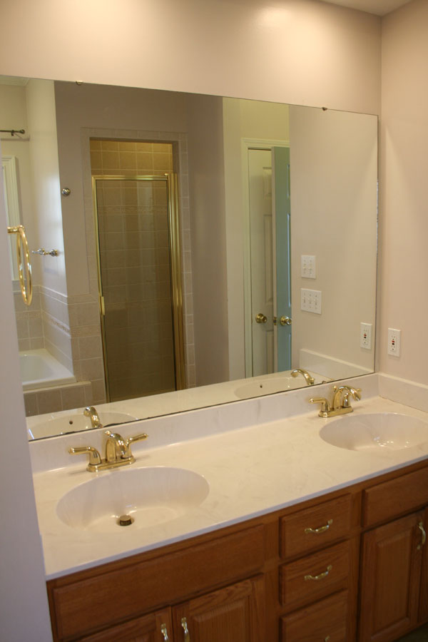
So it’s a small room and here is what it looked like when we bought the house. This is the sink area and in the mirror you can see the shower area. To the right of the shower door you might notice a white door. It’s a small linen closet in front of the shower. If it looks crowded, that’s because it is.
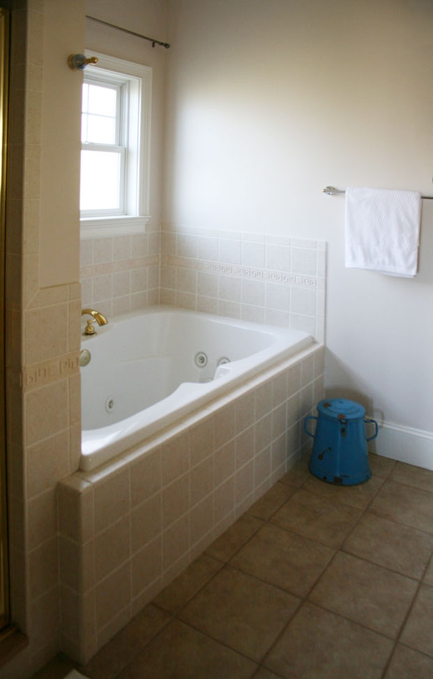
Here’s the tub.
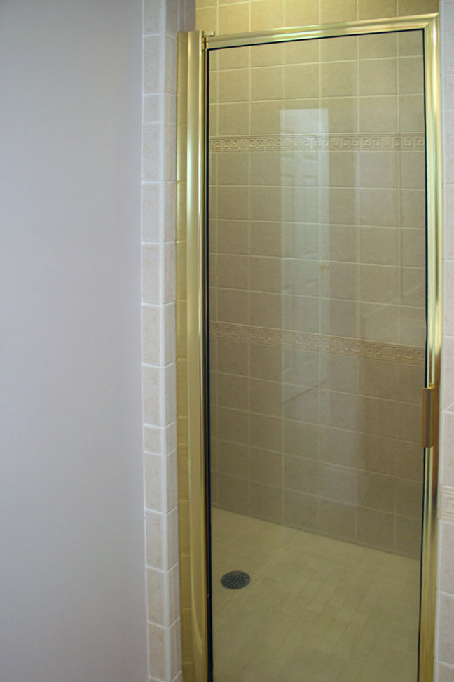
Here’s the shower door.
I want this bathroom to look more like my bathroom in Texas. We’re planning to make some changes that will give it an updated look. Those changes include:
- marble look tile flooring
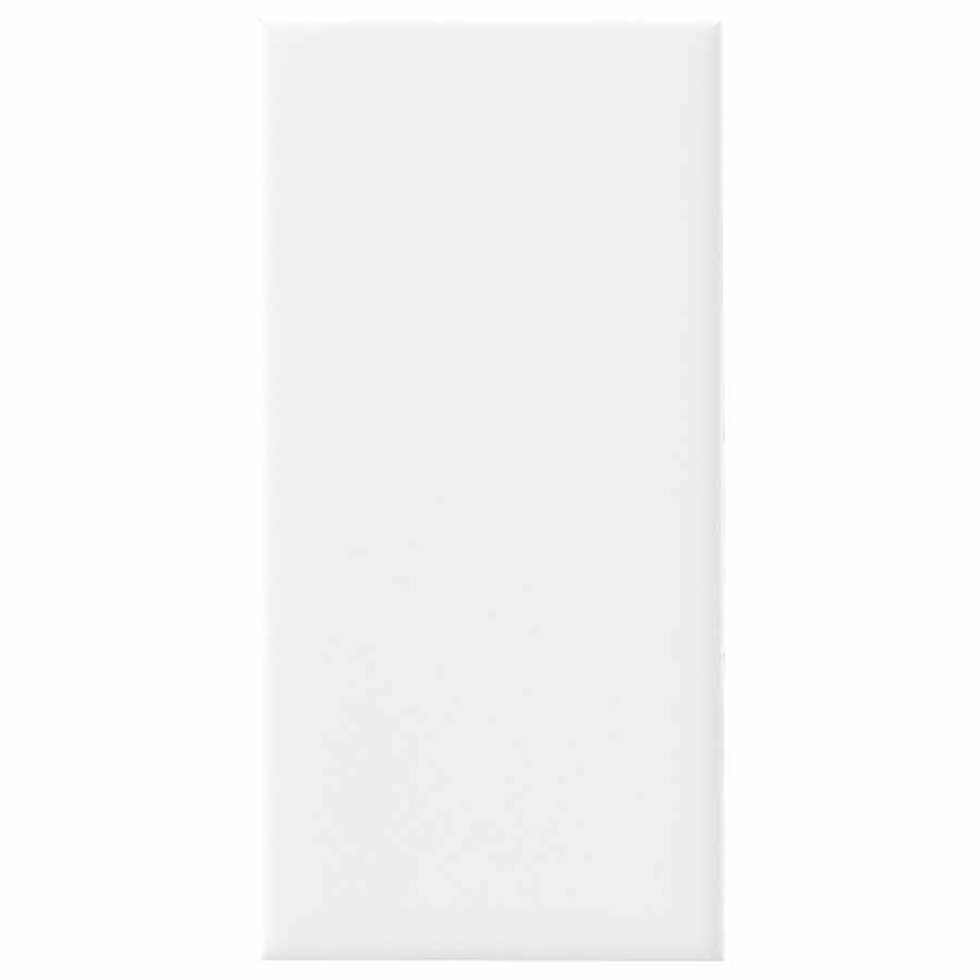
- white subway tile on the walls
- marble look tile in the shower
- frameless glass shower doors
- white pedestal tub
- new, taller vanity
- new vanity mirror
- new vanity counter top (maybe a marble-like quartz)
- new faucets
- new lighting
- new sinks
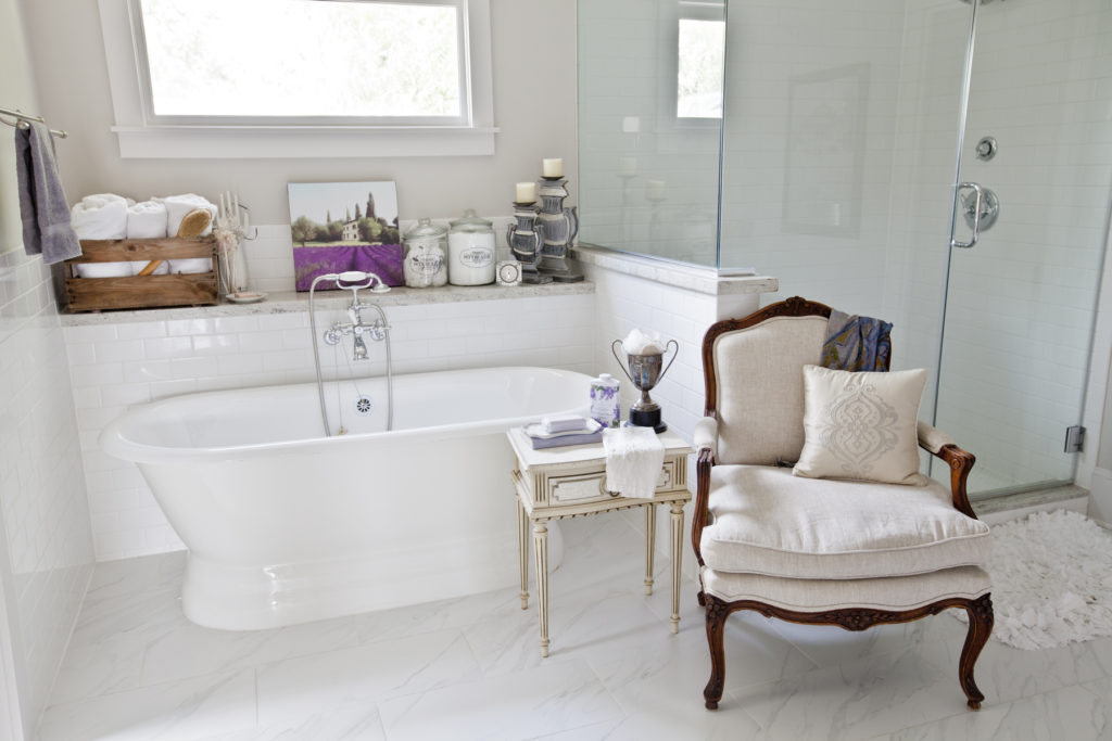
The good news is that the new bathroom is not very big. You appreciate that when the remodeling costs increase by the square footage.
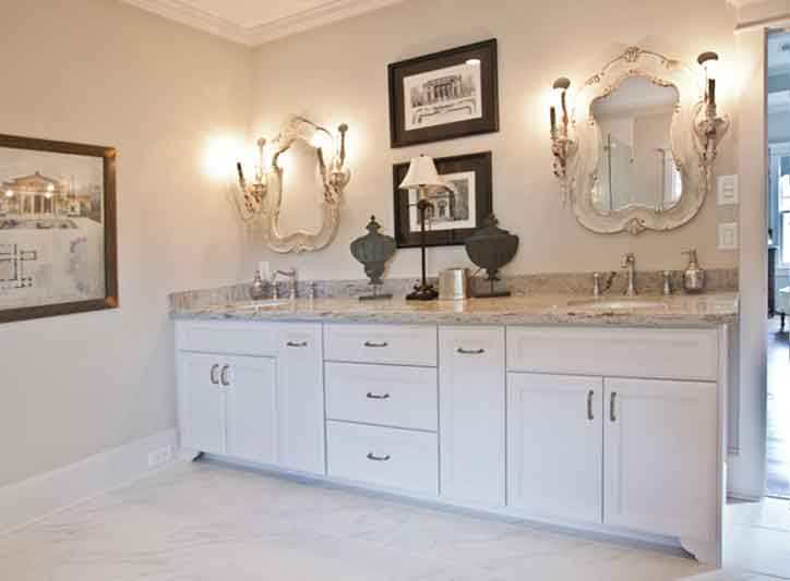
The tile I selected for the walls is a simple white subway tile. CLICK HERE.
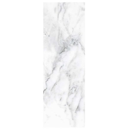
The tile I selected this 4×12 Carrera for the shower is a marble look ceramic tile, CLICK HERE.
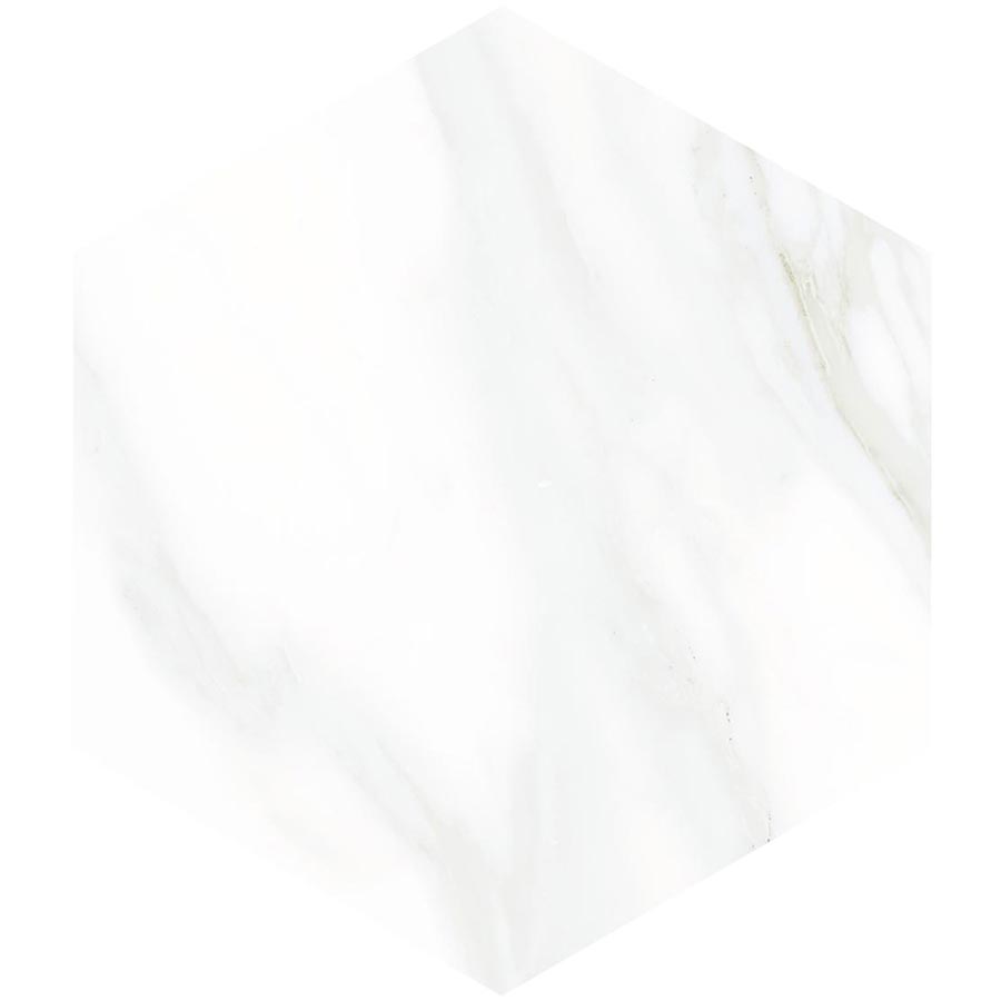
For the flooring, I’m thinking of something like this carrera hex tile CLICK HERE.
I already had the vanity painted because I didn’t know how long it would take for us to get to the remodel of the bathroom. You can see it already looks better. Remember the small linen closet I mentioned? We’ll have that removed. It will open up the space more and allow more light into the shower.
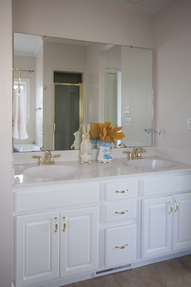
It’s a big job, so we want to make sure it get it right. I still need to select the vanity, the mirrors, and sinks. I’ll go with the same pedestal tub we have in the bathroom shown above.
I’ll keep you posted as the project progresses.
If you plan to entertain this holiday season, you won’t want to miss our holiday entertaining guide!
PODCAST EPISODE 122 HOLIDAY ENTERTAINING GUIDE
A bit too safe and basically boring as far as all the finishes. You don’t need to pay a designer to pick out such finishes.
You are a superstar designer and can be more creative than that ..Subway tile … really ?
I know it’s a classic but this “ classic “ has been over used since the 1980’s and beyond.
Truthfully, I was expecting more from you.
I know you will jazz it up with cutie -quirky accessories and it will look nice. I guess I was just expecting more from you. As a long time follower, you have taught me a few things and my taste has evolved thanks to you and your podcast / blog / and other designer outlets showcases. Now here is what I would do:
I suggest asking the tile rep for help laying the tiles in an interesting pattern or mixing 2-3 similar tiles together in a pattern to take it from “ the same old tried and true “ to the next level of something that shows a designer touch.
I just re-read what I wrote, I must have gotten up on the wrong side of the bed, but it’s how I feel and I’m sticking to it, sorry it’s not exacrly what you we’re expecting to read. At the end of the day, it’s your house and if that’s your most inspirational desire , then go for it.
I agree, come on, if you’re going to go to the trouble to do this not to mention the time and expense, then go for it!
But it’s not her full time home. I believe she also rents it as well as it being a vacation home? Going a little more neutral will appeal to more people! I think it will be beautiful!
I believe she mentioned early on that this home was their retirement home…so she will be living in it full time at some point…at least that is their plan. BUT plans do change, as we all well know. Now being a mountain house, I was expecting a different approach too, but I voiced my opinion on the exterior paint too to no avail. lol As the saying goes, we all have opinions, like we do belly buttons. Sweetie, what ever makes you happy, go for it.
Oh Beverly you are so sweet! I do appreciate all of your ideas! What were you thinking for this bathroom? Now I’m super curious.
I appreciate your honesty, I know we are supposed to be “nice” in our comments but when the writer puts it all out there I think we are allowed to give opinions. I get so tired of reading comments that praise the decor of the posters when it is obviously bad. I would post the link to one bad site but I am not that mean. I think most people just want to please the writer without any real input. And in agreement with what the Mountain house bath choices…. I just built a new cabin and used white subway tile, too. It is classic, I see what my friend did for tile in her kitchen 7 years ago and it looks so tired and old. Subway tile never looks that way (in my eyes, another opinion).
Anita, I think your choices are perfect. In fact our new master bath has the Carrera type tile on the floor of the bathroom, the shower floor and the niche in the shower. My shower walls are subway tile. I look forward to seeing it when it is done.
Wow! MMB, you perhaps could of worded your post a little softer. Choosing the neutral (some say boring) is a thoughtful choice. You can do anything with those colors and change accessories and wall color around as you get tired of a certain look. Anita, I think you’re amazing!
Awesome and beautiful ideas can not wait to see if all finished … your choices are amazing
Classically beautiful! I look forward to seeing it finished, have a feeling this will be one of my favorite makeovers!
I like the neutrals…it is the details and accessories that I look at once everything is finished.
I agree with doing the boring and let your accessories speak!!
Well, this is pretty much perfect timing for me. I am sitting here with an “order approval” on my desk. Demolition is supposed to start next week on my bathroom. They are just waiting on my to sign off for the process to start. The trouble is…yesterday I started “pinteresting” again after thinking I knew exactly what I wanted. I’m not sure if you ever respond to these comments, but if you do, could you give me any “designer-in-the-know”comments on the backsplash around the vanity area? I am getting granite tops on my vanities. I have 2 vanities they are 8 foot long. The proposal is a 4” matching granite backsplash. After looking through pictures, it seems that many have a coordinating tile backsplash rather than the matching granite or marble backsplash. I see in your pictures that you have the matching marble or quartz backsplash. Any thoughts? I really need to give my approval soon for this process to start. I know I won’t get to re do anytime soon, and I need to get it right. I am leaning toward the tile, but that would be another contractor, so I know that the process would be complete faster if I would just get the matching backsplash. But, I want to be happy! 🙂 Any helpful thoughts from you or your readers?? By the Way….I LOVE LOVE your present bathroom and also the pictures of how the new bathroom will be. I would say “timeless” not boring at all.
Hi, Denise,
Just offering my insight on your decision.
If you want a faster finish and can go with the same material backsplash, I suggest NOT choosing the 4″ strip – for the simple reason that “higher end” bathrooms and kitchens do not usually show this option any longer. Instead, perhaps a higher backsplash with a curved or shaped top would look very “designer” and still be installed at the same time. In the end, your remodel will look much more expensive as this is an area that everyone looks at.
Just what I might do..hope the idea is a help to you, good luck on the project.
Thank you Karen! I think that is what I started noticing ~ that the 4″ backsplash isn’t being done as much anymore. I actually just marked that off of my bid…not sure what I am going to do at this moment, but it won’t be the 4″ backsplash. Thank you so much for your help!
Denise, if your vanity is small, a taller, shaped backsplash is a great idea. I did that in our small guest bathroom. As for the 4″ granite backsplash, I’ve used that in my bathroom and see it still in million dollar homes. My countertop is very long in my bathroom, and I think that backsplash works well in there. I’ve never used a 4″ granite backsplash for a kitchen though.
Thank you so much Anita! I have spent the last 30 minutes going back through all your home, looking at both your bathroom and kitchen backsplashes. It’s amazing how you never look at something like that, until you are about to do a project, then you look at every little detail. I am now undecided again. 🙂 Thank you very much for your reply. Your home is gorgeous and I know the mountain bath remodel will be also.
Love all of your choices for your mountain bathroom. Jean
“Classsy and Classic NEVER go out of style. It will be far from boring and absolutely gorgeous! Carry on……. love it. ?
Okay…….all I can say is that this lady knows what she is doing!!!!!!! I have no doubt in my mind that it will be fabulous!!!!! Can’t wait to see the finished project!!!!! Anita you are the best!!!!! Blessings!!!! ? Roxann
I think it all sounds great! I love your Houston bathroom, so I know this will look equally beautiful. I love the white and gray of the marble tiles, and the overall timeless look you’ve chosen with neutrals. Frameless doors make such a huge difference too! Can’t wait to see the progress. ?.
You’re on the right track w your choices! Proceed and enjoy, life’s too short to stress about it or so I’m learning❤️
I like it. Yes, it’s very safe and very neutral. But my understanding is that when you retire you are wanting to live here full time. Such classic choices should still be good when that day comes. Wall colors may change for an update but tile can stay. Looking forward to seeing the finish.
I agree Ann! Thanks.
Beautiful choices, Anita.
As frequent HomeAway & VRBO renters who love the great outdoors, my husband and I have long thought it takes a special family to share their home with others that may not be as mindful. It’s an affordable way to realize a dream, and teach a willing heart life-lessons along the way. May you always recognize beauty from the inside out.
Blessings to you and your family.
Thanks Lori. Damage does happen for sure.
I was just reading that gold is one the way back in for faucets and hardware. Interesting.
Classic choices are classic because they never go out of style and are never trendy. They make it easier to accessorize a bath or kitchen and that is what keeps classic from being boring. Plus, the tiles that you have chosen are soothing in a bathroom setting. Painting the vanity alone has perked up the space. The end result will be fabulous!
Can never go wrong with simple and classic – be unique and creative with the accessories that can be switched up – very refreshing to see a designer who has proven themselves to have exquisite taste and a good eye for decor still take into consideration a budget and functionality. This bathroom will be beautiful I have no doubt.
I definitely have a budget Tracey!
It will be gorgeous…I love white subway tile…I DON’T like liver and onions but I am sure some other people do…what I am saying is that we don’t all like the same things…and I hope you don’t stress over it…go with your plans and don’t give it another thought.
Anita, i don’t think MMB was being ugly, just trying to nudge you out of you comfort zone…and that she did! Lol. As for my ideas, I’m happier with bringing the outdoors in, with colors & textures. I love the tub, long sink and seamless shower to start with. Just my observation, but why does it seem that you’re try in to replicate your Houston home…exterior same color, now basically same tile & marble? I’ve never intentionally been blessed with two homes…but my Fl lake home (was on the RE market) was decorated so differently from my present mountain home. I let my surroundings speak to me. That’s just the way I roll. Maybe I can go stay in your mountain house for a bit, and let it speak to me! Lol Love you Anita and your blig.
The bathroom we remodeled in our mid-eighties house looks remarkably like yours, both before and after! We also painted the existing vanity white for the same reason you did, used marble tile and replaced the tub with one quite similar to yours.
Oh sounds wonderful Valerie!
Your bathroom is elegant but simple with a touch of class thank you for sharing
Your designs are exquisite!
I love the classic approach to both bathrooms and kitchens.
Accessories give impact and know your choices will be beautiful. Well done and looking forward to seeing your vision come to life!
Some who are giving you crap for decorating in a classic, timeless (they say boring) style are the same people who, in a few years after over-decorating their own home, will be grumbling because it’s no longer in style. To try to diminish your status as a designer by telling you you should be more creative, and referring to your accessorizing as “cutie-quirky, is demeaning and since she said she re-read it, should have chosen to delete it. Just because you put your ideas out there on a blog is not an invitation to rudeness and design website trolling.
Anita, I love your choice of the subway tile! We bought our 1981 house 3 years ago. My bathroom has 4 inch square ivory tiles. They go 4 feet up the walls everywhere in my long bathroom. The vanity was just like yours but with 1 sink and that big contractor grade mirror over the vanity. I painted the walls BM chantilly lace and also painted the brown vanity the same color. I switched out the fake brass fixtures for matte nickel ones. And the did nickel knobs on the vanity. That’s all I had to do. I have my vintage embroidered linen towels in there on an old grey chippy chair. Some art work on the walls and my bathroom looks very simple and french. I love your new bathroom and I love mine. White tile is timeless! Well done!!
Thank you Jaine. Your bathroom sounds wonderful!