Years ago, I heard experts say that before you walked out of the door, you should go back and take one piece of jewelry off. The point was that people wear too much jewelry and that less is more. This was a way to ‘dial us back’. Before I get a bunch of emails, let me say for the record, this is not my opinion, but what I have heard from the experts all of my life. Personally I don’t care how much jewelry you wear. I almost never wear jewelry because honestly I forget to put it on. Oh my, did I say that out loud?
The point is, that sometimes we don’t know when to stop. We overdo. And I think sometimes we do that with our interior decorating. I definitely am guilty here. If one thing is good, then isn’t 5 of that same thing better? And wouldn’t 20 of that thing be perfection? Well, maybe, but maybe not.
The reason you may want to edit your bookcase is that if they become overcrowded, they can appear messy, cluttered and scattered. When they become overstuffed, they can become a distraction. I think we are bothered by clutter, even if we aren’t aware of it. Editing a bookcase can make it appear more clean, and more organized.
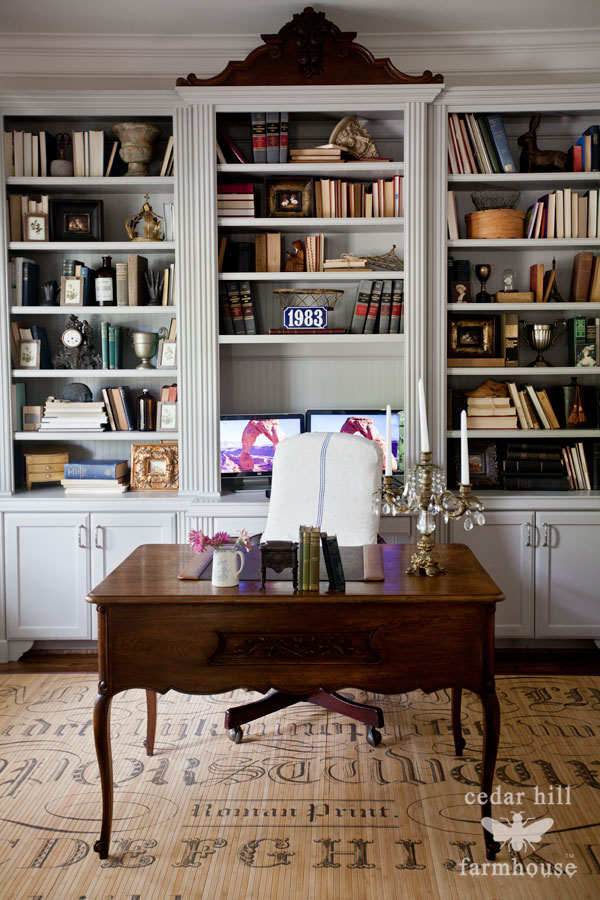
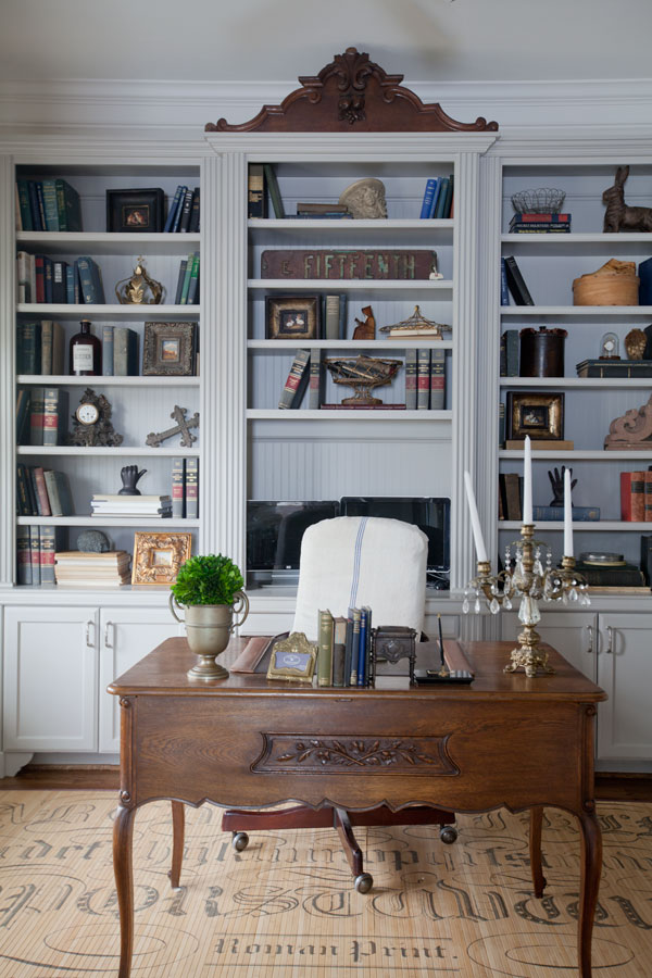
Let’s talk about these bookcases in my office. I have a lot of books. The books I read are actually stored elsewhere in some other shelves, and these shelves hold a collection of vintage books we inherited from my theologian father-in-law. He was a poor student when he bought many of these books as a seminary student, so many were second hand when he bought them in the 1950’s. Most of these books are from the early 20th century.
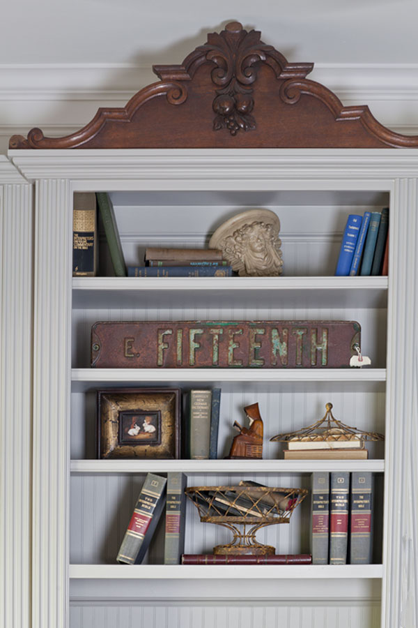
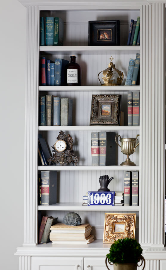
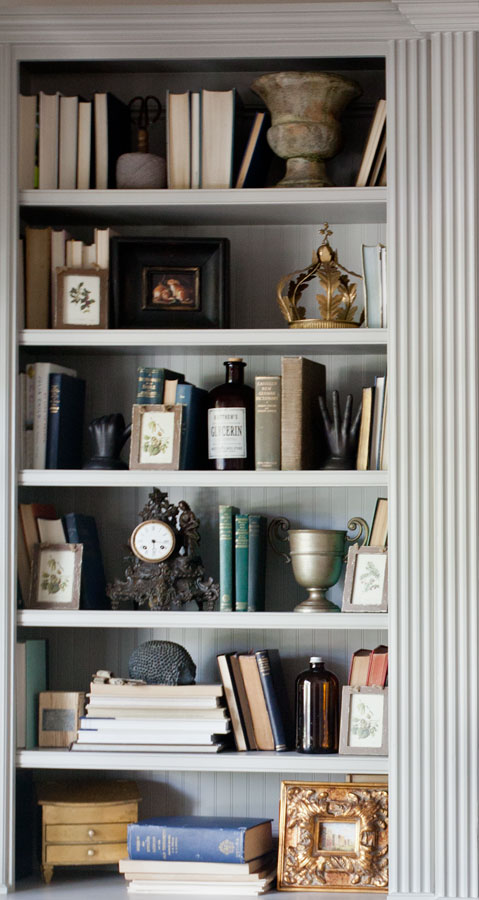
I was able to put almost all of his vintage books in here, can you tell? I decided after some reflection that I would like these bookcases better with fewer things on the shelves. Let’s just take a look see, and you can decide for yourself which you prefer. I know some of you will prefer the shelves with more books on them. (That’s okay!)
You can see the difference is subtle . It feels less cluttered. I like less clutter, although there is something I love about stacks and stacks of books laying about. Okay let’s keep going here’s another section of the bookcase with less on the left and more o the right.
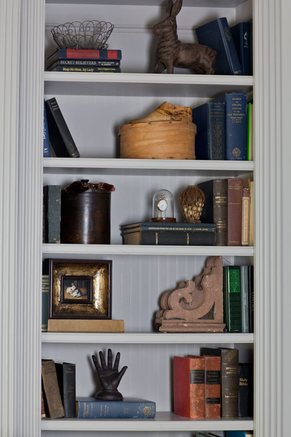
And now let’s look at the last section of the bookcase
Well there isn’t a dramatic difference. But you can see more of the back of the bookcase. So really these are two different looks. I wouldn’t say one is right and one is wrong, but one is a cluttered look and one is an edited look. Honestly I like both looks. Why am I showing you this? Because the editing is something they do for magazines. Look in a magazine and you probably see shelves and bookcases edited rather than overflowing. You can choose the look you prefer, but I think it’s worth the time to play around try both looks in your home.
Here are the entire bookcases side by side. The downside to edited bookcases, is that you have to find room for all of the books you have removed. I probably took out half of the books. The good news is that books work in just about any room. (The color of the bookcase looks a bit different because the one on the right was taken with the lights on, which gives it a yellow tint.)
At the end of the day, it’s your house and choose the look you prefer. The good news is that editing a bookcase is usually free!
This is part of my Budgeting Decorating Series. Be sure to check out the other budget decorating posts from today’s event.

Each has its own appeal. I would have a very difficult time trying to say which one I like best.
Both are beautiful.
Your edited bookcase is visually more appealing. It’s amazing what a difference it makes by just eliminating a few things. Beautiful job!
I love the pre-edited version! So gorgeous!! Also prefer the desk with the trophy & plant :). If you ever saw my home you would understand my preference 🙂 love your style Anita!!
I also like the pre-edited version the best. I have a hard time understanding books turned backwards. I use many of my books and would have trouble finding them. Also the spines of old books are lovely to me. Your newer version looks more cluttered.
One thing is that the non-edited one shows books with the page side out. If the books were turned so that the spines showed, the overall view might not seem as chaotic. I love books, love to read, and if I had the room, I would have shelves full of books showing their titles. Personal preference I guess.
Morning!
I actually think there is a third option . .more books but not scattered about so much.
Stacking a bunch of books next to some placed in the normal way can give a section of books more heft and make the overall design more cohesive.
Using books as weighty backdrop can allow them to become the neutral counterbalance for other prized bits. It’s truly not the number of books, but how they are put together.
Both options you showed are lovely, but I would adore seeing what you coukd do with a plan C. ❤️❤️