HOW TO FIX AN OFF-BALANCE ROOM
Sometimes a room feels wonky, but you can’t figure out what is wrong. Everything in the room is lovely on it’s own, but when it’s all together, it just feels off. Sometimes the problem is an off-balance room.
Let’s talk about how to spot this problem and how to fix it.
We talked how to spot and fix an off-balance room in episode 80 of our podcast. Check it out below.
HOW TO SPOT AND FIX AN OFF-BALANCE ROOM.
Often an off-balance room has too much furniture on one side of the room versus the other side. Sometimes the issue is that all of the tall furniture is on one side and the short furniture is on the other side. Sometimes the color is unevenly distributed.
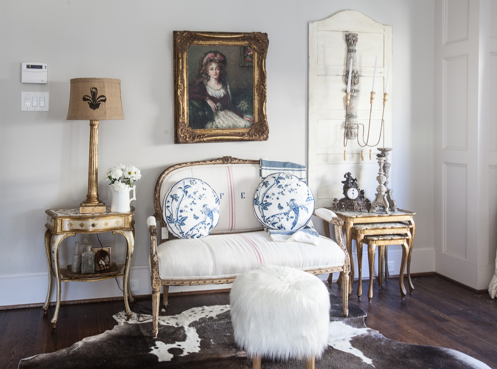
Today we’ll deal with wall art and the heights on one end of my bedroom. Here you can see the door on the right is taller than the lamp on the left. It’s not a big deal so I ignored it. But it began to bother me after awhile. The door is from my armoire. I removed it when I converted a mirrored door to a glass door. You can see the armoire HERE. Since it is a one-of-a-kind item, I can’t just order another door for the other side of the settee.

The lamp is not only shorter than the door on the right, but it is dark, and everything else is light. So I tried switching out the dark lamp and lampshade for this Florentine table and vintage Italian lamp below. Now it’s getting better. The two tables are not the same, one is a set of stacking tables and the other is just one table, but they now add about the same amount of weight to the room. The lamp is also gold so it seems to work better than the blue lamp. Another option would have been to keep the blue floor lamp and change out the dark lampshade for something white. The lamp is still shorter than the door on the right.

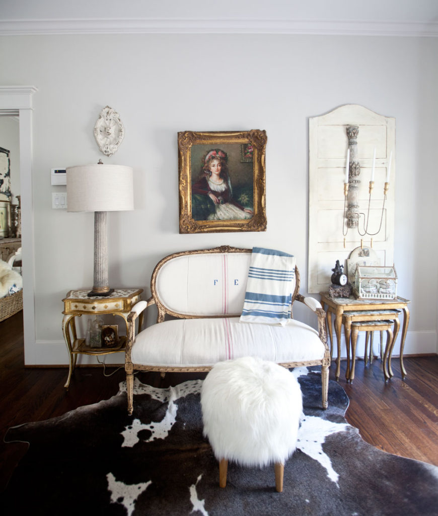
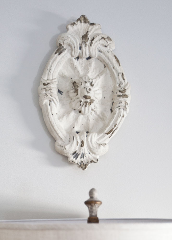
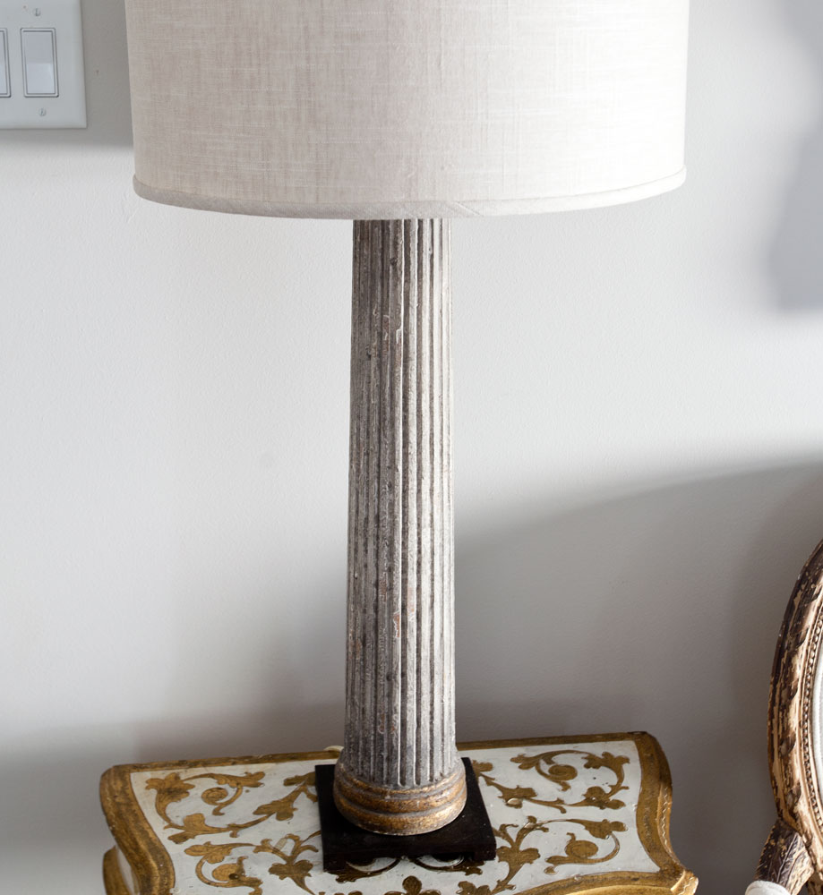
So here’s what I did. I found this lamp on a deep discount. It’s Aidan Gray. The color of the lamp mimics the color the candle scone on the right side. The creamy lampshade is similar in tone to the door on the right. Now I just needed something white above the lamp so it was about the same height as the door on right. I pulled this medallion from another room.

I would say the room is now balanced. Note that had I used matching tables and lamps on both sides, the room would have been balanced without doing anything else. If you have symmetry, you have balance. When using different tables like we did in this room, obtaining balance takes more work, but it can be done.
Here’s a close-up of the medallion.

And you can see the detail on the lamp below.

So balance has to do with height, weight, and color. You don’t have to go matchy-matchy to acheive balance. Simply go for similar heights, colors, and widths.
Oh and we have a new podcast episode today.
Check out the current episode
EPISODE 83 HOW TO USE THE RULE OF 3’S
As a “Decorating Warrior”, I challenge myself to the un-matchy – style. Liking your explanation and photos. Great job, Anita.
Great insight, thank you!!!
Perfect!!!!!!! ? this look!!!!!! ? Roxann!
I’m playing devil’s advocate here. I think the right-hand corner of the room is heavier to begin with because of the “paneling” on the far wall, seen in one picture. I would have tried to move the whole grouping toward the corner just enough to clear the switch on the left. Move the door and tables to the left of the settee. Stagger the tables a bit more. Keep only the terrarium on top of the tables. PLace a small green plant on the floor under the front table. To the right of the settee put the single table and the wonderful lamp you chose. Put the black clock by the lamp. Hang the clock face on the wall to the left of the lamp and below the shade. The lamp will also serve to light up an often dark corner of the room. Medallion, maybe? Just a thought!
Kathleen, I wouldn’t call that being the devil’s advocate, I would call that a different approach. Of course there is more than one way to approach this room, and I think you have a very creative and lovely idea. Bravo!!!
I love your style and how you can see the wonky and make it work. That lamp makes a huge difference and the medallion is the perfect “equalizer”. I also like that you’re not ALWAYS perfect first go around! Gives me great hope ?
Ginger
OK, now I get what is wrong with my problem area. In your final photo, you have created a “gilt triangle” formed by the two gold table(s) and the large portrait with gold frame…very subtle and pleasing to the eye. I’m working with different furniture and decorative items, but can create the same “triangle” effect by using a large painting with heavy dark wood frame, a small dark cabinet and nest of wooden tables, of similar size, on either side of my settee. I finished up by adjusting the height of the lamp and other items on both sides of the center piece…..ahhhh…at last. Thank you for the insight.
Oh my now I know why some items does not look right! Thank you for great insight! God bless
Love when balance is different on each side . Lovely job
Great tips on how to balance a room. I always try to keep things at similar levels and try to spread similar colors around the room. Thanks for sharing your tips on Merry Monday.
Anita, I love the way you show 3 possibilities rather than just 2 – a good, better, best instead of just a before and after. Looking forward to reading more of your blog; this is my first visit! Will be tweeting this one.
Thanks for the ideas. Have you considered moving the painting along with the medallion above the end table? That would balance the larger objects. Or, you could ut down the door. The settee looks too small for all of the items in that vignette, especially the stack tables. Just my opinion.
Judy, this is a conversation, so I appreciate all advice! Great ideas!!