Welcome to our monthly installment of DIY Tips and Tricks.
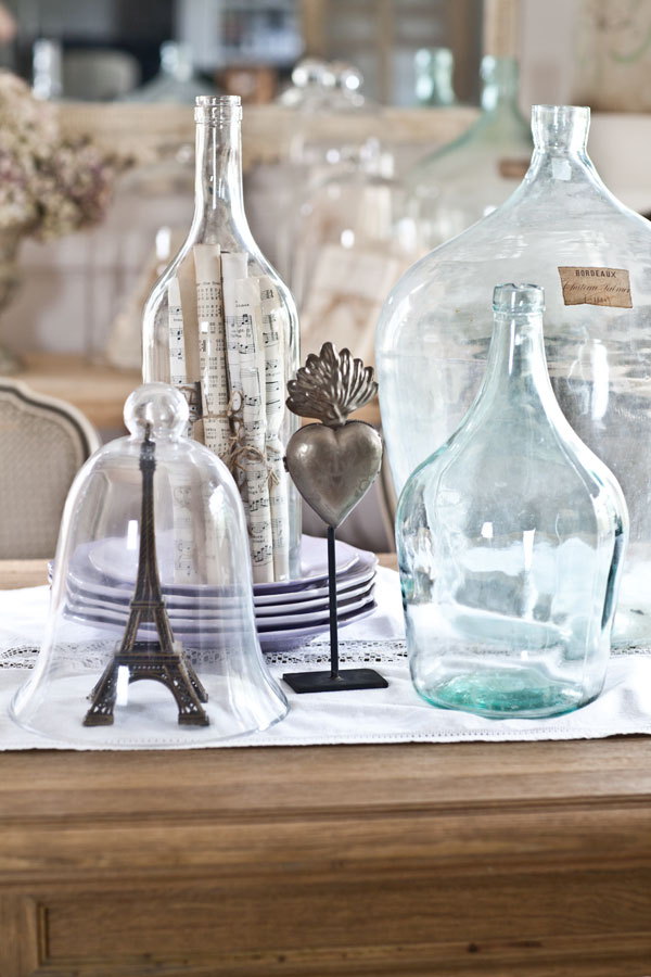
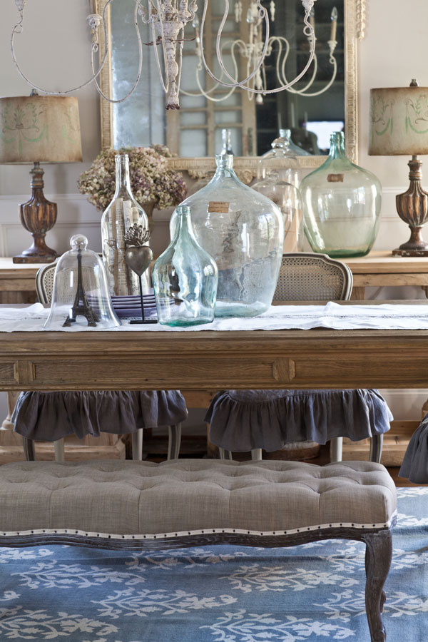
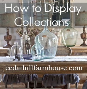
Today I’m talking about how to display collections, and this is a bottle collection I have. The first thing I want to say about displaying collections is that you do not have to include every item that fits in the category. I have other bottles, but I did not put all of them on the table.
A few on are the console behind the table, and and I have several in other places. The thing is, if I put every bottle I own on the table, it would look like a flea market. So rule number one is that you do not need to include everything in your collection when displaying them. Simply choose several that look good together and are the correct size for the space.
1, BE SELECTIVE
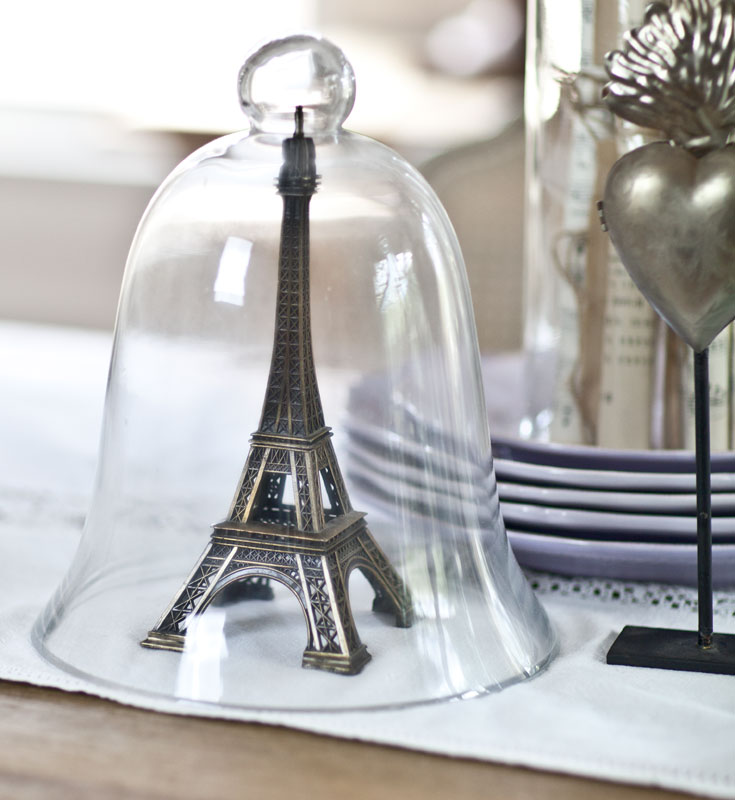
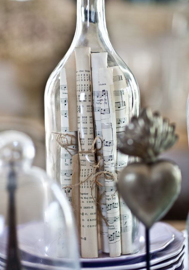
I only only 4 bottles on the table, but they aren’t all bottles. There is one cloche with the Eiffel tower in it, and one bottle (on the plates) that is open on the bottom. So is the bottle without a bottom technically still a bottle? I’m not sure. But the cloche is definitely not a bottle, but it goes well with our collection here. So rule number 2 is that the collection does not all have to be exactly the same thing. They just need to make sense together or look good visually together. Because I used the cloche and the bottle without a bottom, I was able to add some interest by including the Eiffel tower and the sheet music.
2. BE FLEXIBLE
Now, if you will notice they are all varying heights. It adds visual interest if everything is not exactly the same height or size. If they are all the same height, then you can give the illusion of varying heights, but using a riser (something you put underneath the item.) I used a stack of plates here as a riser, but you could also use books or something else.
3. VARY THE HEIGHTS
Because the bottles are basically clear and needed something else to make them more interesting I added the heart on the stand. It’s not a bottle or a cloche, in fact it’s not glass at all. It’s totally different. I just added it to break up the monotony of the glass.
4. ADD SOMETHING UNEXPECTED
I think this is a bit tricky. If your items are too small for the small they can get lost and look cluttered. You want a collection that is boldly sized, but not overwhelming for your space. Had I used small perfume bottles you would barely be able to see them from across the room. These bottles are not going to be missed. It’s all so individual. I like the amount of items on a dining room table, but some people will think it is too much. That is just up to you. Make it work for you in your home.
5. USE THE RIGHT SIZE ITEMS
Well I hope that was helpful.
You can find some spring inspiration at my post on the Bali Blinds blog today where I am a contributor. SPRING INSPIRATION AT BALI BLINDS BLOG
Please join the other blogs joining our event today.

Gorgeous and so informative!!!! I adore your photography and the way you use bottles cloches and interesting little touches! Perfection!
Anita, I love the collection of glass bottles you have on your dining table. Love your tip about adding something unexpected. That bottle with the rolled up music in it is wonderful!
I love the bottle with hymnal pages! I want to do this! Sheila
I love how you create your displays of your beautiful collections!!!…Always a pleasure to see and take note!!…Hope you are having a great week!
You are a clever girl making your display interesting and fun. That works for me!