I think we all struggle to find the right size artwork for a wall. On social media I see lots of questions about what should go on a wall, what size should it be, how much should be on a wall, and I’m going to go there. That’s right, I’m going to put my flag in the ground and state my opinion, no matter how scary that can be.
So here it goes.
Firstly before we talk size, let’s talk quantity.
LIMIT THE AMOUNT OF ART ON A WALL
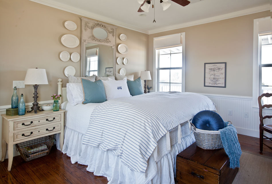
Too many things on a wall can look confusing and cluttered, less is more. This is a BIG wall and yet the only thing on the wall is one piece of artwork above each bed. I think I could have gone crazy here with lots of color and artwork. I feel this restrained look adds order and calm to the room.
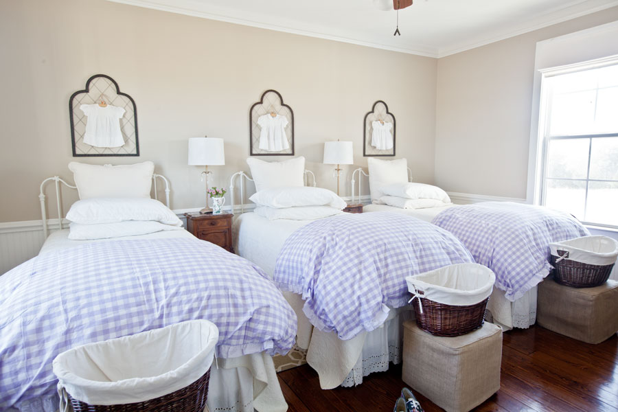
Artwork above a bed looks great when it is one large piece above each bed. Too small and the item looked dwarfed.
GO BIG OVER A BED
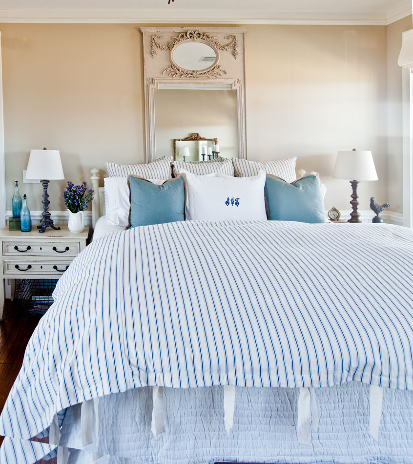
Although the mirror below is large, I think it was too narrow for the bed below it.
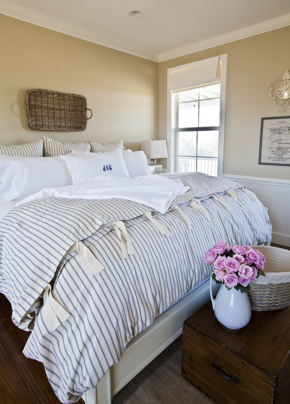
Size-wise this basket is basket is pretty good; it’s long enough I think, but maybe a bit boring. Although it is about as wide as the French mirror because it is horizontal it feels wider.
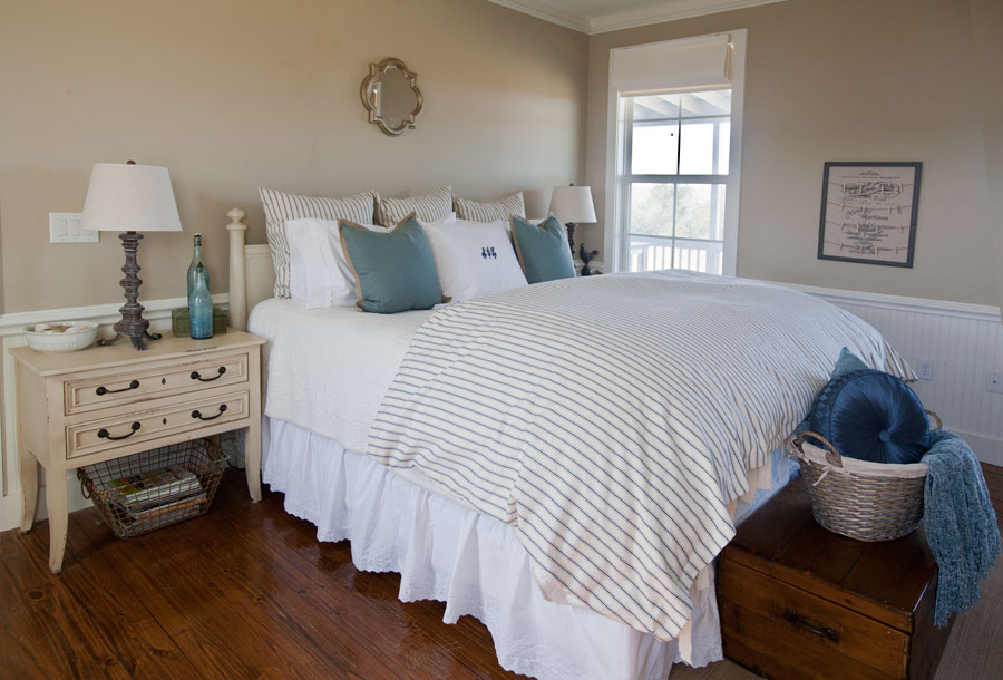
Here is a mirror that I think you could use, but in general is too small for the bed. It’s okay, but not spectacular.
My favorite look over this bed is the French mirror with the ironstone platters. Although there are several things on the wall, the fact that they are all the same color and grouped together make them feel in some ways like one piece of art.Then with the platters the artwork is new wide enough for the bed.
DON’T OVERWHELM A WALL
Now let’s get specific with this desk area.
Here we have a very large canvas. The wall is a pretty good sized wall. I don’t have too much artwork, just this one piece, but it did overpower the room to be honest.
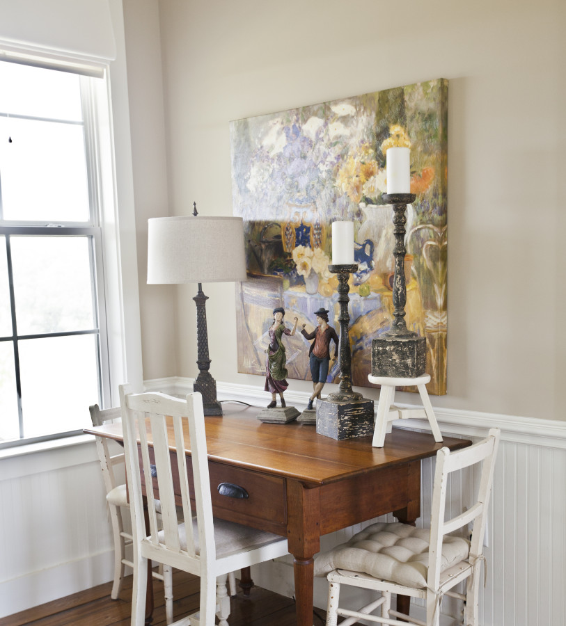
And so I switched to a smaller piece, a mirror. It thought this was much better sized for the room.
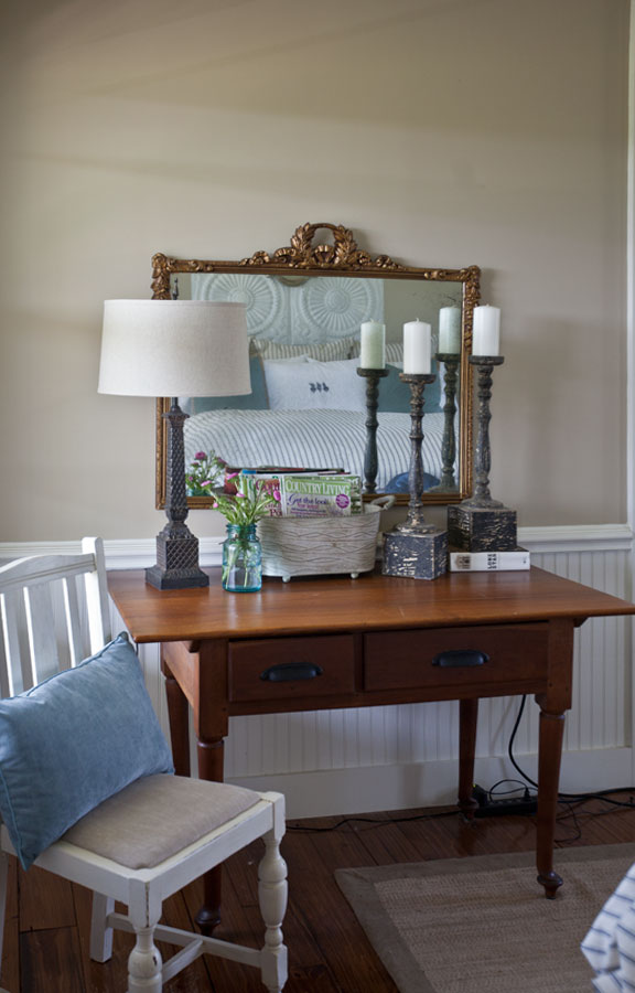
And then I found a fabulous desk, that was more narrow. So now the artwork was a bit too wide for the new desk. I tried an optical illusion, using a frame on top of the mirror to make the artwork look narrower and better sized for the new desk.
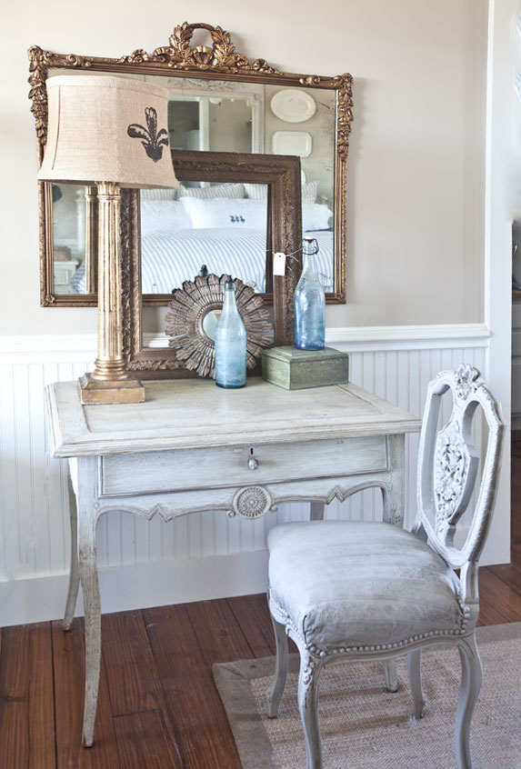
So I went with something smaller, but not too small.
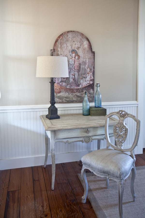
It’s all about getting the right size for the space, but having said that, please, please, please do not buy something you do not like just because it is the right size. You will be sorry. I know, because I’ve done it.
IF YOU GO BIG, GO SIMPLE
Now you get do something really large on a wall, if the wall is large and if the thing on the wall isn’t full of lots of color. This chalkboard is massive because it is made from a door. I think if it were a busy painting the size would feel too big. But with the neutral look (black and white) it seem just fine. It is almost as long as the Swedish Gustavian bench below it.
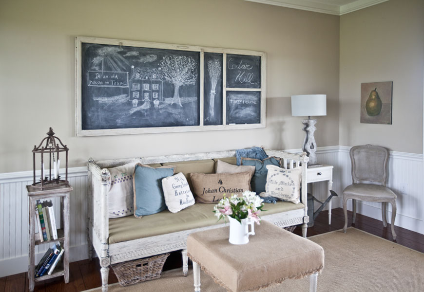
I think to summarize my philosophy is fewer larger pieces look better. But a big, colorful piece may be too much for a wall unless the room is large.
The bigger the art, the simpler it should be (in general.)
I’ve had gallery walls before, you know, the wall with lots of photos on it. I’m not opposed to those, but I think they can look confusing.
That’s my take on artwork, what are your thoughts?
Many of us are so visual, I love the way you have analyzed real examples. My favorite is the repetition of the dresses in wire frames – so cute.
Thanks Cyndi.
Anita,
I agree that hanging art work is truly personal preference!
Years ago, while renting a duplex, I had a small hall wall that could be visibly seen from the living room.
I hung our family photo gallery the width of the short hall from the top of a small chest all the way to the top of the ceiling! It was stunning!!! I now have a glaaery of family photos strung down my hallway leading from the living room to the bedrooms. Again, it is a showstopper!!! Most of the time, I try to keep my artwork simple.
Great tips!!!
Fondly,
Pat