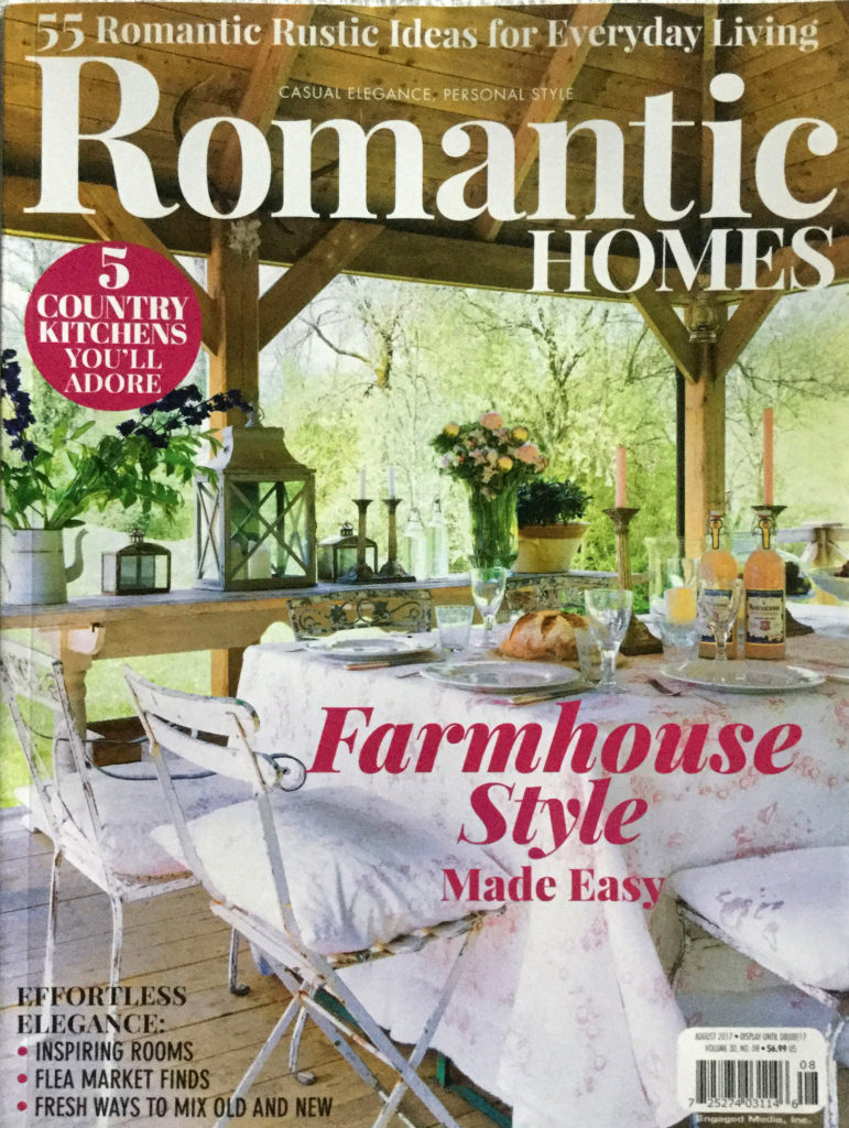
Before we get to the gray paint, I wanted to say, I’m so humbled to be in Romantic Homes magazine again. I didn’t really pay attention to the date, so I thought it was the July issue, but actually I’ll be in the August issue. Here is what the cover looks like.

Yvonne asked me if I was tired of being in magazines. Silly question. It’s not the first time obviously, but it’s still special. The first time I submitted my home to a magazine, I was told ‘no thanks!’ And so each time I’m in a magazine I remember that time I was turned down. Please don’t take rejection as a permanent condition. The first one said no, but now I’ve been in 21 magazines. Had I thrown in the towel after the first rejection, it would have all been over before it began. Okay I’m stepping off my soapbox, so we can talk about gray paint!!!

EPISODE 63 THE BEST GRAY PAINT COLORS – LISTEN BELOW.
First let’s talk about gray paint. Is it still hot? Is it a classic? Is it too late to put it on your walls. We discussed it on the podcast, but here are my two cents. Gray is here to stay. It’s a new neutral. It adds color to your space, but stays neutral. It’s everywhere, but doesn’t seem to be going away any time soon. It’s the new classic, so you’ll be seeing it for a long time.
I think the bad rap it gets sometimes comes when people use a very blue (cold) gray. That doesn’t work with a lot of furnishings and can leave the room feeling harsh and industrial. Some grays have a purple undertone that people often don’t like. There are a lot of bad grays out there, but happily there are many that will work beautifully as a wall color for your home.
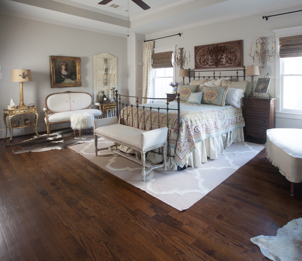
If you are a regular visitor, you probably know I love Agreeable gray! The walls are a soft color that works with so much. The gray is warm, not cold. It looks great when the sun streams in and when it’s dark. I love it! See how soft it looks?

Agreeable gray SHERWIN WILLIAMS
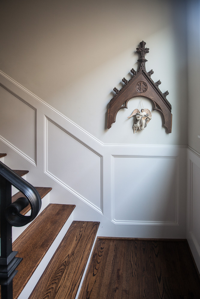
I chose Eider white for the woodwork. It’s a gray-white. You might not notice it’s a very light gray until you see something bright white next to it. It works very well with agreeable gray.

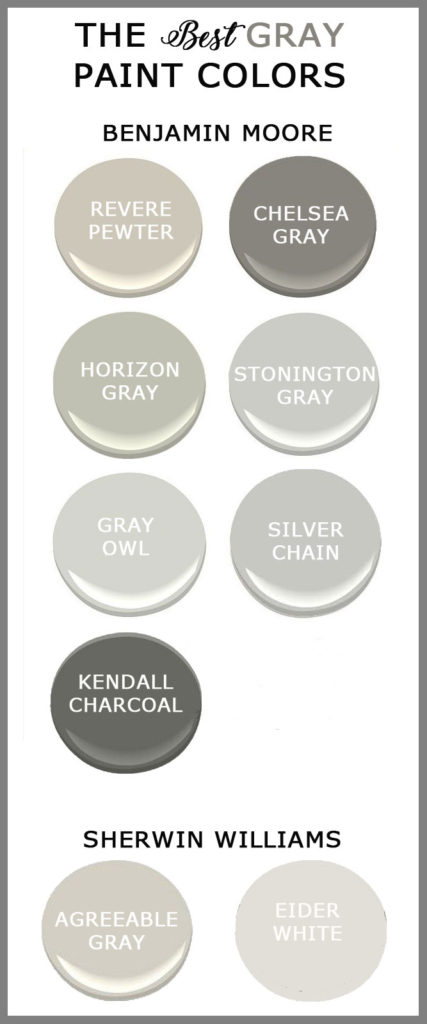
These are some more grays that we absolutely love. I don’t have photos of these, since I haven’t used them in my home. The Kendall charcoal and the Chelsea gray would be a fabulous look on a kitchen island. I think they would be a bit dark for walls, unless it was a bathroom or paneled study.
The stonington and owl gray are on the cool side, so just keep that in mind.
Here are links to the rest of the paint colors we mentioned.
Stonington Gray BENJAMIN MOORE
I’m so happy you love agreeable grey! I painted my whole first floor in agreeable grey and I’m VERY happy with it. It feels very warm and classic… which is a relief because I’ve definitely made the purple-grey paint mistake before. Ack! Lesson learned.
I found you through the podcast– I’m loving it! I started listening a few weeks ago and have made it through almost every episode 🙂
Oh it sounds lovely Sarah. Yay, I am so glad you are enjoying the podcast. Aren’t Kelly and Yvonne a hoot?
My favorite Agreeable Gray is so soft, I agree with you. Painted my tiny downstairs power room that color with a black ceiling. Very calming while being a bit dramatic.
We used Agreeable Gray in several rooms when we did our remodel, and based that choice on the lovely rooms in your home and the lovely rooms Cindy (Edith and Evelyn) is remodeling. After reading this and listening to the podcast (HILARIOUS!), I plan on incorporating Agreeable Gray and Eider White when we repaint. Love all the suggestions, hints and tips!
This is very timely as I am looking to redo our bedroom in GRAYs! I will definitely be using your tips on which gray to choose. Congrats on the magazine — amazing to see ‘yourself’ in print! Very cool.
We recently began painting our home, room by room. I was sure I would use Agreeable Gray as it was recommended by so many, and it looked so beautiful in my son and daughter in laws house. I bought a sample, tried it out and it went purple in my home. I ended up choosing, believe it or not, a cooler color called Passive, and just love it. The lesson here is get a sample and try it out. Lighting, other colors in the room, sun exposure etc, can all affect how the paint will look. Hope this helps someone before they commit.
Love all your posts, and your style. Thanks for sharing!
I have Stonington Gray in my home and I love it! It is in my kitchen. It looks wonderful with my granite. My back splash is small tiles with little flecks of color that goes perfectly with this color. I painted the rooms next to the kitchen in different shades of gray as well. Love how well they all blend.
Sounds gorgeous Marilyn!
We have the Revere Pewter in our family room with white board and batten on the lower two-thirds of the walls (BM White Dove) , and it is absolutely perfect! All colors look great with it! I chose it before I knew how popular it was and started seeing it pop up on all the blogs, so I was very pleased to be so “in fashion”. Our mantle and flanking bookcases are Annie Sloan Graphite. I agree with you that gray is here to stay – at least the softer side of gray.
I haven’t listened to many of the podcasts yet, but please consider discussing, if you haven’t already, whether to keep original stained doors in old homes (1895), or go with painting them black? I know you talked about stained woodwork but I keep going back and forth on this issue…thanks.
Hi Anita,
I found you, Kelly and Yvonne on Decorating Tips and Tricks about a month ago. I have almost listened to ALL of the episodes. You all are great!!! I feel like I am sitting down with 3 girlfriends and discussing decorating. Your home is beautiful. I am getting ready to put new wood floors down in my house and was wondering what color of stain you used on your oak floors? Thank you so much for sharing all your decorating expertise.
Happy Day,
Linda
I’m thinking that I want to paint my small bathroom gray – a darker gray. Do you think Chelsea Gray is too dark? I have white baseboards and window trim. The backsplash around the tub is glass tile – black, gray and white. Also thinking about painting my mirror a whitewash yellow.