Let’s talk about adding bold color to your home. Even if you have a neutral home like I do, it’s still fun to add splashes of color here and there. Let’s talk about how to do just that.
I love my neutral home, but I am slowing adding color back in my home in measured doses. There was a time when my entire house was full of bold color. Then I transitioned slowly over time to a totally neutral palette. I love, love, love neutrals, but it can become boring. So now I want some bold color, but this time I am adding the color in small amounts here and there, rather than everywhere.
It’s fine to have it everywhere; that’s a certain look. Just be careful to make a conscience decision about which way you will add bold color and stick with it. I think it’s best to have a plan.
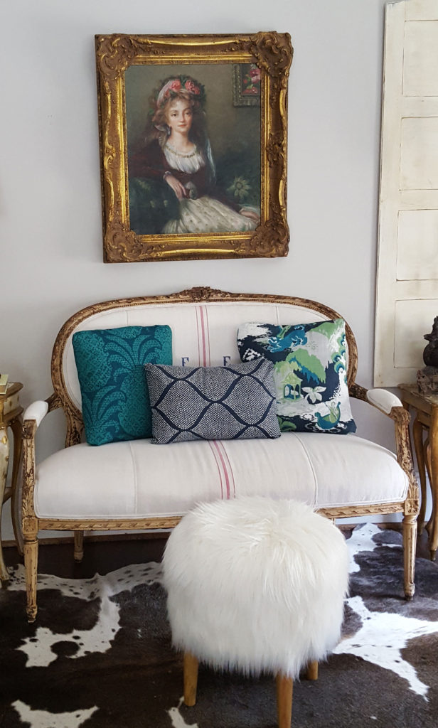
The easiest way to add color is to do so with pillows.
Try making some pillows using fabric with lots of color. (Calico Corners is a sponsor of mine.) I made some charming pillows with fabric from the Madcap collection from CALICO.
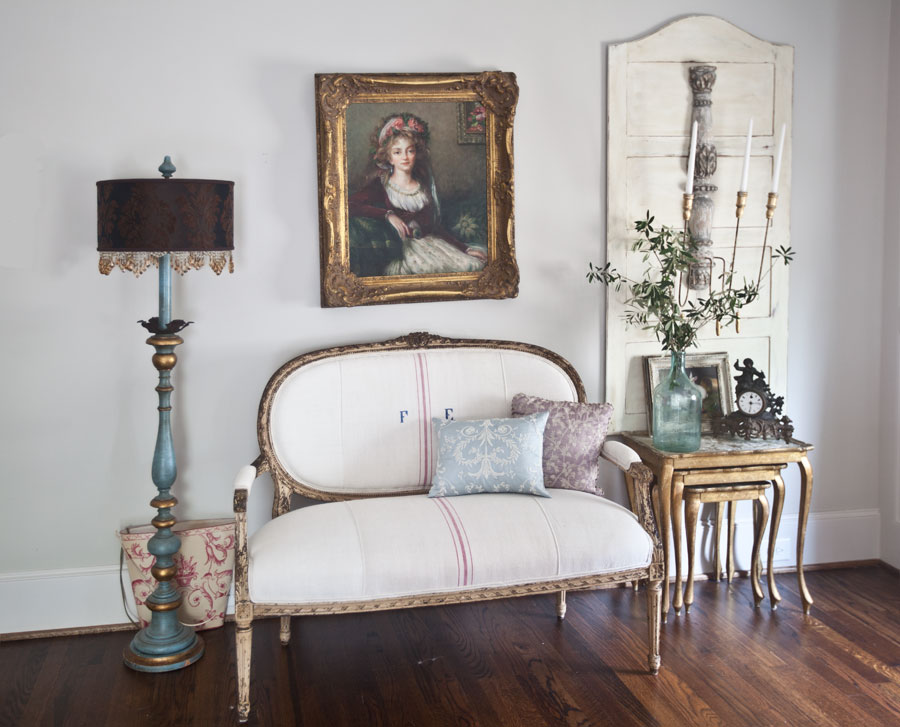
Below you can see what the room looked like with less color.
Be sure to listen to the podcast today for more info.
EPISODE 67 ADDING BOLD COLOR TO YOUR HOME
If you don’t sew, you can just buy some pillows already made. That works too. I actually made the pillow below in the bold purple velvet. For instructions, CLICK HERE.
Let’s compare it to the room with less color below.
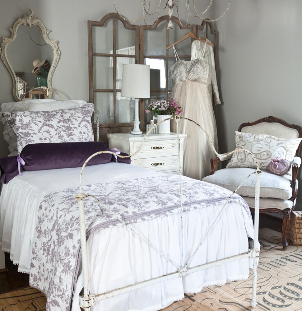
This is a purchased pillow below, CLICK HERE. I love the color in the room. I think the bed wouldn’t be as interesting without the pop of color.
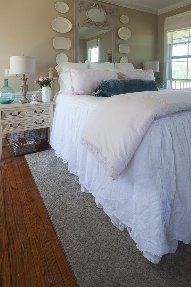
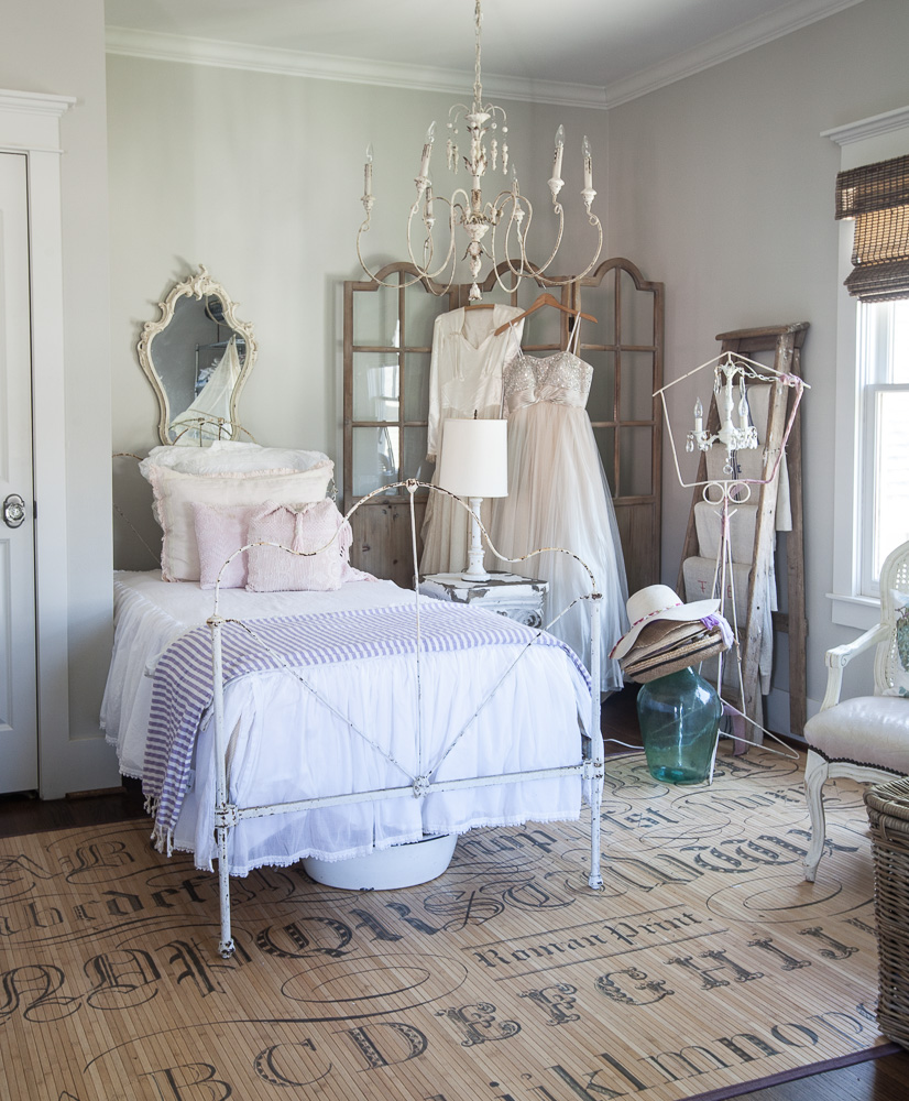
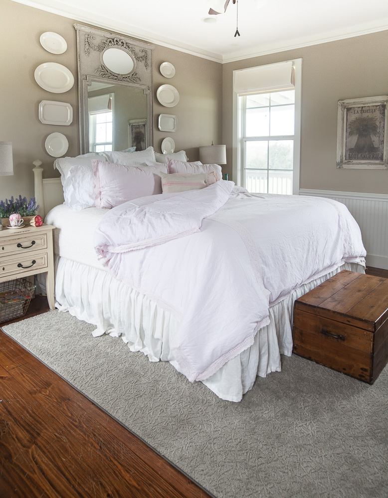
Here’s the bed without the blue pillow below. I want you to see the difference.
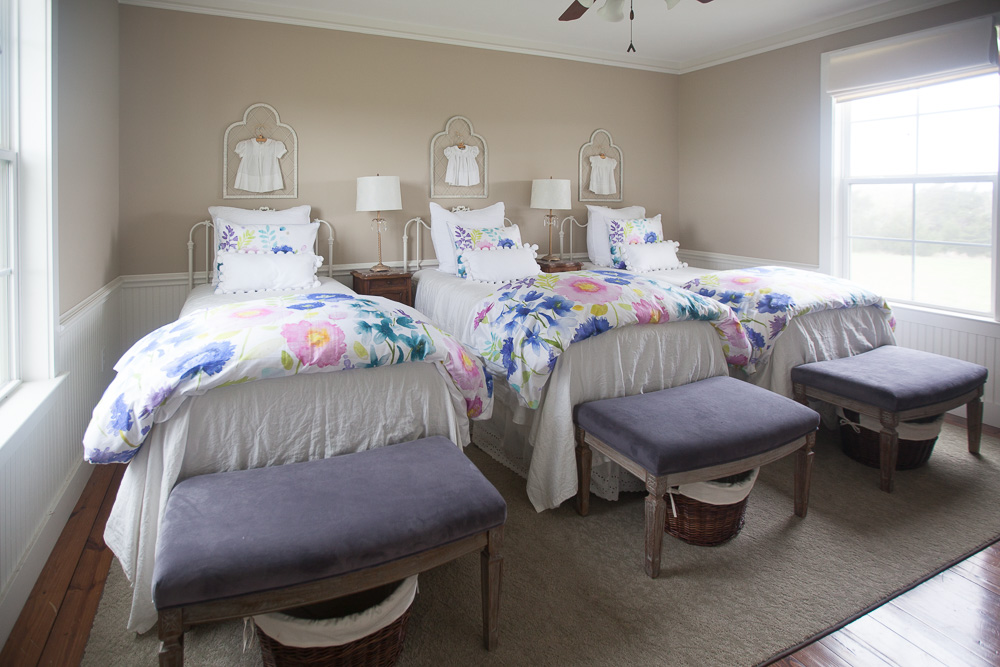
I don’t know if you remember when the girls’ room at the farm was all white. I thought it was quite charming.
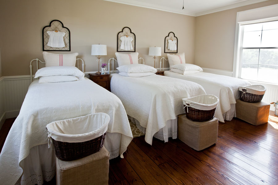
I was told it looked like a hospital ward at Downton Abbey. That totally cracked me up. Ya’ll are funny! I actually agreed with that assessment. So I added some color with the check duvet covers.
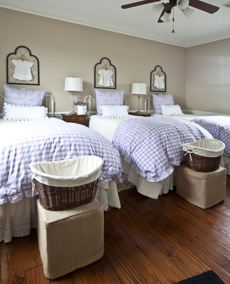
I liked the gingham duvet covers, but I also went with a bolder pattern shown below, CLICK HERE.
I added a dark quilt to the daybed.
Below we have the same daybed with a lot less color.
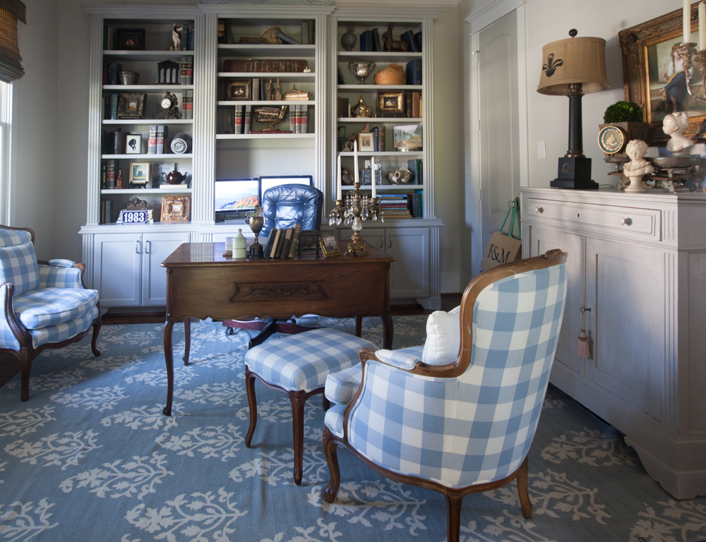
Now let’s check out the study with the blue rug and chairs.
Compare that to the room without the blue. 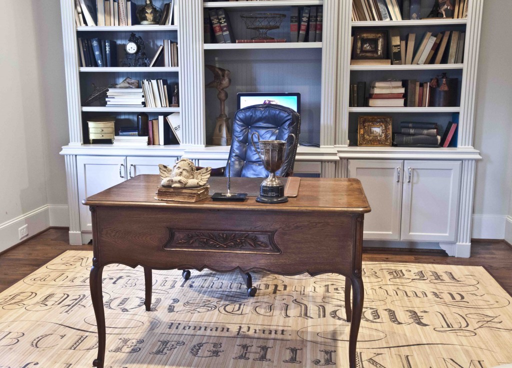
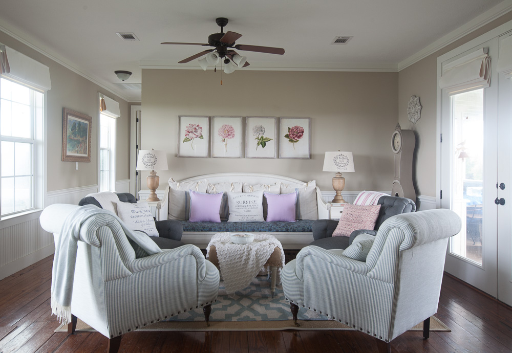
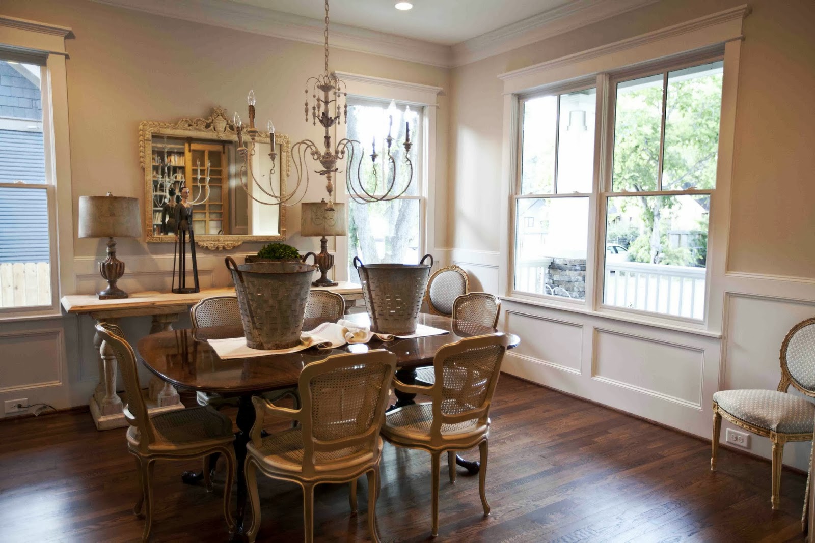
And now for the last example. Here is my dining room with a blue rug.
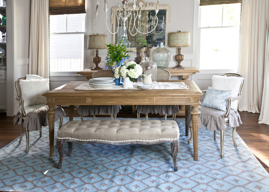
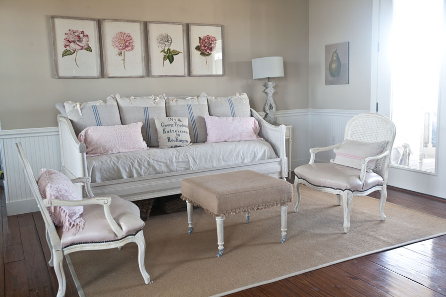
Here it is without the color.
So which do you prefer? Totally neutral or splashes of color? Obviously there is no right answer, it’s just a preference. It’s your home, so go with the look you want, be it color or none.
One of the best blog posts I’ve seen. It really showed the improvement of the very small changes. Definitely , helpful! Thank you!
I’m sorry, isn’t the above my comment? I’m confused.
I am a color person. So I love the colors you are adding.
Every time you show the room with the three beds layered in purple gingham, I smile! One of my favorites!
The blue rugs are fabulous; they truly transform the office and dining room. For me, some rooms (for example, the ones with the daybed or the seat below the portrait) are more appealing with the softer colors, maybe just add more. The bold colors are great occasionally for changing the mood of the room.
I agree, it’s fun to change things out.
I just read your article in Romantic Home!!! I love your Blog and your articles here & there! The splashes of color in your post really make a difference, even as I thought that I would like it better without! Subtle color changes can make a world of difference after all.
I too love the gingham in the girls room. I’m trying to change my wall color to a Light gold from kitty pond green. But I need the change. Light gold will be my neutral as you know it don’t like grey. I’m in a true craftsmen house built in 1928.
I do have a question though. My kitchen is tiny, but one wall has no cabinets…if I go with a very dark color will it give more depth?…the cabinets are space and white.
Really like the splashes of color. I’m thinking of changing up my color splash from aqua to another color… or even just add a bit of coral.
Great pictorial!!!!! Love the rooms both ways!!!!! Just beautiful!!!!! ? Roxann!!!!!
Variety is the spice of life!
I’m a “color” person. Too many lights or neutrals make the room float, I,think.
I love the splashes of color! You’ve convinced me that if I every buy a new sofa I’ll get one in a neutral color.
Sounds great Nancy!
I LOVE this fabulous blog. I do the very same thing. I started out with whites, light cremes and florals. Now, I still have that (I’ll never change!), really, but I am adding some dark teal and a little purple and changed some candles, too. My whole house is all related in these colors in one way or another, with a creamy white background. Very easy to switch pictures, pillows, candles, napkins, bedspreads, florals all around for easy updates to each room. I’m very happy ALL the time. Thank you so much for all you do for us………e
Thank you for the examples! I’m still a neutral girl, after having lots of color for years, I’m not sure if I can add more than a pop here and there. Love your spread in Romantic Homes!
I love the blue in the study! The blue check is fab! I may be biased, blue always catches my eye! Thank you for sharing!
Beautiful choices and changes?thank you!
Such a small and inexpensive way to add color and change up the look. Great post.