Sometimes the design of a room is just off. You know it’s off, but sometimes it isn’t clear exactly what is causing it to feel off. And if you don’t know what’s causing the problem, then it gets difficult to correct. So f you know a room feels off, what do you do? Where do you start? As you might expect, I have some ideas on the subject. I would also love to hear your ideas in the comments.
Take a picture first
If you haven’t taken a picture of the room yet, go ahead and take a picture. A picture is worth a thousand words, and that is really true with decorating. It’s even more important than being in the room to some extent. If you live in the house, then you are used to walking in the room and seeing it as you see it today. The photo gives your eye a different view of the room. A photo can reveal things you didn’t notice when you were actually in the room. When you see the photo, the problem may become quite apparent. But if you still don’t know what to do, here are a few things to look for.

Symmetry
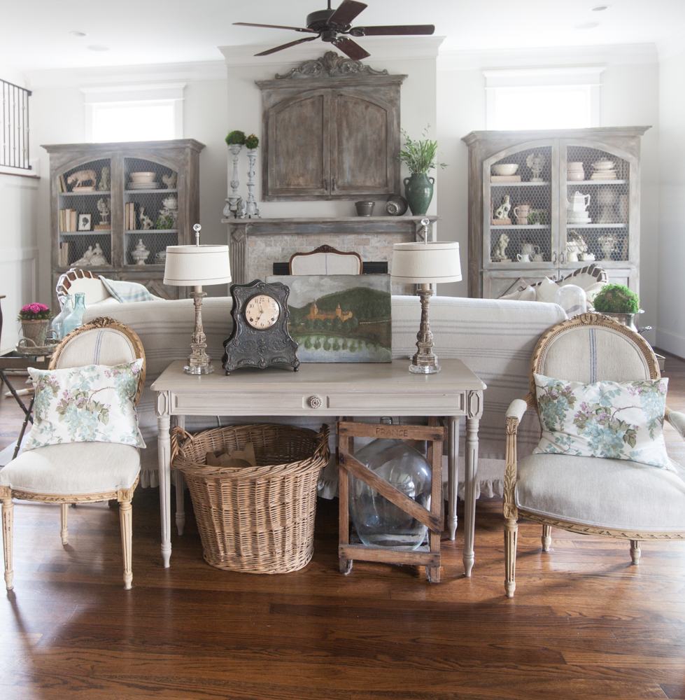
Does the room have some sort of symmetry? Does one side of the room feel like it’s not in balance with the other side? If so, you’ll need to rearrange things so you can feel some balance. You don’t need side tables on both sides of your sofa, and they don’t have to be the same, but you do want them to feel balanced. If one is very dark and the other is very light, they can feel unsymmetrical.

Color Balance
Is the color balanced in the room? Is the color interspersed through the room, or is the color just on one side of the room, or in one corner?
Texture
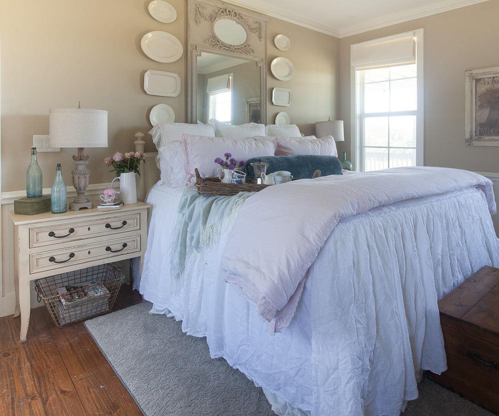
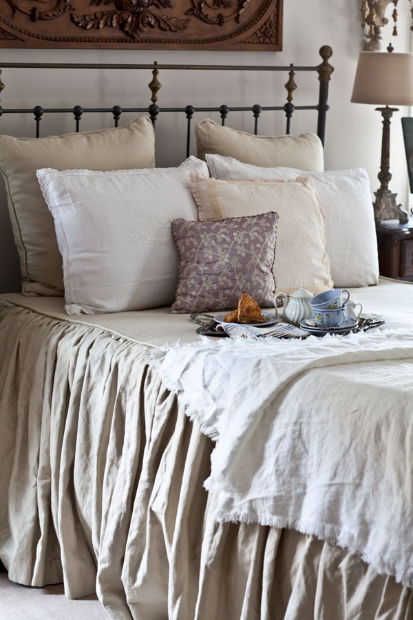
If you have a neutral room, then you’ll really want to be sure you have enough texture in the room. Otherwise it can appear very bland.

Lights and Darks
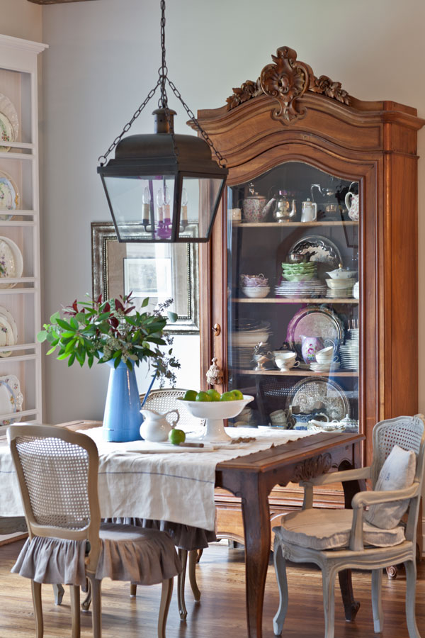
Black or dark colors can ground a room. I think every room typically needs both. Does your room have some darker colors and some lighter ones?
Be sure to listen to our podcast episode all about how to spot what’s missing in a room.

Some wonderful readers alerted me to the fact that my Amazon Affiliate shop looked all wonky. Amazon changed the way the pages are set up. With the change, my site looked very weird. I spent a lot of time rearranging it so it’s all nicely organized. The upgrades that Amazon did was to allow influencers to have all of their product favorites sorted by product type. You can see it here -> Amazon.com/shop/cedarhillfarmhouse
Your home is SO lovely! I’m glad you are enjoying your new eating and workout routine. What a great way to start the summer.
I have a somewhat small living room that is open concept on 2 sides with a large fireplace on the 3rd, so furniture arrangement and balance can be quite difficult. I’m finding that my sofa is the fly in the ointment, and I’m not able to replace it. Wish I’d purchased either a love seat size or two chairs instead, but I’m stuck. Your suggestions are helpful, thank you, and I’ll keep working on it.
I can’t quite picture your living room, but remember a sofa does not need to go against a wall. Can you put it across from the fireplace with a sofa table behind it??
I totally agree with taking a photo. Seeing it through a different lens (no pun intended) is sometimes all I need to figure it out. love the rod iron spindles! laura
Ha Laura! Good one.